Hello, all. I have designed a typeface using only single strokes – ie. no closed paths – such that these paths can be used by a CNC or engraving tool, with the line width set by the cutting tool itself. Of course I’m very aware that creating a font in this way is not supported in OTF/TTF, which requires closed paths! However, a number of CAD and other software tools still use special TTF fonts designed in this way, ignoring the “correct” way of interpreting the font. There are a number of options on onelinefonts.com in TTF that are designed to be used this way.
I see that there has already been some discussion of this topic on a couple of threads here, but I think I’ve come a bit further and I’m hoping for a little help in figuring out the final problems I’m having creating my own fonts the way that onelinefonts.com does it.
As I understand (from those other forum threads), if I export my fonts from Glyphs as TTF with “remove overlap” and “autohint” turned off, Glyphs will export without closing the open paths that I have created. My hope was that this would be sufficient for the font to work in my CAD application, but there is still something I’m not doing correctly. I assume it has to do with the way my paths are defined, but I can’t figure it out.
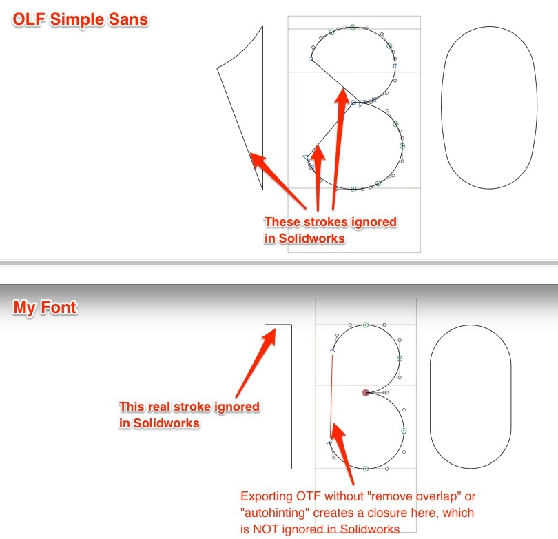
Here are three comparisons between my font with OLF Simple Sans – a “stick” font in TTF on onelinefonts.com (and included with Solidworks incidentally). First, here is a comparison in Glyphs itself (where I’ve just opened up the TTF of OLF Simple Sans). You can see that OLF shows all closed paths, but I guess these may be strokes that Glyphs is implicitly adding when it sees the open strokes in the TTF. You can see that the “3” actually has two open paths that are being closed in this way. Then below you can see how I am defining the same characters in my font in Glyphs.
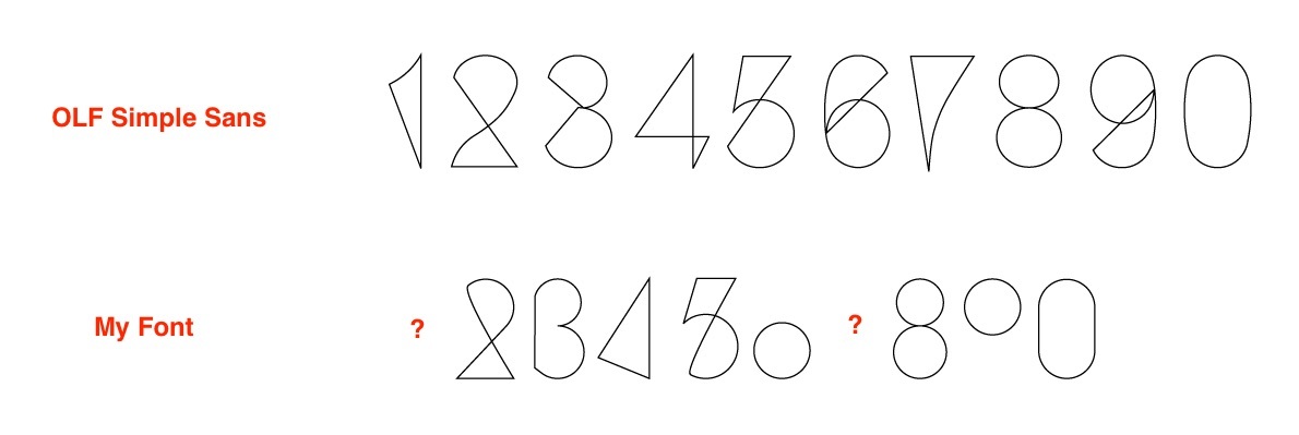
Then second, here is a comparison of the fonts in Illustrator (changing display from filled to stroked). You can again see how the open paths in OLF are closed (implicitly or explicitly, I’m not sure). Then with my font, there is some strange behavior. “1” and “7” are completely missing for some reason. “6” and “9” have lost their tails. “4” shows a stroke I didn’t create, but ignores others that I did.
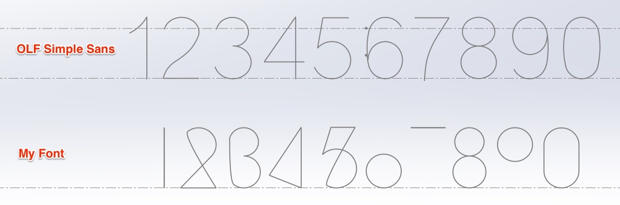
Then most importantly, here is a comparison in Solidworks. OLF works perfectly, removing only the unwanted path-closing strikes (removing 2 strokes in “3”, 1 stroke in “1, 2, 4, 5, 6, 7, and 9”, and no strokes in “8” and “0”. Then you can see my font where “1” and “7” appear, but only one stroke of each, and various implicit strokes that I assumed would be ignored in “2, 3, 4, and 5” are still visible.
So in the end, my question is: how do I define my strokes so that they are interpreted correctly by a CAD package that is expecting such a font? I assume that I don’t want to explicitly close my paths – then how would it tell that two of the strokes in “3” are to be ignored, where as none of the strokes in “8” should be ignored? But if I leave my glyphs open, how do I create my strokes so that they are interpreted the same way that OLF is in Solidworks (and I assume the other CAD software listed on openlinefonts.com)?
Any thoughts or advice would be greatly appreciated. An automated script to handle this would be fantastic, but I’m even willing to do some hand-work on my glyphs in order to make this work correctly, if I know what direction to go.

