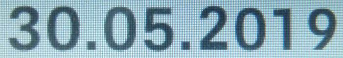
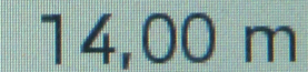
A customer experiences problems with a font used on various displays.
For example, the numbers do not have the same height and thickness.
I assume, that this issue is due to missing or wrong hint?? Please have a look:
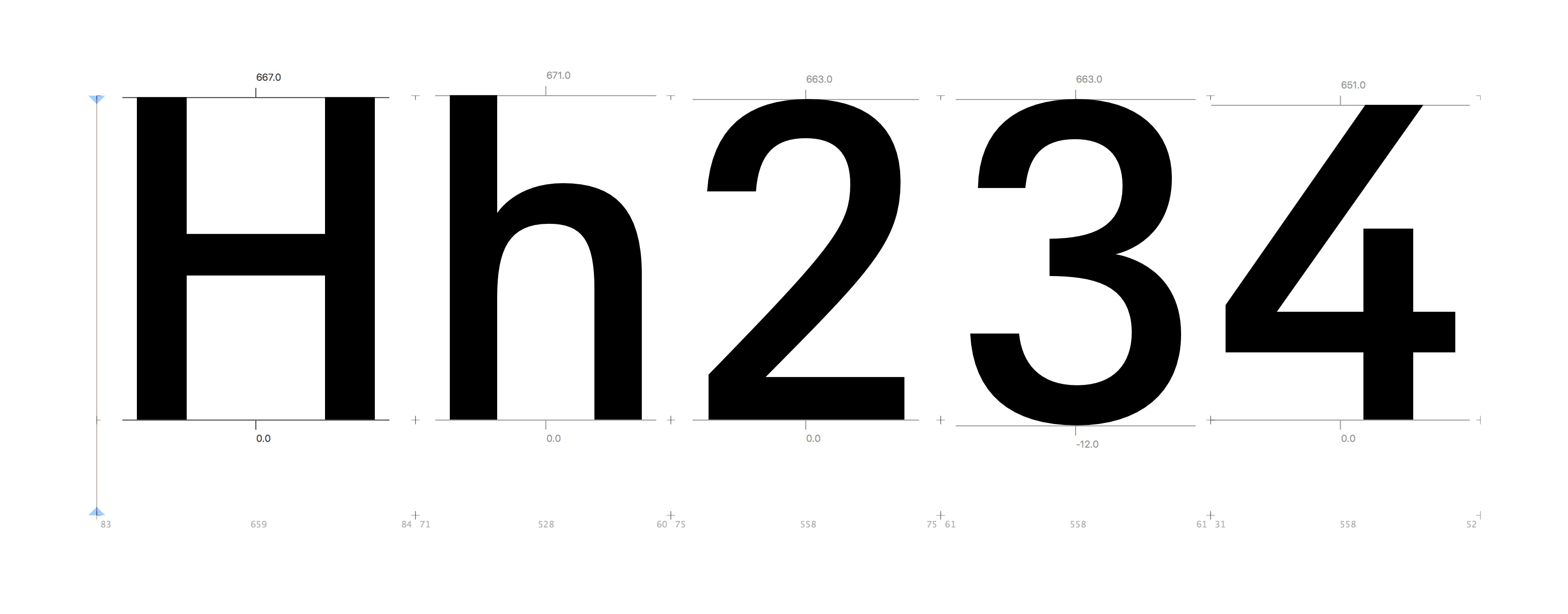
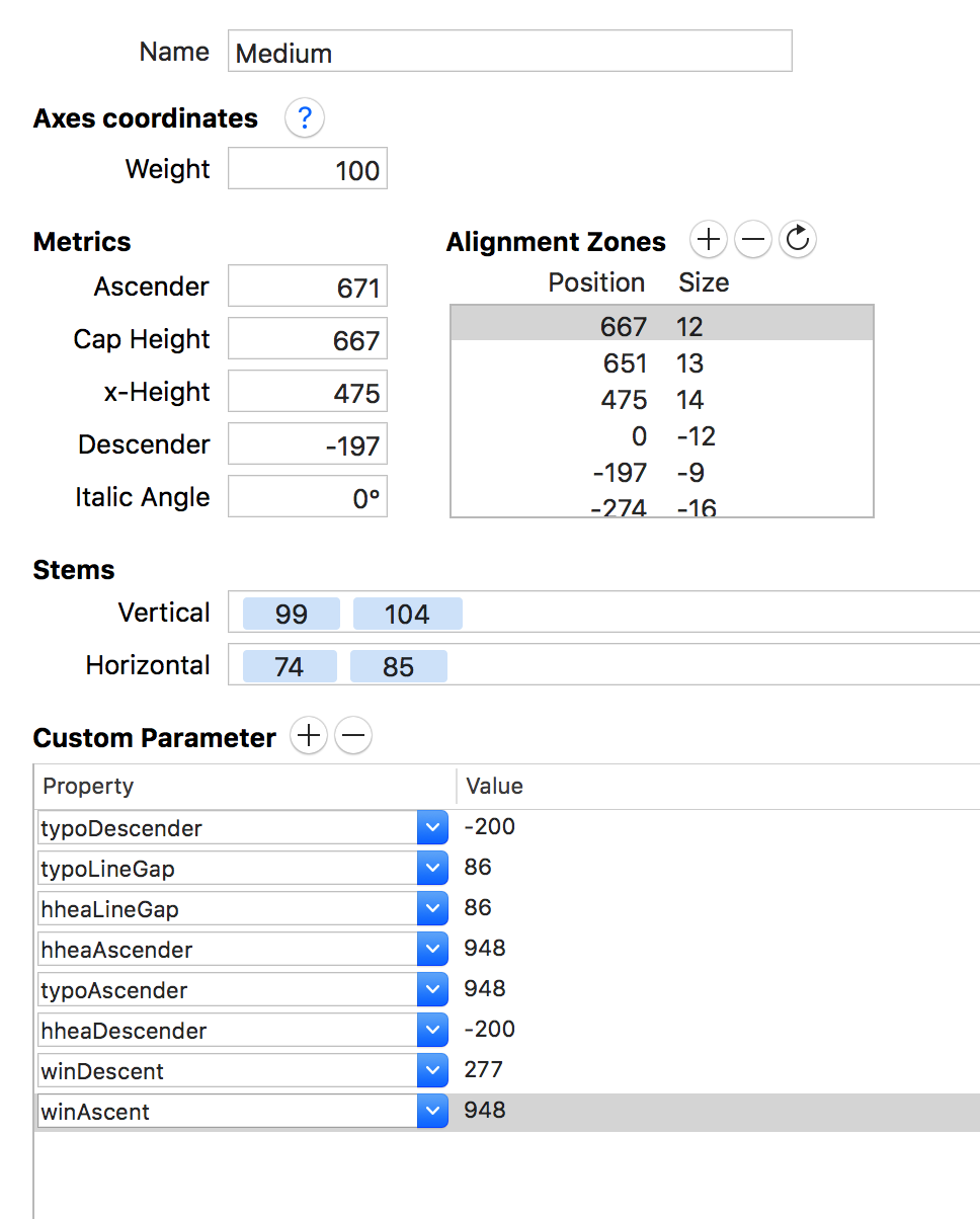
In ‘Font-Info’, I have now entered various value and have noted, that the numbers in the font are somewhat lower in the design than Caps and Ascender. I have in ‘Alignment Zones’ given the numbers the values: 651-13. Is this OK? Or should other parameters also be adjusted to accommodate the numbers? And what about the ‘Custom Parameter’ settings?Thanks!
ttfAutohint does not care much about the PS alignment zones. That depends on your ttfAutohint settings and control instructions. (I started a tutorial about control instructions, hoping to finish it some time soon.) There is more info on the ttfautohint homepage.
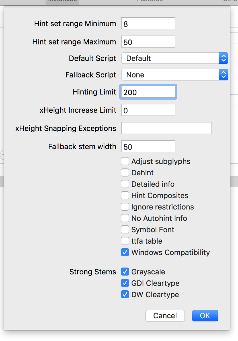
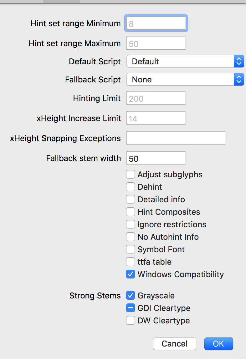
Thanks! A strange issue occur: When I return to this dialog-window in Glyphs, my previous entries are gone? The figures are gray and I can’t choose DW Cleartype? Please have a look here: