I have a problem I wish you could help me solve. For the scenes header in my screenplays, I use the Courier font in bold, but find it a bit too thick. I would like to modify it and make it thinner so it does not stand out too much on the page comparing to the regular weight. I don’t need to modify all the glyphs, only the capital letters, and maybe the numbers and dashes.
I would appreciate if you could guide me to some tutorials and plugins to automate the process, or at least make the task as painless as possible. I am new to Glyphs, but have made a couple of logos with Illustrator so I am familiar with the pen tool.
Start with the Get Started page. Take a look at the tutorials, then. There is one called opening existing fonts. What you need is the Offset Curve filter. It is documented in the Handbook.
And save and export your modified font under a new name. And do check if the EULA allows editing in the first place.
I appreciate the prompt response. This is regarding the Courier Prime font released under the SIL Open Font License (OFL), so it should be OK to edit it for my own use.
I will check the tutorials and write back if I encounter any difficulty. Thanks.
I looked at the tutorial and it looks promising. I only need to add a semibold weight to the font specified above. One of the things that would simplify tremendously my task is the ability to draw each glyph on a top layer above the two others, regular and bold, so I can easily find the middle length that would correspond to the semibold weight. If I could do it in Photoshop, I would stack the three layers, and set the two top layers to 50% opacity, so I could see through the whole thing. Is this possible when setting up a multiple master project, or is there a simpler way to kind of automatically add weight to the regular font by a certain amount without needing to redraw the whole glyph?
Sorry, I am just trying to find the right procedure before committing to it to avoid unnecessary experimentations that would lead to frustrations. Thanks for your understanding.
You can enable all other layers in a multiple master file in the layer panel. But you don’t need to draw the semibold yourself. If you make the existing outlines compatible you can get every intermediate step automatically.
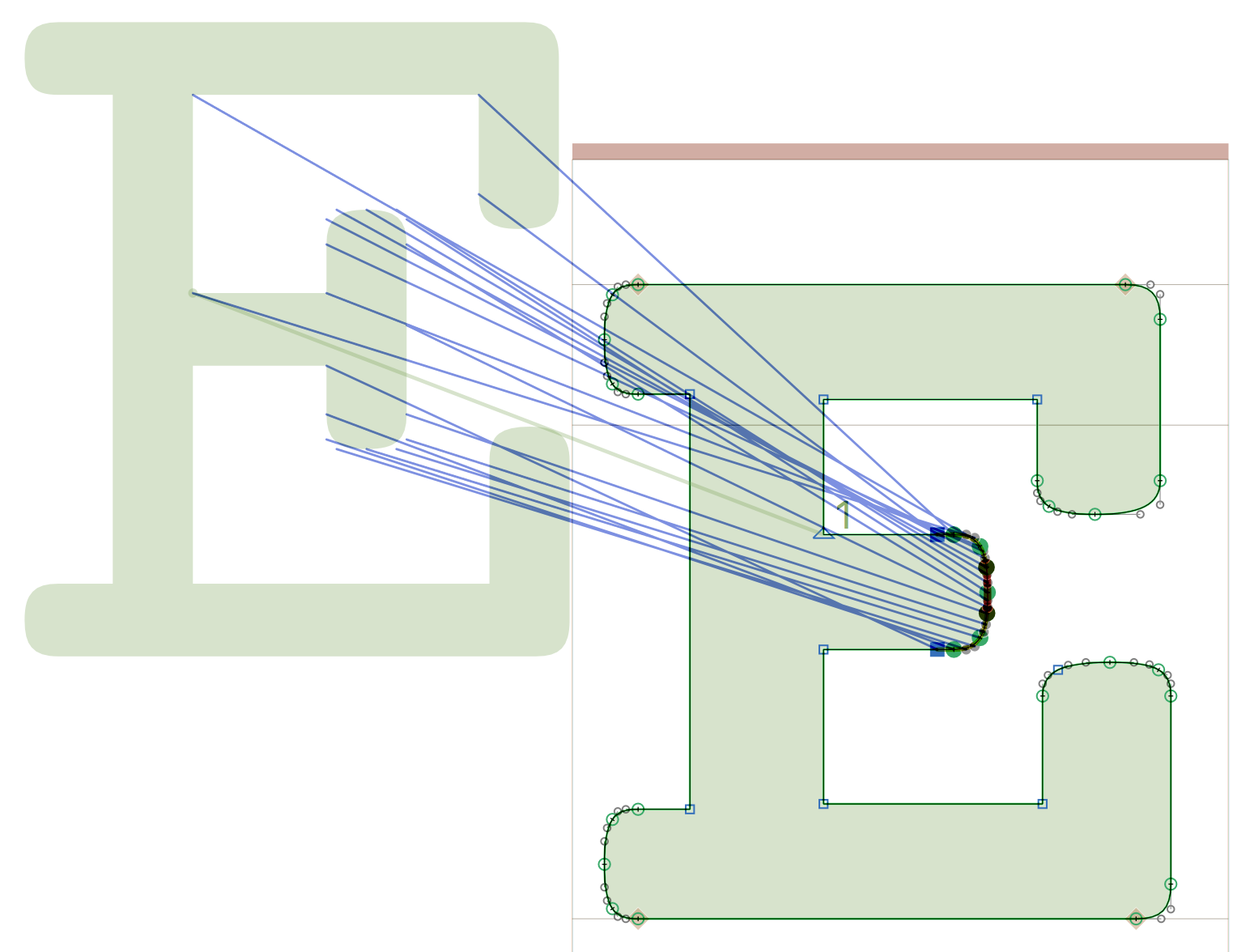
Thank you. In trying to make the masters compatible, I encountered a problem regarding the capital letters E and F because of the different shape of the middle stroke in Bold comparing to Regular. No matter how many nodes I add or remove in one master or another to match each other, I get the red lines. It was quite straightforward for all the other glyphs, but these two letters are problematic.
You will have to generate the instance (i think File > generate instances) in that case. Usually, that points to problems that can better be solved in the masters. IOW I would suggest to improve the interpolation by fixing the masters rather than the instances.
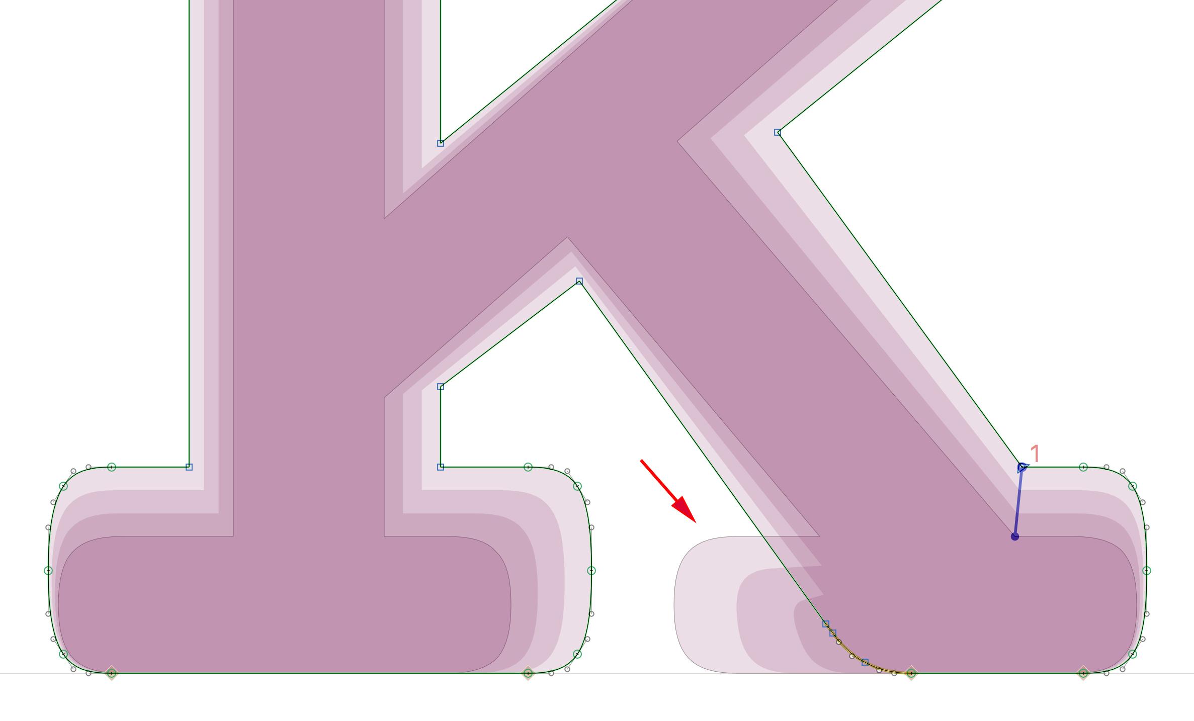
Sometimes the masters don’t have any problem, but the instances generated end up having a weird shape. This is the case with the letter K in the courier font I am working on (and I guess with probably many slab serif fonts). Modifying the masters helps solve the problem, but one must remember to throw away the masters when exporting the font.