Hello, I have a problem with my OTF file.
I’m working in Glyphs with 3 different masters, light, regular, and bold; in the exported instances I add also a book, medium and semibold cut.
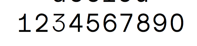
But when I try to use it, in the OTF file of the Book cut, the number “3” is thinner, is the same like in the Light version. All the other glyphs are correct. In the glyphs file is drawn correctly, do you know what can be the problem?
There is this problem only in the OTF file, in TTF there is no problem
Thanks in advance