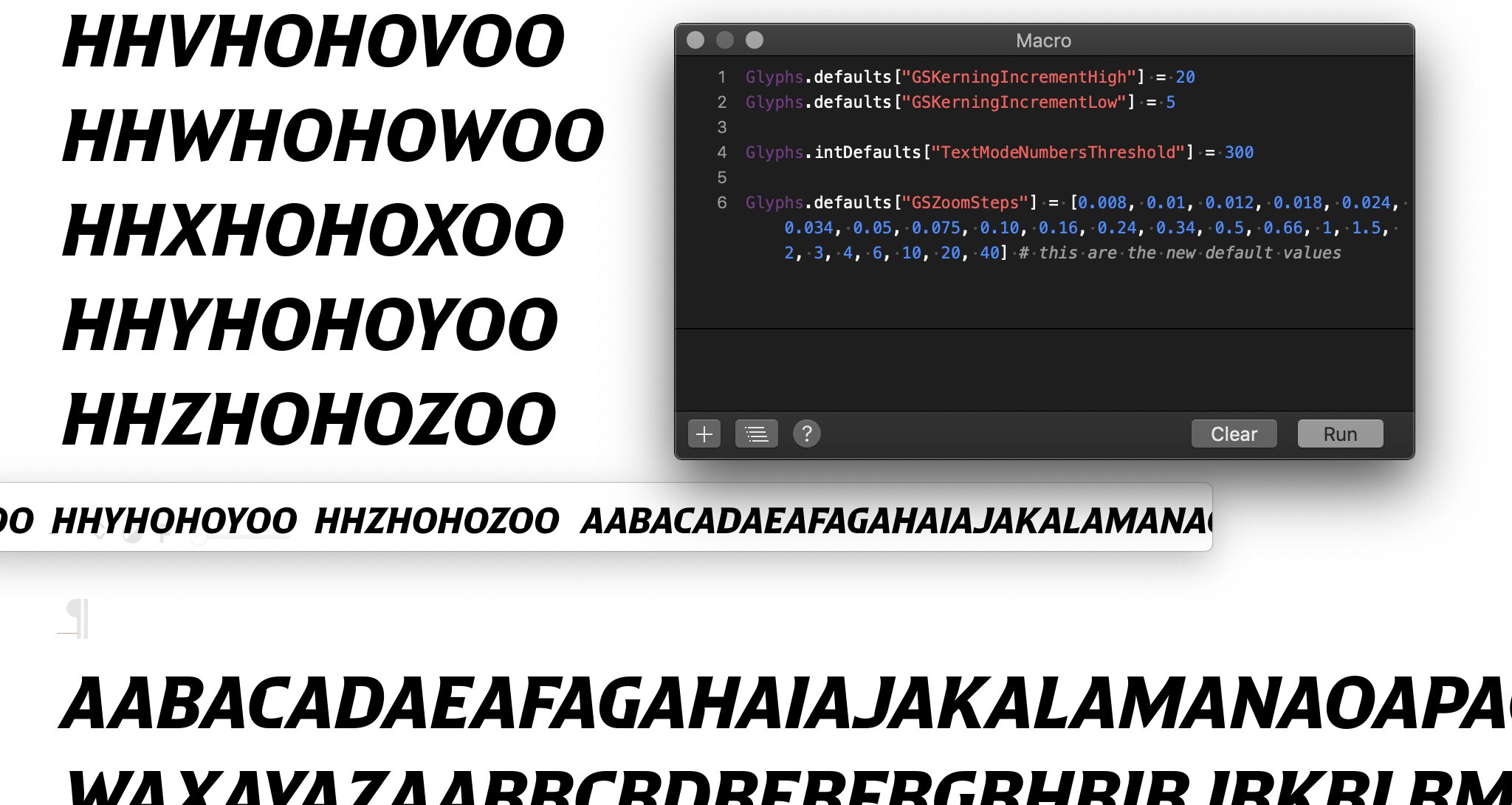
Is it possible to customize the standard zooming increments Glyphs uses?
Most of the standard changes in pt size feel very even, but the jump from 50pt to 25pt and then from 25pt to 12 pt seem larger than the rest. I often find myself typing in 30, 36, 20, or 18 pt to find a size in between the standard values (especially when spacing and kerning).
I couldn’t find anything about this in the handbook or preferences, is it possible through the macro panel? If not, perhaps some customization could be offered for user-defined pt size zooming increments?
Using the preview panel to see text at smaller sizes would be great, but it’s always constrained to one line of text making it difficult to review more than a few characters at a time — is there a way to zoom in/out the text show in preview panel or show more than one line at a time?
Also thanks for adding the zoom customization! It looks perfect but I may be trying to implement it incorrectly. I ran it through the Macro panel, restarted, but no changes took effect — does the bit of code you shared above need to go somewhere else? (Screenshot of both preview + macro panel below)
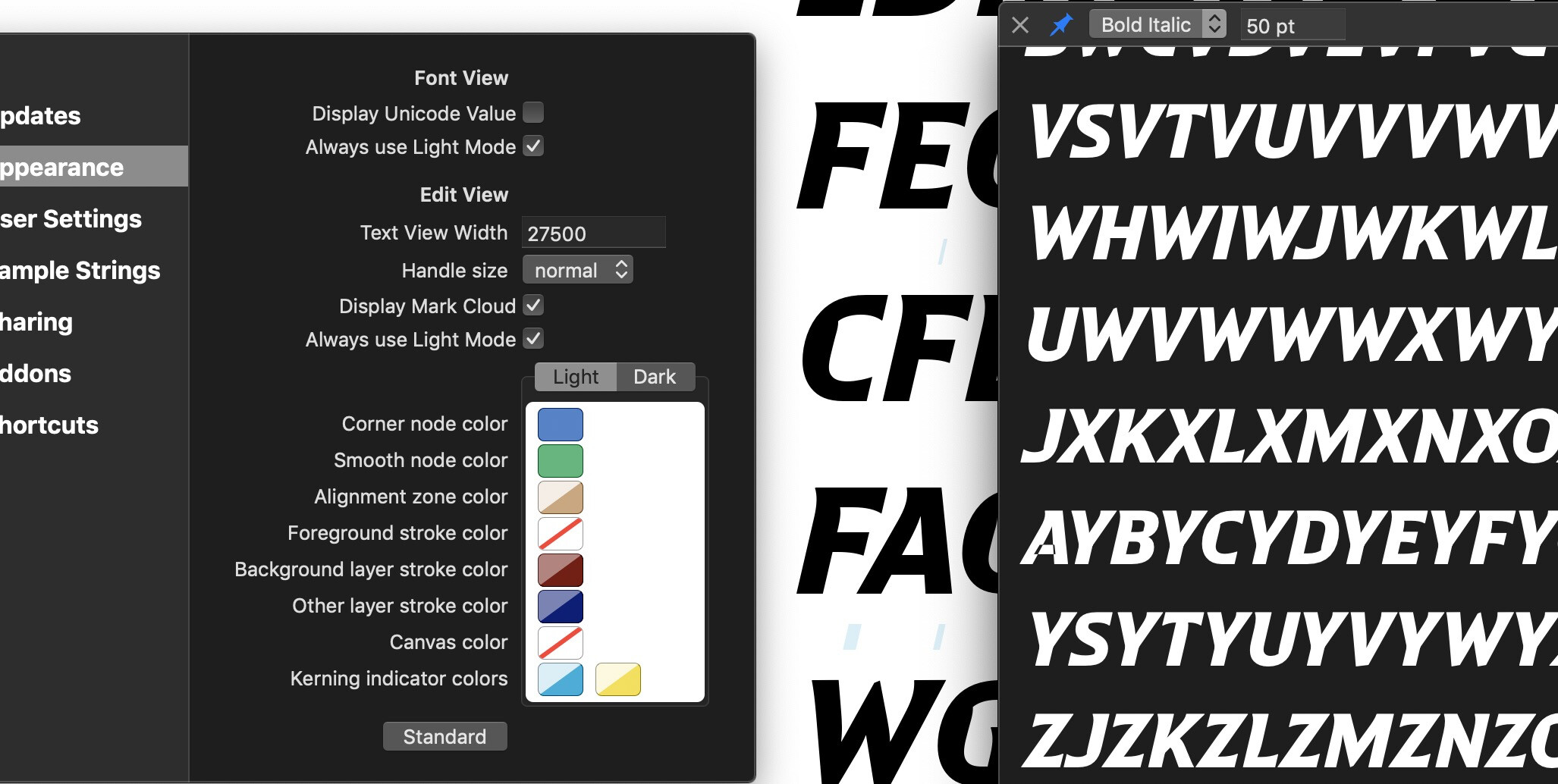
Got it! Right now the Text Preview window still defaults to the OS UI preferences (Dark mode in my case) even though I have “Always use Light mode” selected in Glyphs appearance - I’m not sure if it’s possible based on how the Text Preview window is written/coded, but it would be nice to have the Text Preview matching the rest of Glyphs UI
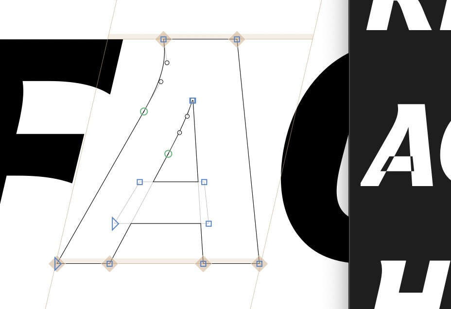
It also seems to be having some trouble with overlapping paths (See ‘A’ in screenshot below - looks fine in Glyphs editor but the paths appear to be in conflicting directions in Text Preview window)
Text Preview is separate from Font View and Edit View, it uses the OS text rendering and also the OS appearance. But I can see that an appearance toggle for Text Preview would also be useful.
Overlapping glyphs work for for me. Can you try to correct the paths in the A glyph: Path → Correct Path Direction.
What version of MacOS do you have?
The preview font for the TextPreview window doesn’t remove the overlap for performance reasons. In older versions of MacOS, those can show up.
Good catch @GeorgSeifert I’m on MacOS Mojave (10.14.6) because newer OS versions don’t work properly with a number of Adobe Illustrator plugins I use regularly. Path directions are all correct, so I 99.9% sure it’s just my outdated OS.
@FlorianPircher That’s kinda what I assumed, that the Text Preview was running off of OS appearance rather than Glyphs user preferences. Again, not sure how difficult it would be, but a light/dark toggle similar to the Preview Window would be great
I’ll work with what’s available at the moment.
Thanks again for your help and support!