Hello forum! I’m working on my first couple of typefaces, and the kerning process has made it very clear how much my astigmatism skews my sense of visual balance. I can, for example, assign sidebearing and kerning settings on symmetrical characters so that everything is identical, and they still look imbalanced. It makes me worry about what I’m not catching because it looks balanced to my warped eyeballs.
Does anyone have advice for working through this? Methods that seem to yield good results or at least highlight areas to reexamine?
If you don’t wear prescription lenses, you should do so. I had to start wearing them many years ago for the same problem and while it isn’t a perfect solution, it helps enormously.
Do professionally made fonts look good to you though? Optical illusions indeed affect everyone. Consider putting side by side your font and a similar well-designed one and compare. Also, reading texts in your font instead of staring at letters in the editor helps to spot mistakes.
*this is a suggestion from someone without astigmatism
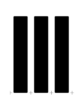
Yes absolutely, lots of practice will be necessary, but the fact that the identical left and right sidebearings and kerns here…
…look a little off to me is evidence to me that my perception is something to account for or at least be aware of while doing that work.
Thanks, alexs, those are great suggestions that I’ll incorporate (and I’m sure would helpful for people without astigmatism too). As @DunwichTypeFounders said, it will of course take lots of practice, so it may be that I just get closer and closer to getting it right, and to trusting my own perception along the way – suggestions like yours will be helpful for that process for sure.