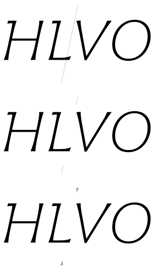
Is there a way to change the design of the Text Tool cursor? The default design is a single grey line form top to bottom at the left hand side of the glyph. It is subtle enough most of the time, but I find it a bit obtrusive when kerning, specially in light styles. Is there a script to change this? Wouldn’t it be nice to add this option in the preferences panel so that the user can choose between two or more designs? (the image explains it better I think…)

I see. Interesting idea.
As a workaround in the meantime, you can also kern the next pair. E.g., for this example:
- put your cursor one step to the left, i.e. between H and L
- hold down Opt and Cmd (not Ctrl!) and use your left/right arrow keys
I usually look at my kerning pairs in the preview panel for that exact reason that I find the UI In text view too distracting. But I’m ok with that, as I have my edit window with kerning strings at a rather small size that I only use for navigation, and the actual pair I’m kerning at a bigger size in the preview panel (plus a different size in the additional preview panel, sometimes in negative).
Yes. I use that shortcut all the time, specially when kerning symmetric glyphs (as in VOV OYO ATA…). Once I get the right value for the first pair (ctrl-opt), I make the second equal (opt-Cmd). I’d rather not changing this since after thousands of kerning pairs, my fingers are so used to those automatic gestures… ![]()
I use a similar strategy. A medium size in the edit window, a small one in the preview panel, and a big one in the extra preview panel in a second screen. The thing is that sometimes there is no second screen ![]()
I think it’s a good idea by Juan. But wouldn’t it be better if the cursor changed like this when you do different things – i e one cursor for kerning, one for metrics, one for writing? That way it would be clearer what mode is active. I like Juans three cursors.