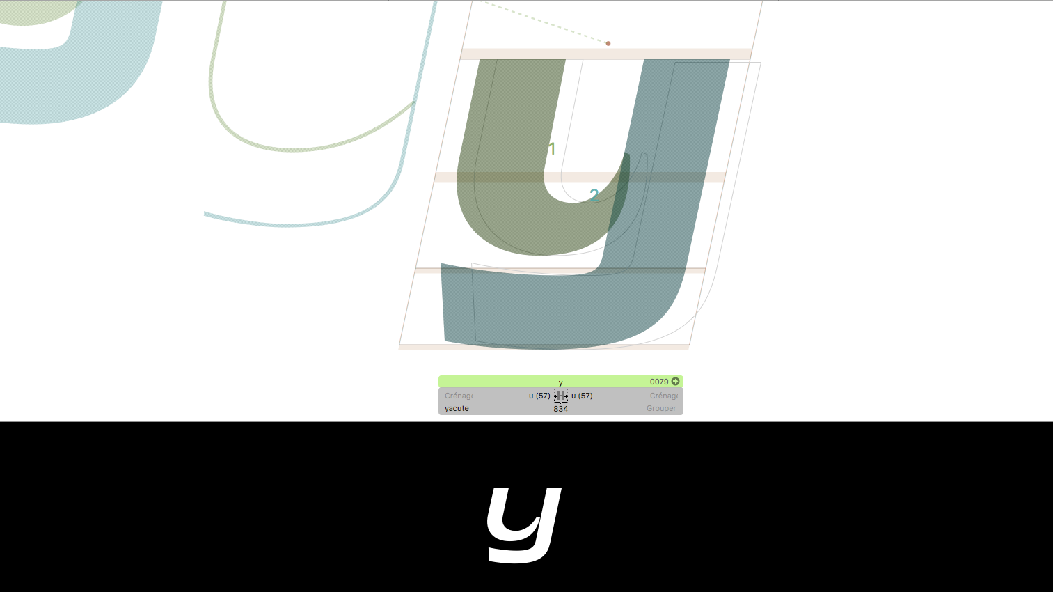
I try to find an issue to built ‘y’ from 2 components (_part.1 & _part.2) but still sidebar like ‘u’. I have anchors in each component.
My problem : I use auto alignment for both of components and Glyphs seam to calculate in wrong way. So in my interpolation the connection don’t works.
Somebody to help me to not become mad!
Thanks a lot
What kind of anchors are you using? Have you tried #exit and #entry? Read State of Component Alignment in the 2.3 release blogpost, or the respective chapter in the handbook.
You can use the Disguiser plug-in (via Window > Plugin Manager).
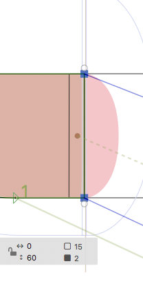
I’m having a similar case; with exit & entry anchors though !
A font with 2 masters
The Light one has an overlapping base of 60 where the entry anchor positioned on 30
The Bold Master has an overlapping base of 120 where the exit anchor is positioned on 60 .
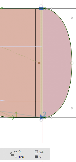
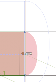
Following sample of screenshots
The interpolation result is shifted slightly
after Normal & Medium weights are generated ;
At the beginning I thought it was a matter of rendering on screen; but this has been verified, further to testing the fonts in Indesign, by converting to outlines where those little jumps can bee seen.
Wondering if it is related to “rounding to Grid” ?!!
I always would keep the exit/entry anchors at the same height in all masters to avoid rounding problems. I always keep them on the baseline but you can pick any height.
A quick answer: E&E anchors are maintained at the same height through all connecting glyphhs … this is 100% certified;
Better results were achieved by keeping connected segments with no decimal fractions or less of height positions;
so to avoid as Georg said “rounding increments”.
I’m afraid this issue has been raised here after plenty of explorations;
i would not be able to elaborate in details now; will share you my conclusions though; after testing on other conceptual fonts.
Two things. If the anchors actually be the same height in all glyphs, you don’t actually need them. Because then you can get everything to work with spacing.
You only need the entry/entry anchors of they are on different heights.
If you add them, then have them on the same (relative) height in all masters. Best at he upper or lower edge of your connections.