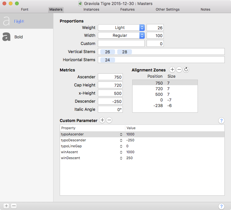
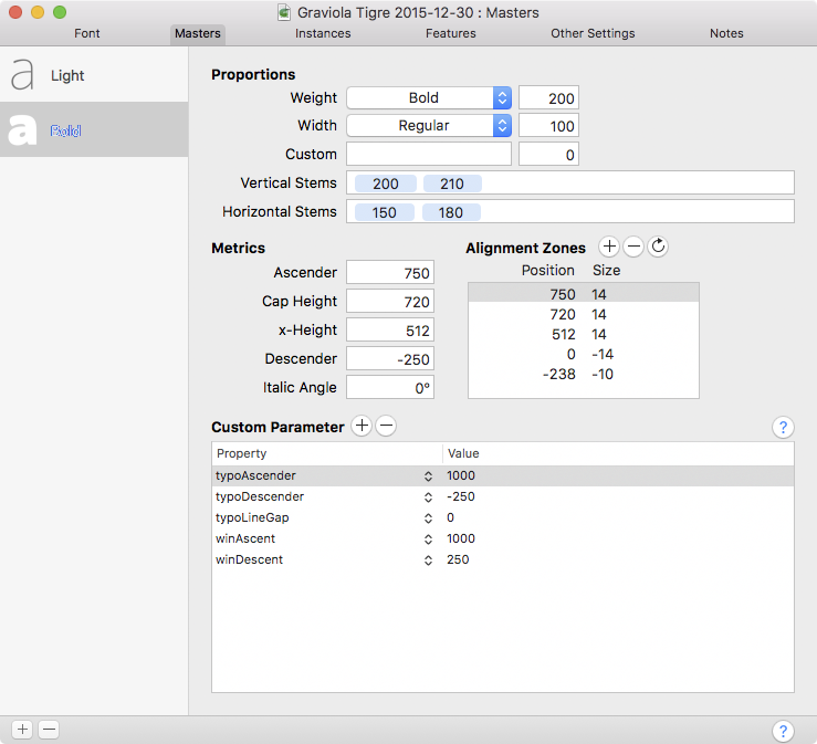
I’ve just found out that autohinting does not add ghost hints. I have set alignment zones and all nodes fall on the baseline or within the zone. However, vertical stems do not align, specially on bolder weights.
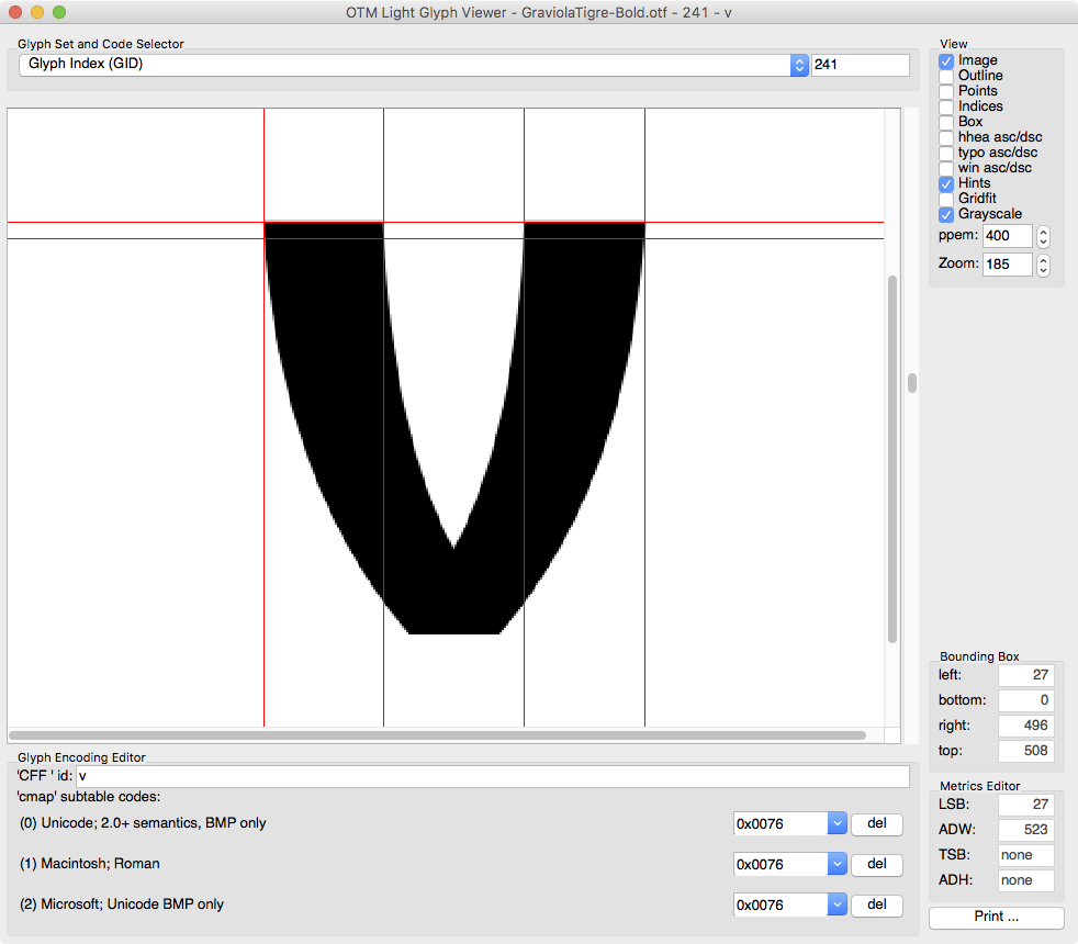
Note how the m and n differ on the sample above. The n is relying completely on autohint, while on the m I right-clicked and selected “Autohint”. This is the result:
You can get a good start by right-clicking anywhere in the canvas in Edit mode, and choosing Autohint from the context menu. This way, glyph-level hints will be inserted similar to the way the autohinter would have done it when the font is exported.
Considering this was what I did to the m, shouldn’t the result be the same?
Ok, I’ve tried regenerating all alignment zones on both masters, adding a missing horizontal stem on the Light master (old file…), and saving as a new file. All but a handful of glyphs have baseline hints now. The original file was ported to Glyphs from Fontlab back in 2014. Could this be the issue?
The glyphs that still don’t have baseline hints are A (even though Á, Â etc do) idotless and Eng. Some glyphs that are used as components have the hints but some don’t. Does Remove Overlap have something to do with this?
For reference, the alignment zones were auto generated back when I was working on Fontlab. If anyone else is facing the same problem, I deleted and regenerated the alignment zones on both masters and everything works fine now.
My bad… In the process of troubleshooting, I had multiple files open in Glyphs and OTMaster. I guess I got confused and mixed them all. I promise I’ll be more methodical next time.
Thanks for helping me with this and I’m sorry for any miscommunication.
Why that so?
There’s StdH/VW for that single main stem, then you can have up to 9 or 10 more stems for often occurring stems, especially helpful in bolder fonts, and not necessarily problematic in MM context. E.g. another stem for a bunch of rounded dots, or one for superior stuff.
In PS rendering, different stems that are too close together can cause unequal pixel jumps between PPMs. Example: you have two standard stems 50 and 60, and they are both rendered with one pixel at 12 PPM and two pixels at 20 PPM. You may run into a situation at sizes in between, in this example perhaps 16 PPM, where one stem is rendered with one pixel and the other already with two, which amounts to a probably undesired 100% difference. The effect is less visible with anti-aliasing.
I have found that in the very most cases, one value for each stem suffices, sometimes I add a second H stem for serifs. The question I ask myself when setting stems is: Is it OK that stems differentiated this way can render with a 50% or 100% difference in pixels? If yes, i will add a second stem, if no, I will not.
This strategy only makes sense in PS hinting. TT hinting is a completely different story, of course.
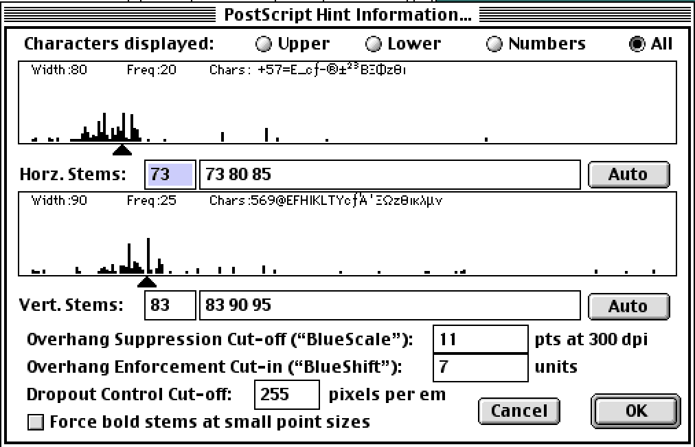
Hm, the problem you describe is exactly what stdH and stdV are for. Are you sure they’re written properly? Adobe fonts always had plenty stems. The interface does not reflect the mechanism, which is not good in my opinion. This piece of interface from 1990 is really nice.
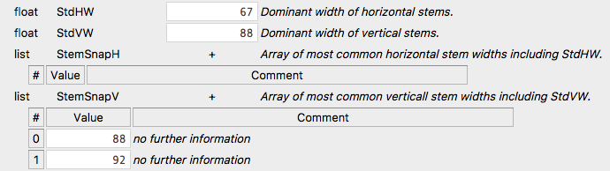
Different strategies are possible, of course. I am not so sure about Adobe fonts, though. Perhaps they changed their strategies over the years. Here is a look inside Myriad, which does not have any extra horizontal stem snap values, and only one extra vertical one:
I think if you only have the StdHW/StdVW setting, you can control the brightness of the font rendering by adding or subtracting from the value. So if your bold is not bold enough, you make the values a little smaller, and everything is rendered darker, at least in Adobe apps. Cannot do thorough testing now, but I used this trick for a client last year, and I seem to remember that this didn’t work (or at least not as well) as long as there were additional stem snap values set.
I would set all stem values higher if I wanted a font to look bolder than it is.
In Italic fonts you only need StdV, no further StemSnapV values, typically you copy the StdV from the roman, to get pixel jumps at the same sizes as the Roman. Which is a fattening lie, because StdV of an Italic is actually lower according to the T1Spex, where the Italic stems must be measured perpendicular to the stroke direction, iirc.
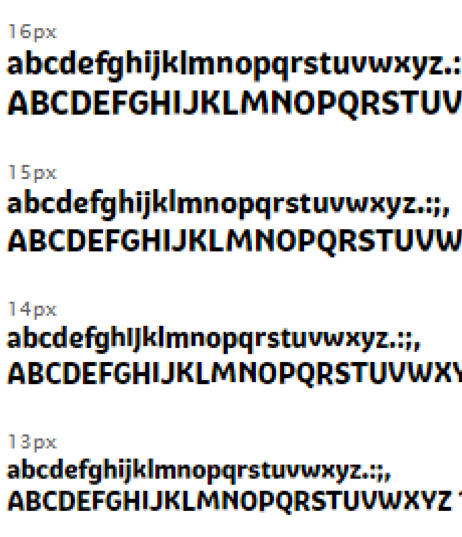

 Funny enough, that does not show in the screenshots you posted.