Chinese character’s background is not in the right place. It get higher than it should be. I think it might be the baseline’s problem, latin characters’ baseline just didn’t work with Chinese characters. And it also went wrong when you copy and paste Chinese characters from other font file.
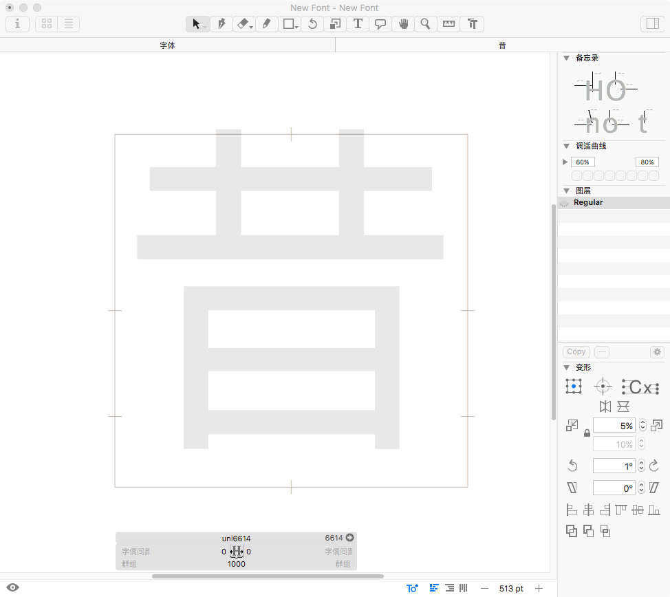
As you can see, the Chinese character “昔” should have in the middle of the box, but it’s higher, and part of the character is out of the box, it’s just not right.
That is not really a problem. The gray background is not meant as a design guide. It is just there to give you an idea what glyph you are in.
And the system font seem to have different vertical metrics.
Chinese needs at least 6763 characters to make a standard font, and many of those characters are unfamiliar to us, so the background is very important, and we do need it to show as a design guide, since the glyph name of Chinese characters are unicode not nice name, when the background disappear we’re not able to tell what this glyph is or how it should look like.
This problem happened when we try to set a font as background, yes we can change this file’s metrics setting to fix the vertical position problem. But different font has different metrics settings, here we need to set them to the same value, seems not too convenient.
Actually most Chinese typefaces are designed with 1000x1000 metrics(box), when we set background for Chinese typefaces, Maybe it’s better just make sure the box is aligned.
Or, we can just edit the typeface we want to use as background, move all glyphs lower, maybe it will work too. But as i said, it’s better if we can just align the box. Or, if we can move the background up and down, left and right, that will be great.
No, the position of the placeholder image does not matter, and btw it is also off for other scripts, including Latin. It is just a reference so you know which glyph you are just about to draw. It is not (and cannot be) a reference for where or how high you need to draw it, because naturally the system font will have differing metrics and a different design. What keeps you from drawing your glyph in the right position?
The second problem you mention, copying and pasting: different fonts can have different metrics, proportions and different origins of the coordinate system. It does not shift between fonts that have the same metric settings in File > Font Info > Masters. So what you can do if you need to do a lot of copying and pasting is to also copy the metrics, not just the outlines.
I’m not saying that i would draw my glyphs in the same position as the reference font (background), and there is no right position too. I just think that if it works as i wanted, it will save us lots of time. Maybe it’s a bad habit, i don’t know, and also our design sure ended different from the reference.
Because we have lots of characters that we don’t recognized, and we really don’t know how to write (draw) them, some of those characters we might never see them before, so we would want the background in the right place.
And i know how to make the metrics setting right now, thanks.
If you need a reference, UnicodeChecker is probably a better option. If you have it installed, you can click on the little arrow next to the Unicode value, and it will open in the app. There, you can watch the character in the (installed) typeface of your choice, not just the system fallback.