For my glyphs I have tried my best to use extreme points and bezier curves.
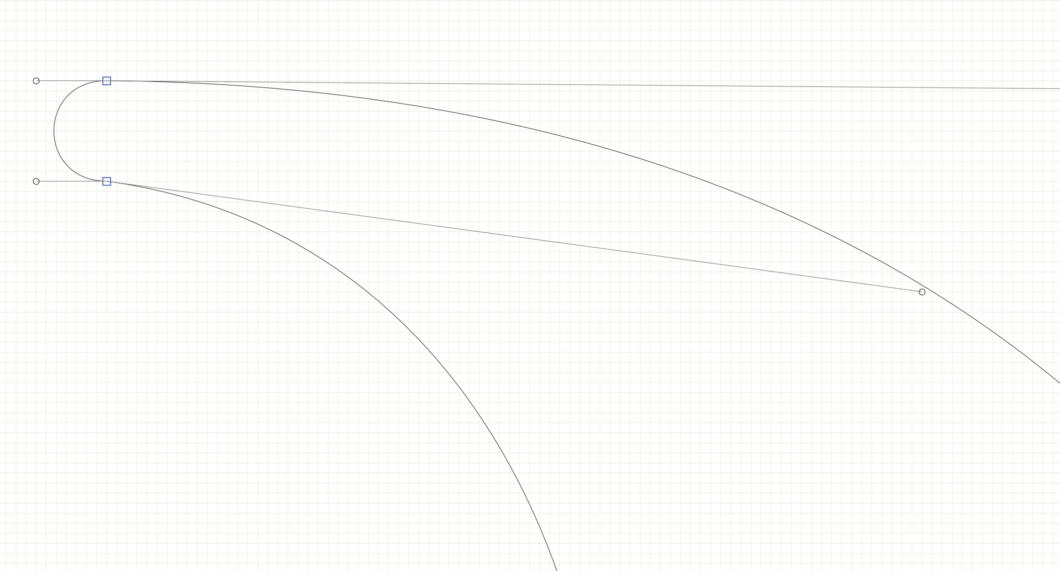
However some of the anchor points are not completely horizontal (see image)
Will this have a negative effect on the functionality of the typeface?
Also the lines in this glyph are curved, however it uses corner points. Should I convert the points to curved points or does this not matter?
The top connection is smooth (meaning the previous and next point are in line with the on-curve point in the middle). It should therefore also be defined as such: select the blue square and press the Return key, or double click the blue square, and it should convert into a green disk, indicating that it is a smooth connection now.
The lower connection is a corner (meaning the the previous and next point are not in line with the on-curve point in the middle).
Not sure if that really is intentional. At first sight, it does nt look like it for me, but tha is your decision of course.