The short conversation here highlights this well and, in my experience, I can only agree! But I think it’s also on the side of the programs/apps that our fonts run on.
I haven’t used Affinity and don’t often use many of the Mac system apps (eg. Keynote), but it sounds like each utilizes these OT features in different ways and with different naming conventions. And as I mentioned before, Adobe has different naming schemes and UI for activating small cap features within their own suite of programs. Not ideal, but it’s better than no small caps at all!
And Petite caps… I didn’t even know those existed!
They can be beautiful in some cases, but they also complicate the letter-case story: Now a small-caps checkbox (binary choice) does not suffice anymore; you need checkboxes (or radio buttons) for no-change, small-caps, and petite-caps.
Upper Case
Lower Case
no change
(none)
(none)
small-caps
c2sc
smcp
petite-caps
c2pc
pcap
With separate radio-button-groups for upper- and lower-case (as in Apple’s apps) you can access all six states and any mix of upper- and lower-case. But with one unified radio-button-group you would need radio buttons for all of these cases:
no change
lower-case small-caps
lower-case petite-caps
upper-case small-cap
upper-case petite-caps
upper-case small-caps & lower-case small-caps
upper-case small-caps & lower-case petite-caps
upper-case petite-caps & lower-case small-caps
upper-case petite-caps & lower-case petite-caps
That is just too much. (Not that all of those combinations are sensible for the majority of fonts, but the interface should still give me access to the full feature set of my fonts and leave the sensible-or-not decision to the designer/typographer.)
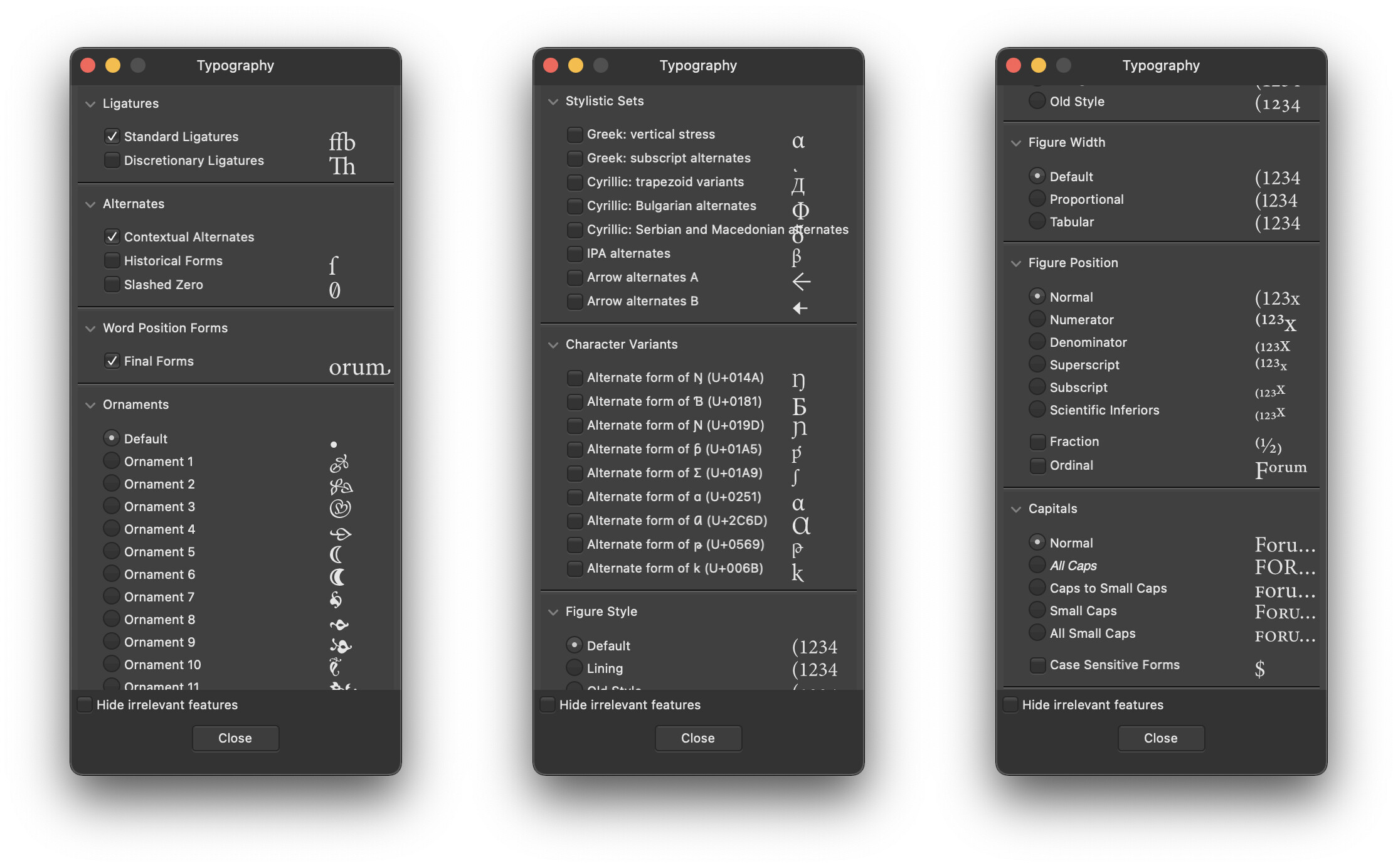
This needs to be addressed by the operating level’s frameworks. Apple’s typographic pallet (as shown in the screenshot above) is a step in the right direction, but it is difficult to discover and nor many apps make use of it.
If apps, instead, implement their own OpenType feature interface it will never come close to that a good font has to offer. Even the beloved FontGoggles – an app specifically designed for inspecting fonts – does not allow for feature selectors other than 0 or 1 (e.g. cvXX = 2 is not possible). The only GUIs I know that allow for selectors other than 0 or 1 are Apple’s apps and the Affinity suite.
If you don’t use a GUI for setting type, then the standardization is much better. Tools like CSS on the Web, fontspec for TeX or HarfBuzz-shape (hb-shape) allow to select features at an OpenType level. This level is the same across fonts and allows fine control over the full feature set of the font, no waiting for the layout-app vendor to add a button so that I can finally access some feature on the font I licensed.
Their OpenType interface is definitely the most intuitive I’ve seen thus far. It even gives you a preview for each feature:
For context, I’m coming from a design background, so the technical/engineering/development related parts of the type design & production process are still the newest to me. It’s a bit frustrating because I see more and more how much effort goes into the creation of a fully featured typeface, (a font with small caps, petite caps, OT features etc.) but the end user (a “traditional” graphic designer in many cases) may have no clue these features exist or how to access them…
It’s challenging because a standardized implementation of OT features across all apps would benefit everyone, but with so many different groups involved and with varying levels of investment, who’s to make that decision and “enforce” it in practice? I’m rambling now and raising more questions than answers - an interesting discussion nonetheless!
And that’s quite impressive from Affinity! I must be underrating the app just because it’s unfamilar to me!