Changes to auto alignment

I saw some complains about the changes to the automatic alignment I did in the last few weeks. I hoped to hear about that here in the forum or by email.

To get it right and understand what you expect (from your old and new files) I would be really helpful to get some samples of component setups that your had problems with or would like to behave differently.

Georg, I work on a geometrical sans serif. Many glyphs are build manually from components (that’s why I have been asking you to enable snapping of components to components). When I open the file in Glyphs now, the components are aligned, but not the right way.

This behaviour can be useful for ligatures but I would prefer an option to use either aligning or nonaligning components. I wish to see a flag/icon for aligned/nonaligned glyphs. And I would add command align/unalign to contextual menu in Font window so it could be applied globally to more glyphs.

What about different glyph name prefix/suffix for nonaligning components?

For this geometric parts you could use anchors. Probably a combination of attach/_attach and exit/entry anchors. Or kern the parts.

Have you tried prefixing them with an underscore?

The underscore has nothing to do with the implementation in the latest version (866). It will try to align much more glyphs. I’ll fine tune that if it is too disturbing.

One thing to watch out for when migrating to Glyphs 2.3b (866):

  • when a glyph was made up of just a single component but moved from it’s original position in a prior version of Glyphs, e.g., 2.2.2 (827).

If that component glyph was one that wasn’t automatically set for alignment and now is in Glyphs 2.3b (866) (and you hadn’t disable alignment), the component will shift to its original position, removing the transform.

e.g., b.dnom made up of b.sub shifted down. In Glyphs 2.2.2 (827), one could move the b.sub component around without touching the alignment setting. In Glyphs 2.3b (866), one needs to disable alignment first.

@GeorgSeifert: Perhaps it might make sense to set alignment = -1 for components that already have a transform in a .glyphs file?

I deleted 2.3 and went back to 2.2 because I open my Kannada font and find broken alignments in glyphs that are components in two or three more. I’ll let other people test this stuff; I just don’t have time for any more awful 2.3 betas.

So if I understand the changes I will now have to:
– modify .glyphs file in a text editor to disable auto aligning
– manually search for glyphs made from non aligned components and use mekkablue’s script Disable Alignment for Selected Glyphs (the contextual menu does not display the command to disable)
– turn on aligniment again and hope that I did not skip anything

I think this is pretty crazy and hope you will soon implement composerjk’s idea to disable auto aligning for existing glyphs that have some transformations of their components.

I’m working on a the alignment right now to keep it more compatible with old files. I should have something tomorrow.

1 Like

Any word on this? The change has caused tremendous problems with font data being shared and worked on by different designers and producers. And it appears some people didn’t notice this in the change log, and only discovered later that their components had been messed up.

I’v uploaded a new version that should fix the auto align troubles.

I’m still seeing auto alignment problems.
See image. that was a apostrophe.

You mean napostrophe? What did you use as the apostrophe?

And slightly off topic (sorry): why do you create napostrophe in the first place? It has not ever been, and will never be used in an OT font.

Definitely getting closer. Here’s one example (of trying to catch components that have been shifted while auto-alignment was still set) that failed:

/centreline built out of /c.sc and /l.sc components.
/l.sc component had auto-alignment disabled and was shifted.
/c.sc component did not disable auto-alignment but was also moved in 2.2.2 (827).

When loaded in 2.3b (868), the /c.sc component got put at its original location with auto-alignment enabled, ignoring the transform that was in the .glyphs file.

Had the same issue with a PUA glyph that used /l.sups shifted (but happened to have not disabled auto-alignment). In 2.3b (868), the /l.sups component got put at its original location ignoring the transform was that in the .glyphs file.

Can you send me the (old) file?

It’s simply required in some character sets. No questions accepted.

Fair enough. Though since it’s man-made, it can also be fixed again. Time (and worth the effort) to agree on new default character sets in the post 8-bit era. If the occasion arises and you need arguing support, send them to me. :wink:

Since the napostrophe has been mentioned by others as well and Unicode shows it as deprecated, I decided to do a little research today and find its history since I’ve been including it, even though it can easily be typed in using two keystrokes. Here’s what I found.

It appears to be used only in Afrikaans.

History in Unicode:
Unicode 1 (1991)
Included in v1 but no notes
Unicode 2 (1996)
• this is not actually a single letter
Unicode 5 (2006)
• legacy compatibility character for ISO/IEC 6937
Unicode 5.2 (2009)
• this letter is deprecated and its use is strongly discouraged
• legacy compatibility character for ISO/IEC 6937

From Wikipedia: https://en.wikipedia.org/wiki/Afrikaans

Initial apostrophes
A few short words in Afrikaans take initial apostrophes. In modern Afrikaans, these words are always written in lower case (except if the entire line is uppercase), and if they occur at the beginning of a sentence, the next word is capitalised. Three examples of such apostrophed words are 'k, 't, 'n. The last (the indefinite article) is the only apostrophed word that is common in modern written Afrikaans, since the other examples are shortened versions of other words (ek and het respectively) and are rarely found outside of a poetic context.[89]

[short example of use table omitted here]

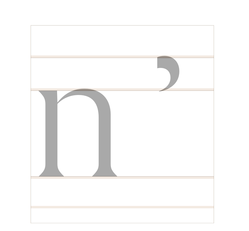
The apostrophe and the following letter are regarded as two separate characters, and are never written using a single glyph, although a single character variant of the indefinite article appears in Unicode, ʼn.

[89] == www.101languages.net
’n
The Afrikaans Indefinite Article, a very unique letter. Pronounced the same way as the English ‘a’ as in ‘a dog’ or ‘a song’. 'n Is never written in upper case if used at the start of a sentence, instead the word that follows will receive an upper case letter.

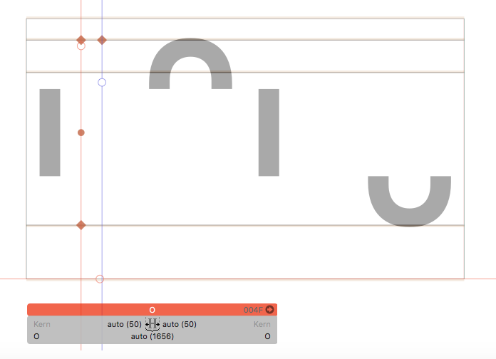
So the bottom line is that it’s still in use but is deprecated as a single glyph. A font can still have it if a desire is there for legacy compatibility. Since it’s a very easy construction, I see no reason to not include it, at least for the next few years – or even always.

I fought time and time again in my (admittedly short) career to exclude all these legacy glyphs, but some people simply will not accept legacy incompatibility, no matter the glyphs in question are actually used or not. So I got tired of arguing. Regarding my napostrophe which is made by quoteright + n (specifically in that order), automatic alignment does not happen, as it always hasn’t (and I think I don’t want auto alignment here).

Totally unrelated to component alignment but digressing further towards legacy issue: in some of Monotype’s typefaces you may find Roman numeral VII on its own but no other Roman numeral, which has a fascinating and ridiculous story behind. Again, I argued against inclusion considering how senseless it is, but it was not considered an option. Like this comment if you want to know the full story.

[edit] By popular demand, here’s the story: Roman numeral VII exist in Microsoft-related character set because of typo in Azerbaijani keyboard (henceforth Azeri). In Windows Azeri Cyrillic keyboard, there’s Numero symbol in Shift-3, and in Latin one, Shift-3 is Roman numeral VII with no other Roman numeral. The unicode values are u+2116 and u+2166 respectively, which led me to believe Numero was the intended symbol in both layouts and Microsoft made a typo in Latin (otherwise you have to claim that Azeri Latin has legitimate use case of Roman numeral VII alone and it totally justifies the inconsistency with the Cyrillic layout). I cannot express enough how happy and sad I was to discover the fact! Anyway, this is why some of Monotype’s fonts include Roman numeral VII, because we are following the standard set by Microsoft. I hear the Azeri keyboard issue is fixed in the software keyboard (like in Surface), but I think it’s unlikely that they change the hardware key layout. If your font does not support that character, it technically does not support Azeri Latin in Windows.

3 Likes