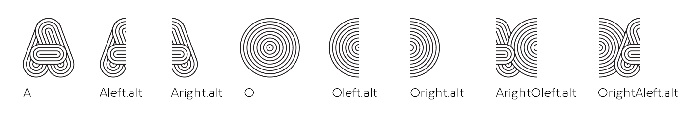
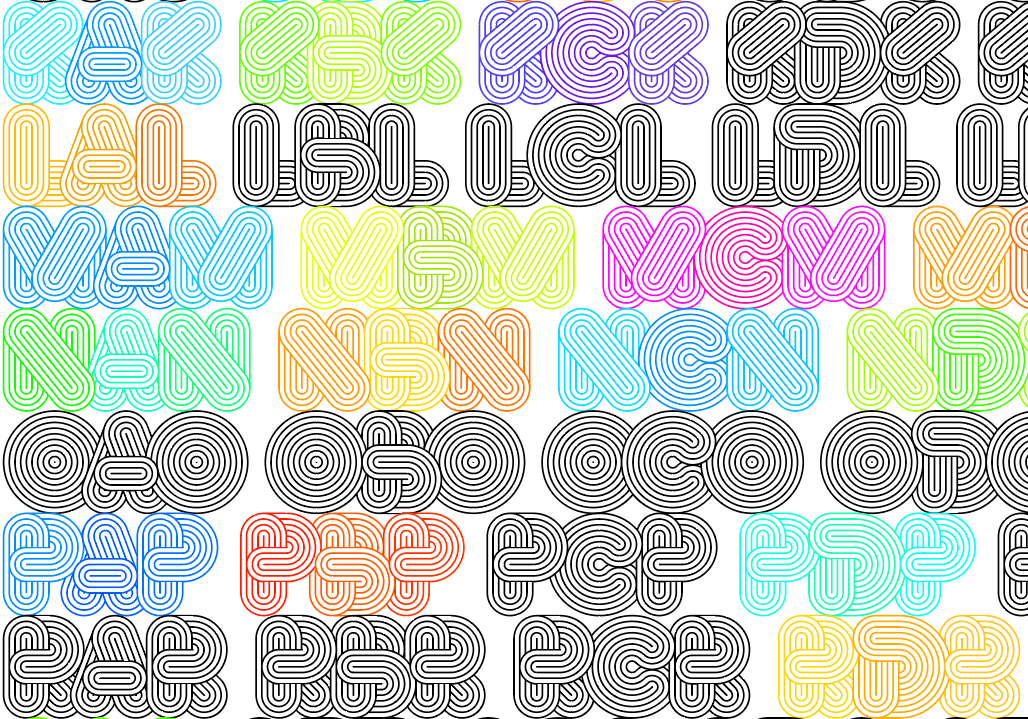
Hi, I hope this can still help, I searched the post that you mentioned in Typedrawers, I actually have made a completely contextual typeface before, the only downside of it is that the character count is very high, I though of a similar solution as yours first but soon realized that the user had to know how to open or close a word with an extra character, but then I though of a different approach by having individual puzzle like pieces that can be reused with letterforms of similar characteristics (B D E F H I K L M N P R for the left side in your uppercase characters for example, or C G O Q for rounded letters for left and D O for the right, and so on; H I M N, J U, V and W and letters that share some characteristics that you should understand better).
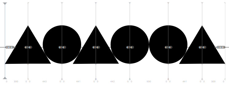
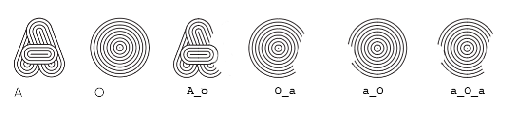
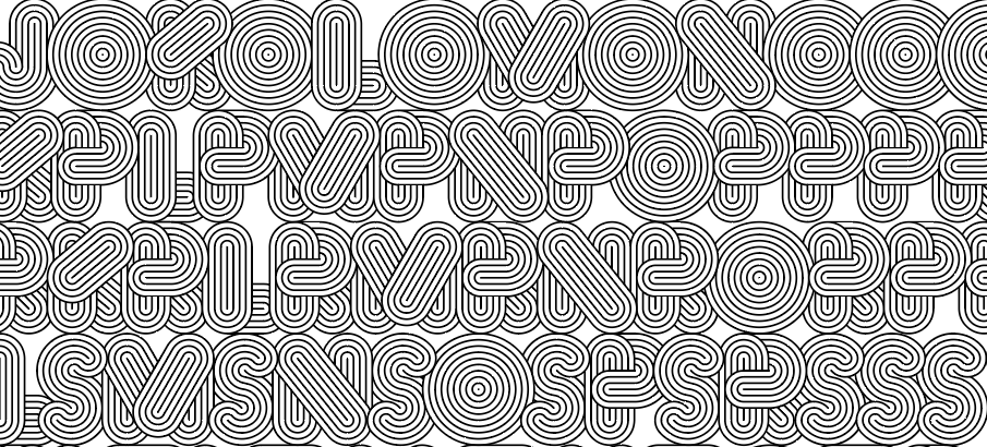
I took the time to simulate and example with your image, you have your default letterforms, for isolated use (or sometimes for use as it is in context, like B G Y in your uppercase alphabet image), then you have your initial and your final contextual forms (although no init or fina feature is needed), you make all the possible forms for all letters that would be used next to any other letter, for example A_o would be an A that will fit the next O (or C G Q also); and you need the complementary a_O to fit that character (in a two letter word AO that would be enough, in your proposed system you would need 3 glyphs to do that.
Then, you’ll need all the intermediate forms like a_O_a in the example, wich would be an O between two A’s, the first a contextual one and the second a default one (AOA, or A_o - a_O_a - A), the names could be changed so you know what other letters fit that glyph, then you group letters and your CALT feature should have first the medial letters replacements in the form of:
sub [A C E F G N O S] A’ V by ACEFGNOS_A_V; for example, but with the @ symbols for the clases, is just that the forum thinks I’m mentioning users and I can’t mention more than 2 users, except for the ones that are being contextualized
then the initial substitutions, for example:
sub A’ M by A_M_;
And then the final subtitutions (their order can also be mixed with the initial), for example:
sub X A’ by _X_A;
I did it with 3102 glyphs, it is not 26^2 + 26^3 + 26^2 (18,928) but actually a lot less than that, I recommend that you give this option some though, but I strongly advice that you explore color and layering alternatives, and you try to achieve a dynamic look, and only a black and white letterform or a duplicated filled layer would give the desired results between two lines of text; but with the method I’m describing you can’t have that effect across two lines of text, you’ll have contours with no background, but if you change the tracking it would break the effect, I think neither solution is elegant but one doesn’t depend on the exact «ligature» half of each pair, I know this is probably not so encouraging but at the end of the day, it is a possible and probed solution, although not very effective as it is a lot more work, but again, just consider that it is another option. Great work by the way.
Greetings,
Iván Moreno