I’m creating a somewhat experimental typeface based on LED screen fonts, where I’m starting with a common set of components and varying them for different weights and styles. Some imitate the look of LED screens, while others are a little more imaginative.
My problem: I’m using a two or three-pole system in the interpolation of different styles, and in some, the components that make up letters change size at a slightly different rate. This causes unintentional jagged spots in the resulting outlines. Is there any way to prevent or fix this?
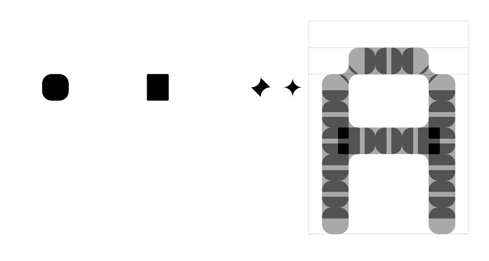
The basic way I’ve set up this typeface with components, showing how each letter is made up of four basic components (dot, dot connector, diagonal blur, and corner blur):
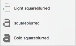
Pole weights in masters, for one style of the typeface:
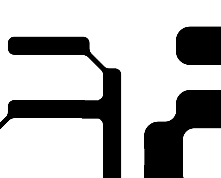
Example of the issue I’m having. Some of the weights generated from interpolated components get jagged spots where things don’t line up, because they seem to have interpolated at slightly different “speeds”:
I’ve experienced this to a slightly lesser degree in a more “serious” typeface I am also working on, when using a component for the terminal of a G and C. However, it’s much more pronounced in this display type project, due to the amount I’m using components. Any tips on how to fix this would be greatly appreciated!
Thanks so much. ![]()