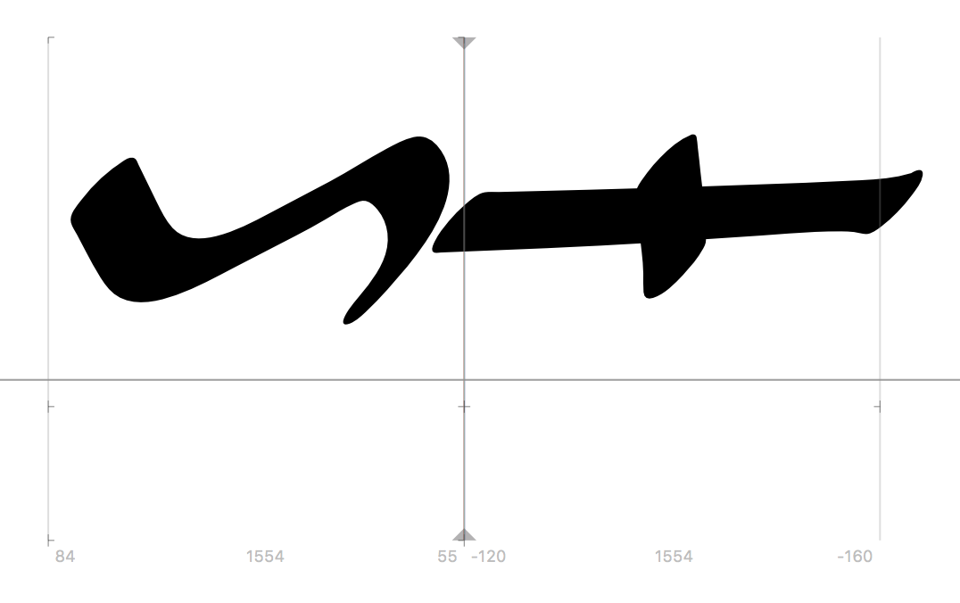
I’m working on digitally recreating the cursive script of ancient Egyptian hieroglyphs… “Typographically”, they were always going for a balanced line, so two successive low, wide symbols would be written one above the other as opposed to next to each other. For example, the following two symbols, if they appeared next to each other, would be written over each other:
So, in short, I’m looking for a way to contextually affect the vertical positioning of symbols. I’m having no problem contextually affecting the kerning to get the two symbols aligned over each other, but I’m not having any success with vertical positioning. I’ve tried anchors, but as far as I can tell from the tutorials, they are only programmed to work with accents and diacritics, and not with just any glyphs.
Anchors would be the perfect solution, though, as I could position symbols anywhere, regardless of their relative widths which will vary greatly from symbol to symbol. Is there any way to do this?
I’m trying to avoid creating component glyphs for both top and bottom positioning, because as I’m already dealing with thousands of symbols, having two more variants of each would start to make for an unmanageable file size (this will primarily be used as a webfont in an online editor).
The potential combinations are theoretically endless, as the symbols in this context are no different than a modern alphabet. I’m already using ligatures for the most common combinations (ligatures the Egyptians themselves used when writing, interestingly enough).
The easiest solution would be creating alternate glyphs for the top position and for the bottom position (using the originals as components) and then positioning those with custom kerning. But since I have five alternates for each glyph, that’s going to make for a much larger file than I’d hoped. On the plus side, this would give me much more control over each individual glyph if any exceptions present themselves.
So you agree, that the best bet would be creating alternate glyphs for the top and bottom positions?