Creating an icon webfont

Hello, I’ve been really enjoying playing with Glyphs trial version.
the tools are really nice, and the grid to which points snap is excellent! Also love being able to type-preview.

I have initially learned about glyphs from the github article about octicons.

I have since, also found this:
http://glyphsapp.com/forums/index.php?action=vthread&forum=1&topic=465

and so I have been creating my icon set & oiccasionally converting it to a web-font format & testing on webkit & mozilla.
I was aiming for this to look good 16px & up, and was pretty satisfied with the results.

I then had a look in ie, and well, was pretty shocked.
As a web designer / developer I am very aware of the rendering differences in typography between mac & pc platforms.

I then had a look at font awesome and how that renders on a pc, and whilst it wasn’t anywhere as good as mac, it was acceptable.


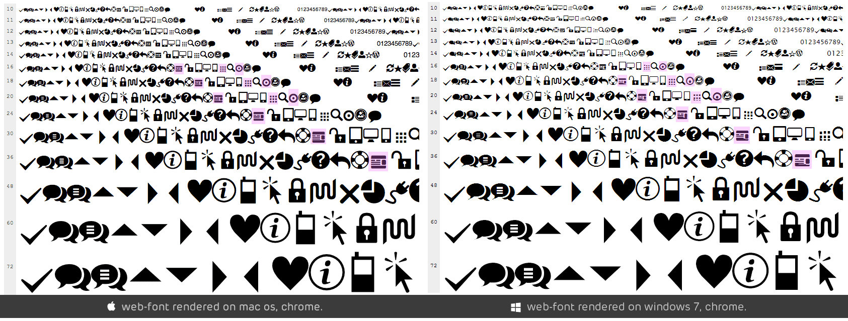
*edit: i realise that a full-size image would be better for comparison, here’s a link: http://i.imgur.com/XTiIb.png

here’s a screenshot comparison of the icons i’ve been working on.

I have also highlighted the particularly bad ones.

At first, i thought that importing curves from illustrator might have a lot to do with this, so I’ve tried creating the ‘Target’ shape using shapes provided to me by Glyphs which made no difference at all.

I am really hoping that this is due to my inexperience with both glyphs software, and font creation in general.

I was hoping someone could suggest some ways in which I can improve this. Alternatively, if anyone has used glyphs to create an icon webfont before, I would really appreciate if I could take a look at your .glyphs file for it
(obviously without your icons)

thank you,

victor

How do you generate the web fonts can you try to do them without autohinting?

i use http://www.fontsquirrel.com/fontface/generator
to create the webfonts.
I gave it a go without auto-hinting, bu the result was more or less the same, which leads me to believe I might have gotten something wrong during the grid set-up…
unless there’s a better way to generate the webfont formats.

some of the problems seem to be bad outlines.

And the grid alignment for 16 px does not work well.

do you think some manual hinting would help here?
I’m not sure how that is achieved but I understand how hinting works. Can hinting be done manually in Glyphs and is there anywhere I can read more about it? Also, I’ll try a different grid to see what kind of results i get, currently focusing on the ‘target’ & ‘theme’ icons, to get them working well.
Thanks for your help.

No sense in hinting if you don’t get your vectors in order before. Importing curves from Illustrator: AI often gives you bad curves, I’m afraid (missing handles, bad path direction etc.).

But hinting works via the context menu: select two nodes, right-click, add v/h hint. (There will be an extensive chapter on hinting in the upcoming version of the manual, to be released around Xmas.)

mekkablue
thank you, I definitely look forward to that manual update!

in terms of curves, I’ve mentioned that I thought this may be the case and thus re-drew the problematic shapes using glyphs tools but the result was the same.

I’ll let you know if a different pixel grid will improve things.

The Manual hinting will not help here. MacOSX ignores it and for windows you need TrueType fonts. They use a completely different approach to hinting that is not supported in Glyphs.

For icon fonts, you need no hints. Some TrueType instructions could help but this is very complicated and not always leads to better results.

The most important thing for you now is to fix your paths.

Georg Seifert

not sure i understand what you mean.
the problematic shapes have been re-drawn using glyphs tools.

i’m using 1024 units per em, with a 64x64 grid.

the points are all directly on grid increments.
is there something else i’m missing?

This one is ok. But can you have a look at the one with the two black bars?

And add -webkit-font-smoothing:antialiased; to the CSS. This should improve the rendering in Safari and Chrome.

And can you send me the .glyphs file and the resulting web font?

I’m also attempting to create an icon webfont in Glyphs with not much luck. I have the paths aligned on the grid, however, the icon is blurry, at small sizes like 16pts.

Any recommendations?

What are you grid settings and units per em?

Grid spacing is set at 100 with subdivsion set at 10. UPM is 1000.

Then this font would work on at 10 px but not on 16 px. Have a look at the forum thread linked in the first post. In the 6. entry I explain how to calculate grid and UPM values.

Or this blogpost:
http://glyphsapp.com/blog/pixel-perfection

Thanks for the references. The blog post helped to clarify how a pixel is rendered on the screen.

Taking into consideration that all browsers render icons and fonts differently, what would be the recommended UPM & PPM for icon webfonts?

You chose the size you like to use the icons most.

I decided to use a UPM of 2048, and was able to successfully produce an icon font that is pixel perfect at 16pt, 32pt, 64pt, etc.

My only issue is that the stroke is too thick. I was wondering how I am able to make a thinner stroke, while still maintaining the pixel perfection sharpness at 16pt intervals? Do I have to adjust the UPM and/or grid size?

Here are screenshots of my settings:

Screenshot of Glyph:
http://d.pr/i/NqNe

Screenshot of Metrics settings:
http://d.pr/i/yTar

Screenshot of Grid settings:
http://d.pr/i/DGrr

can you post a screenshot how it looks in 16 px in a browser?