When I define my vertical and horizontal stem widths in font info, should I make an average of the lowercase and uppercase? or should I define stem widths for lower and uppercase separately?
That depends on the design. If stems are rather close, use an average.
It’s a monoline typeface. The uppercase stems are approx 10 units wider than the lowercase. Just hesitated because I got from the handbook that it’s better to define the stems based on the most used characters, that being the lowercase.
If you employ different values, you risk the stems being rendered with a difference at low resolution, e.g., 5 instead of 4 pixels. You need to decide if that is OK for your font.
Alright, that’s kinda what I got from the handbook, but wasn’t completely sure. Glad to have confirmation. Also, thanks a lot to you and Georg for being so helpful and proactive in this forum!
Sorry for reviving this topic, but I have a similar question.
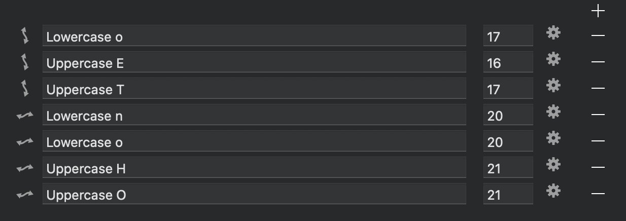
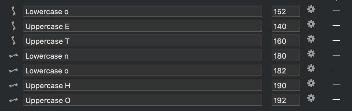
I am attaching screenshots of both Masters (Hairline = 20, Black = 180). Should I define as many stems as possible to aid in interpolation even if they are very similar (190 in H, 192 in O and actually identical in Hairline) or simplify it to only 4-5 as it doesn‘t yield any benefits?
Thanks.
I would not do that. Better use one and the same stem definition for similar stems. Think like this: two similar stems with the same stem def, will be rounded to the same pixel width. If they have different stem defs, they may be rounded to different pixel widths. Mayyyyyybe differentiate between UC and LC, but in the example above, they are very similar.
Can you recommend a good stem width process and theory?
I would take a good average for those that should render similarly at low resolution. More advice about TT hinting in the Manual TT hinting tutorial.
1 Like
Thank you for the comprehensive answer.
I’ve noticed Path > Transformations > Cursify also need those stems defined to work and I suspect RMX Tools as well? Taking those into account, does that change anything?
I specifically want the Cursify filter to produce the best results it possibly can before proceeding to revise the paths manually.
The Cursivy filter uses the stems, indeed. So you can tweak the result by temporarily changing the stems.
Is it better to set the vertical stem at an average between the smaller and the bigger values, or choose one of them?
For example, if all my vertical straight stems are 200 and all my round stems are 220, should I set 200, 220 or 210?
Your straight stems should be your reference. Round stems can vary depending on curvature.
Set your “base” stem to 200 in your example. However, as is also already discussed in this thread, you should add multiple stems if your design calls for it. Less stems is better, but you always need to check the actual rendering in order to decide.
The point of doing hinting is to draw similar stems with the same number of pixels. So adding two stems will make them different. I usually add one stem for Uppercase and one for Lowercase (per direction). And usually I put it somewhere between the straight and round thickness. It might influence the overall wight of the font.