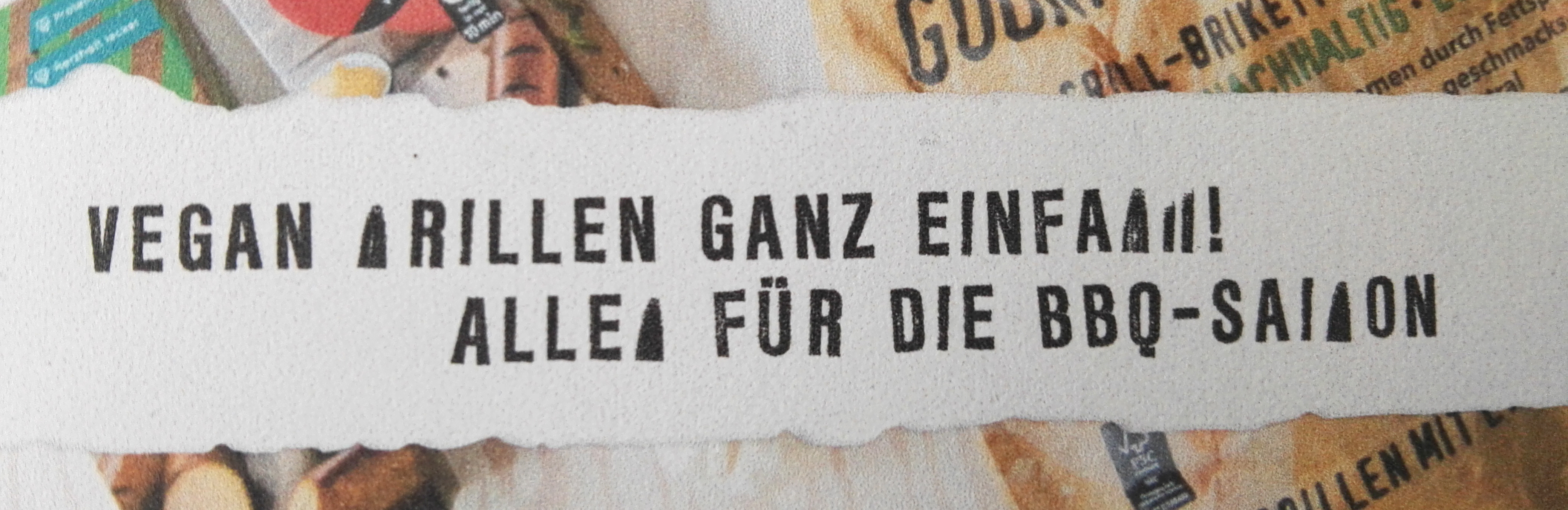
my client noticed a bug when printing things set in the font I made. It’s a highly complex font with a huge number of paths, as it has a vectorized grunge effect (stamp look). The problem seems to occur mostly when printing from a PDF X3 file.
It often works completely fine (it has already worked with offset printing with embedded font in the PDF), even on common laser printers, but it just as often doesn’t work. It also seems to occur with any character, not just specific ones. The picture shows what happens when the bug occurs. Characters also mostly seem to “morph” into this specific triangular shape.
Should I reduce the complexity of the font? Could the problem be solved through a certain way of PDF writing of print files?
I also added a zipped .otf file to this thread.
I can only imagine the heavy “path load” as the root of the problem. I might be wrong though.
This is most likely because of the hinting. For fonts like this, hinting doesn’t make any sense. So disable autohinting on export. This will also reduce the file size a bit.
Hey Georg, thank you for your quick response. I already did that before giving the font file to the client for production. It happens anyway. I don’t know if their printers spilled out any “Too many subpaths” error, but I could imagine it possible. Exporting the font as TrueType curves would mean loss of an important OpenType Feature (fake randomization). Hmmmm.
The OTF contains hints. Make sure you delete all hints you have in the font (there’s a mekkablue script for that), and disable autohinting.
Disable subroutinization at export. Or consider a TTF export.
There are many small curve segments in the outlines. Consider removing handles and turning all mini curves into small straight line segments. The plug-in Retractor (available in Window > Plugin Manager) can do that, even non-destructively at export.