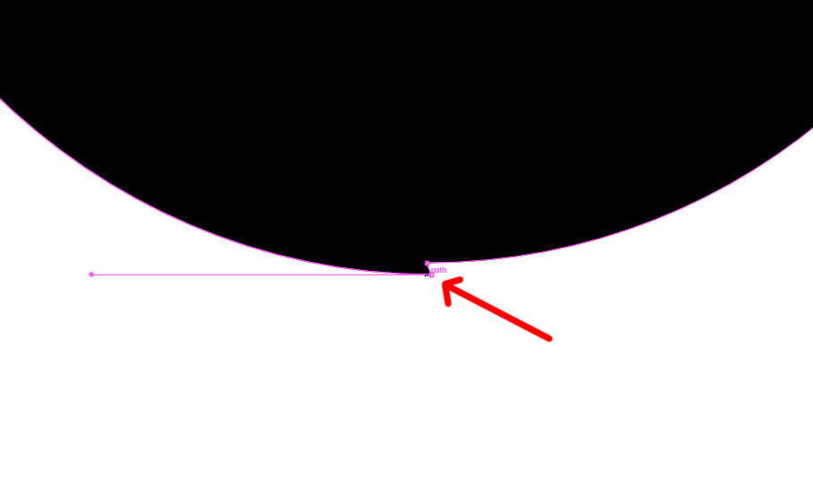
In Illustrator, when I convert my font to outlines, there are some anchor points added which I don’t see in my original Glyphs file. The anchor points are at exact the same location (just for this example I picked one up and put it on another position, see the red arrow).
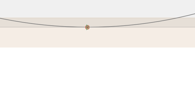
That made me look at the exported OTF file. I opened it in Glyphs, and to my horror I see the red dots you don’t want to see (second screenshot).
What could go wrong here, and how do I prevent it?
You’re right! It’s set to 0, because I pasted paths from Illustrator and didn’t want it to round up the coordinates, that would ruin the shape of the curves.
That will happen if the last segment is a curve. It might be solved by setting the grid to (1/10). That should be enough resolution to keep you shape but prevent such rounding problems.
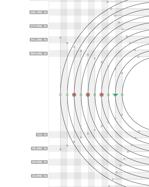
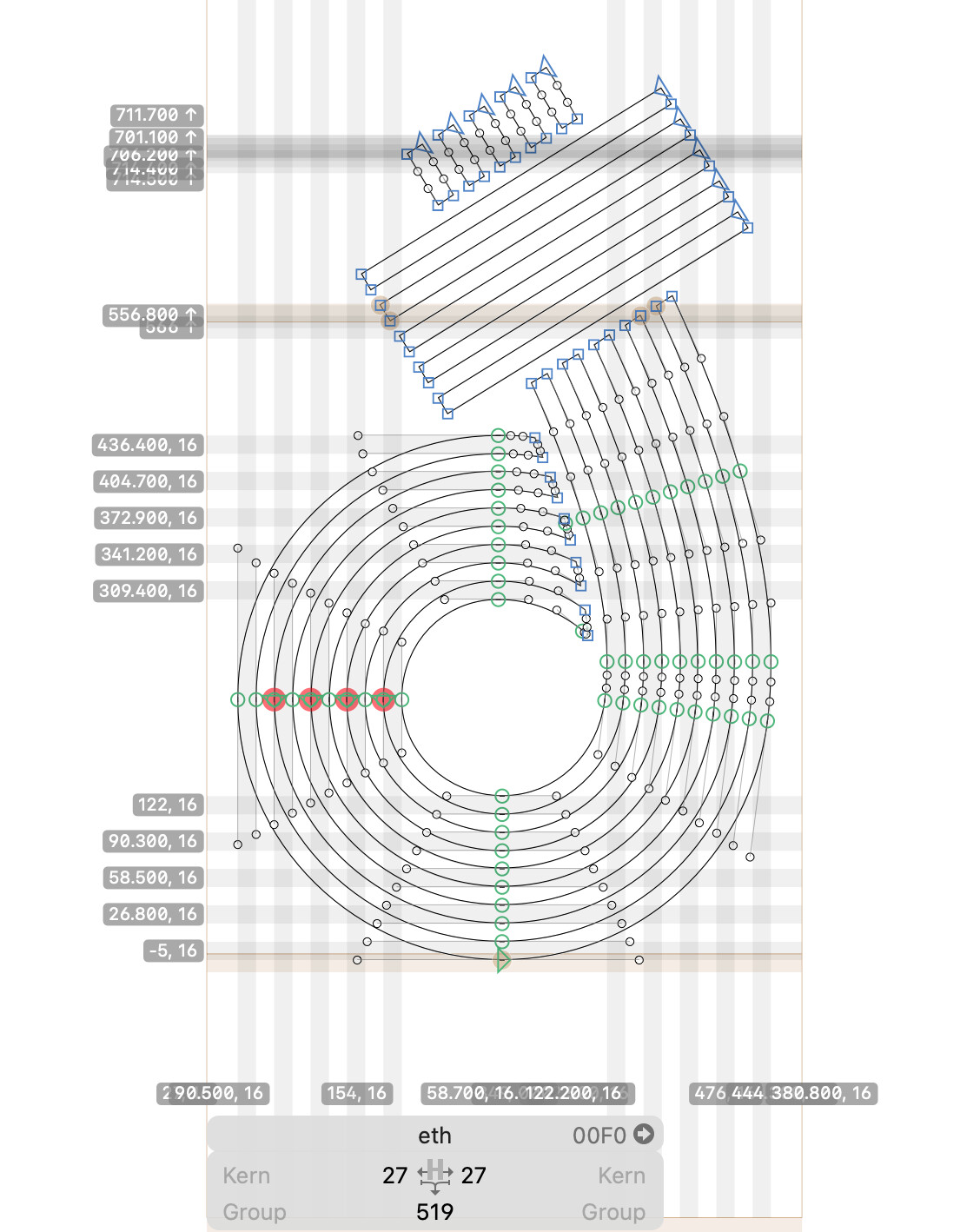
@GeorgSeifert I’ve been testing all evening, and I found that when I enabled autohint, the exported OTF has weird extra nodes and the coordinates of the nodes are a little off.
When disabling Autohint the end result looks okay at least…
Does the shape of the font has anything to do with this, and does it make any difference to the quality of the end result when I have Autohint disabled when I export the font?
I would strongly recommend to not autohint this font. It will snap things to the grid and that will distort your stripes. the small offset is not a problem.
And opening a font in Glyphs will not really tell you about the structure of the nodes in the font.