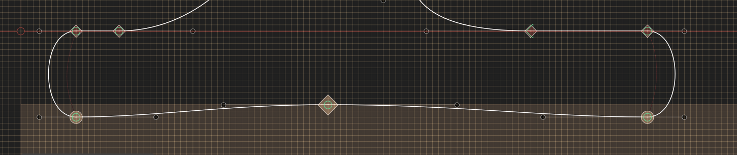
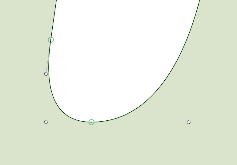
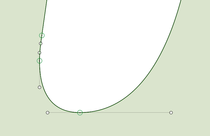
I’m working on an update for an older typeface of mine and I’m looking at the italics. I have a few glyphs where I’m not sure what would be the best/recommended approach for dealing with extremes, as if I add an extreme it creates a short path segment – and in some cases this create a kink. When it comes to using PostScript hinting, would it be better to use an extreme and have the short segment, or not use an extreme in these kinds of instances? And if not, would this adversely affect the hinting? I’m leaning towards not using the extreme to avoid kinks when I interpolate, but is that a good idea?
I’ve included some screenshots below.
Would really appreciate some opinions on this!