Hello all,
I was testing my font in InDesign and saw that although the spacing of my font appeared consistent, the kerning looked too tight when used in smaller sizes. When I added a tracking of +20 in InDesign, the spacing looked great. So I’m wondering if there’s an easy fix in Glyph to somehow simulate this when exporting the font?
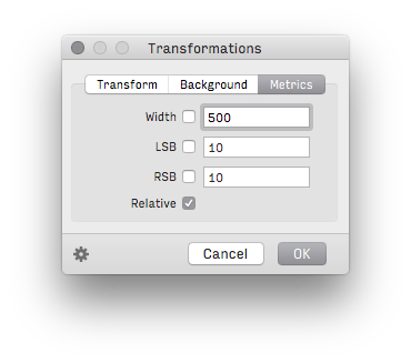
I can think of a time-consuming way to fix this by manually adding 10 units to all the LSB and RSB, but I’m wondering if any of you guys have encountered this problem and how do you guys fix it?
Thanks