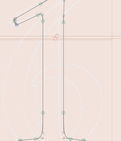
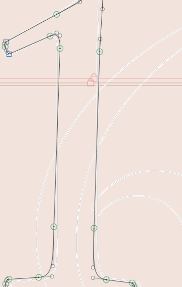
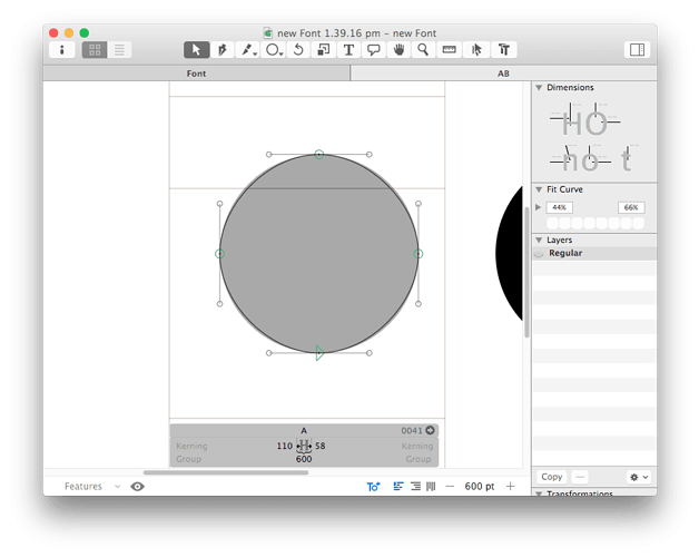
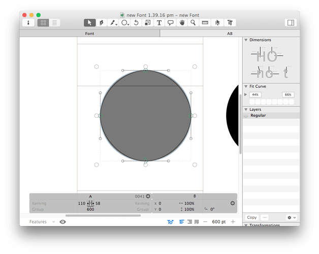
It was changed recently? I think this change isn’t good, previously it was clear, now when on the background layer, the foreground lines are white and pixellated…not clear at all:

Especially when trying to compare:

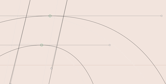
And when on the foreground layer, and there’s a component, there’s a background line, it’s also the same ugly and way too strong lines:

I do not have a retina screen
I fixed that. Will be better in the next update.
1 Like
I see it’s changed now but now when on the background layer, I can hardly see the foreground?
still pixellated here too
The pixelation is intentional as it shows better where the extremes are.
I’ll check this.
Sorry image didn’t upload
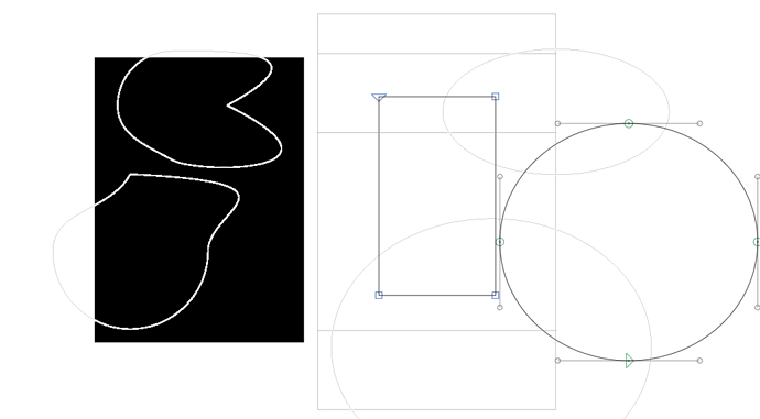
If I have shapes in the background which are beyond the metrics, it shoes up behind adjacent glyphs way too much and distractingly.
I’d like to point out that a selected component appears too dark compared to a black outline, in this situation it’s hard to see exactly how much a shape differs from a component to a shape. I do this when comparing a similar but not exact glyph with another one by adding a component.
I know I can unselect and then get a clearer view but often I need to move a component into the right position and so I will have it selected and move it around before comparing and sometimes moving while comparing.
in this case you need to compare the path to the path of the original glyph not the component.
Why is the selected component so much darker now? It was good in Glyphs 1…
