Hello!
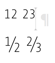
The automatic generation of the Fraction feature lets all digits in a text frame “slide up” - even if there is no “contact” when the digits are separated by a break.
Is the problem in the feature code?
Hope anyone can help me!
Hello!
The automatic generation of the Fraction feature lets all digits in a text frame “slide up” - even if there is no “contact” when the digits are separated by a break.
Is the problem in the feature code?
Hope anyone can help me!
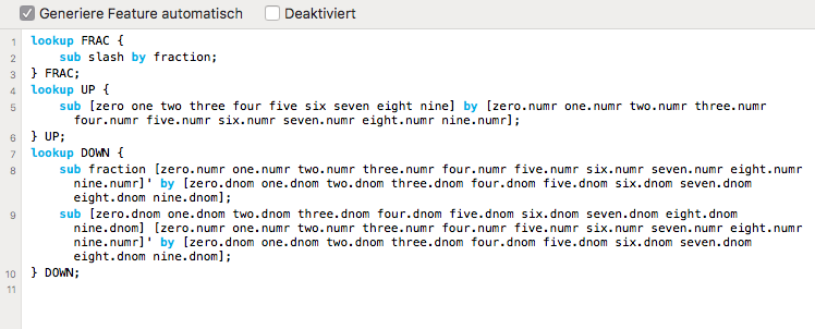
There are plenty of other ways to build a FRAC feature, but the question is what behaviour would you like when the FRAC feature is applied but there’s no slash?
EDIT: For other ways to build the FRAC feature, see:
https://glyphsapp.com/tutorials/fractions
or http://opentypecookbook.com/common-techniques.html
or http://talleming.com/2008/04/16/fraction-fever/
or http://talleming.com/2009/10/01/fraction-fever-2/
Thanks for all the tips and links!
Actually, my goal or my understanding of a “simple” FRAC feature is that fractions only occur (in a text) when a slash is set.
With activated feature not here: 1 + 1 = 2 But here: 1 1/2 + 1 = 2 1/2
Or: A car has 4 tires, not 5 1/2.
But the automatic feature generates only “numerators” or fractions, which surprises me, if this is the standard solution of Glyphs – without checking the Tutorial!?
(About the problem of 11/2 vs. 1 1/2 I haven’t considered yet.)
Well, the user applies it, so that is how it is expected to work. In InDesign you can apply a GREP style.
There is the Fraction Fever 2 solution by Tal Leming for allowing the user to simply leave it on. There is a link in the fraction figures tutorial, or just Google it.
Again: Thank you very much for the quick feedback!
But, I can’t imagine that a user expects only superscript numbers (numerators) without setting a fraction/slash?
I’m going to test the FF2! 
Why would a user apply the fraction feature to numbers that are not part of a fraction?
Exactly!
In my opinion, I activate a feature for an entire text frame (or style presets) because I know that fractions occur in the text or I have to type them. And then it’s easier to “identify” only combinations of numbers that contain a slash as a fraction than to just set all superscript numerals.
Or am I making a mistake now and I’m on the wrong track?
I don’t know! Personally I type the encoded fractions (½ ¼ ¾ ⅓ etc) as characters to be sure they remain that way even if the font is changed.
My general sense would be it’s best for the user to apply the FRAC feature in isolated cases where fractions occur, rather than to the whole text. I haven’t tested Fraction Fever, but I’d want to be sure that cases like the dates of a weekend (e.g. 24/25 November) don’t get fractionated. One might need to do something on either of those days and a slash would be a sensible operator to signify alternates.
Okay, there are - as always - different approaches …
If I want to mix a date with fractions in a text, I really have to pay attention. And if I use the encoded fractions anyway, I don’t need the fractions anymore.
Whatever … The fact that all digits - as a standard solution - are set high is in my opinion rather strange and obstructive in this case.
Would you rather recommend the Glyphs standard or Fever-2?
Or: Which “idea”/code has which advantages/disadvantages?
The problem with fraction fever is that it only works for a limited number of numerators.
The selection and application of the frac feature should/could be a software problem. There is an elegant solution with grep styles in InDesign.
So this means: Use Glyphs standard and hope that the user/designer has a clue about GREP?!?
That is not what i wrote. It is up to you what you put in your fonts. You can use the regular frac feature without grep too.
I know that. And because of this i wrote “hope”, which means that the combination I have mentioned will cause the best results, while both feature solutions “solo” have their individual (technical) weaknesses. (That’s the way I see it now.)
I only want to implement the best and/or most simple solution for the „non hardcore font and Adobe user“ …