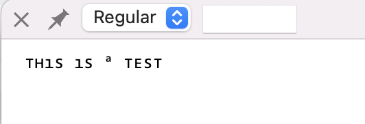
I have made some I thought small changes to a font. It looks fine in the Glyphs edit view text mode. But the ASCII text in TextPreview is garbled. For example, the text
The names and unicode values of the glyphs that do not display properly are just the standard ASCII alphanumeric characters.
I will send you the ttf under separate cover. The only odd thing that I noticed, when I was adjusting certain glyph values, like say left sidebearing or X scale, sometimes I accidentally pasted huge numbers into the fields (in glyph edit mode) and might have damaged the font? I don’t know.
This is in fact based on two open source fonts, Noto Sans Mono Regular and Noto Symbols 2. I used the ttf file because that seemed most convenient. I do not know what other formats are available or what the pros and cons of the different formats are. I am just trying to produce a simple monospace font or so I thought.
Maybe not quite in the spirit of the topic, but in case you’re just looking for a monospace version of Open Sans (which doesn’t exist, and making a proper monospace version would be quite an undertaking), you can look into Droid Sans Mono. Open Sans is basically identical to Droid Sans (both designed by Steve Matteson), so Droid Sans Mono should be a good fit.
That did fix the issue, thank you! I removed a number of those features: none of them, judging from their names, seemed important. But I hope the remaining ones do not cause mysterious issues on some platform down the road.