Hi: A customer has trouble with digits on a display. Rendering sizes here are 32 px. and 27 px. I have now experimented with different settings of ttfAutohint in Glyphs, but there are still decimal shift problems, etc. Should the font be made as a pixel font instead? Or should it simply be TrueType hinted? I guess the last one …
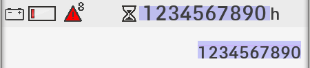
The font is rendered on a truck-display! (I still need some tech-infos about the specific render). I have delivered both .ttf and .oft versions of the digits. Hereby, the rendering-version of the .ttf-version. Still problems:
OK. Thanks! It must be a issue with the Alignment Zones … but I’m nearly sure that these settings are correct. The render used is named ‘OpenVG’. I’m absolutely blank! Which control instructions do I need to add to the font?
You can read about Control Instructions on the ttfAutohint page. In Glyphs, you add them as a custom parameter in the instance. In short, you can move certain points in the TT outline (see the index numbers in the TT Instruction tool) by up to 1.0 pixels in certain PPM sizes. Each intervention goes on a separate line.
You can go pretty far with proper ttfAutohint settings (also a parameter) and raising your figures to the same height as your cap letters (which is often an option for screen fonts), and syncing all overshoots to the same height.
There are a couple of things you should try (and ttfautohint is the last one of them).
First, try to scale the font that it has the right size without any hinting. There is a section in the Pixel font tutorial about that https://glyphsapp.com/tutorials/pixelfont
Then I would try to play around with the Postscript hint (size of the zones, stems, and family zones). If that didn’t work out, us manual TrueType hints. You have the most control that way. If it is only the numbers, that is not much work.
If all that is over your head, you
might need to hire some that has done that before.
Thank you guys. Well, I think special TT hinting seems too complex too me … Do you have any names that could be interesting for me to contact? Thanks in advance!
Hi! I’m having a similar problem with a TrueType font. I have a whole family that works ok in all of its weights but in one of them the whole set is shifted 1px below the baseline. I’ve read the blog you posted here but still I don’t fully get how this syntax works. Should I add a control instruction to the instance? Does this work with some sort of classes or a list of glyphs? It’s a bit confusing and I don’t know exactly how to fix this problem.
 BTW: The font used in this example is a .otf-version.
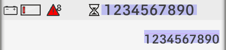