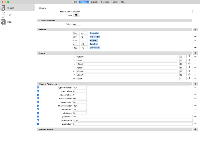
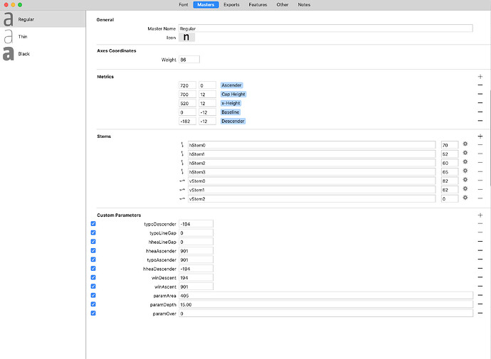
I think that the gray bars help to indentify easily each option.
Cheers
I’ll think about it. I like the white page quite a bit.
1 Like
+1 from me. White is nice, but that would give it more visual stability of the layout and hierarchy.
The separator can be subtle, but I think it will add a lot.
2 Likes
Speaking of layout, maybe left align the CP checkboxes with the headlines, too?

