The approach described in the Fontlab page is not working in Solidworks.
Hm, interesting idea. I am not familar with ttx/fonttools, but I suppose I could look into it.
I would like to build an one solid font for cnc machines too, it would be great that we can solve the problem.
What CAD app do you have?
I want to use the font for the common used software - opensource and licensed
Like: OpenSCAD, Rhino, Inventor Autodesk, LinuxCNC, Solidworks, coreldraw.
thx for help
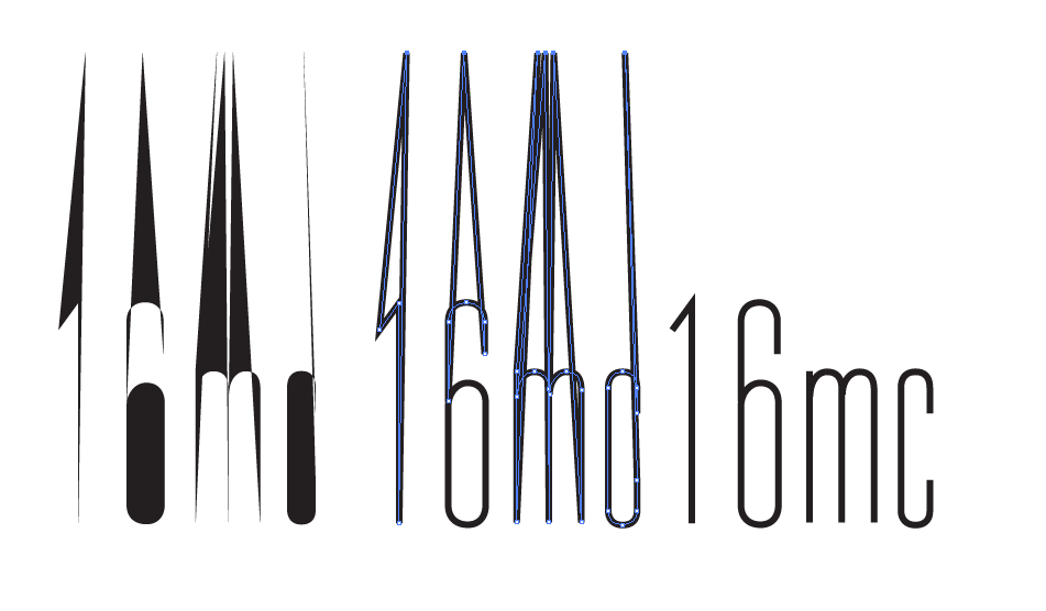
There is no font format that works on all of them. I have written a plugin that can export AutoCAD shape fonts. Solidworks does not support custom stroke fonts and we didn’t look into any other app yet. If you find information on the supported stroke fonts for any of them, I’ll have a look if I can implement it.
I recently needed a single-stroke typeface for laser cutting, and came up with a useful workaround to this problem, though it is not a solution for every use. I’m using Illustrator; I’m not sure how well this would work in Solidworks or Rhino.
I created my single stroke glyphs using open paths, and then created closed paths by adding an extra point far above the cap height and joining it to the ends of each path in the glyph. I then typeset all of my text in Illustrator, created outlines, and then used the Direct Selection Tool to easily select and delete all of the extra points.
I didn’t need to do this for my relatively simple application, but it would be useful to create another font without the extra points but with doubled lines that create a closed path in order to be able to visualize the final design while maintaining text editability. Then once the design is finalized, the text could be copied, pasted in place, and switched to the font with the extra points.
Clearly the fact that the decoy points have to be manually selected is not ideal, and the decoy points could overlap with other text depending on their location and leading, but for many cases it should be a relatively easy workflow. If text is going to be set in paragraphs, if the decoy points are extremely high, taller than the paragraph, then all would be clustered above the first line of type. So versatile implementations of this technique might have different “grades” for different offset amounts of the extra points.