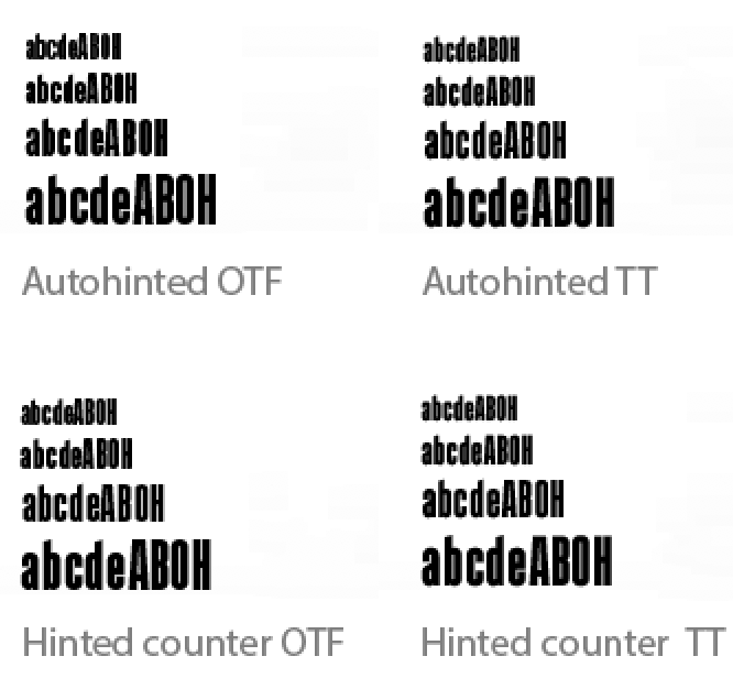
I’ve never read mention of this, but on some glyphs with thick stems and thin counters, I’ve had better luck with improved legibility on lower-resolution displays by hinting the counters rather than the stems in Glyphs. I can’t help but think this is a questionable practice. Can anyone clear up my ignorance on this?
TT or PS hinting?
I’ve attached a couple of enlarged screenshots from Mac OS Sierra running Adobe Illustrator CC captured from an old 23-inch Cinema Display (1920 x 1200).
I see no difference in TT with hinted counters vs. hinted stems.
When exported as OTF with the Save as TTF checkbox unchecked, there’s a considerable difference between autohinting the stems vs. manually hinting the counters. The outsides of the stems are a bit less-well defined when the counters are hinted, but the counters themselves are better defined.
I’m not really asking which is best since that might depend on various considerations, like the font in question. What I’m really asking is whether or not my ignorance is showing in thinking it’s sometimes OK to hint the counters in Glyphs instead of the stems. I’ve never read anything about anyone hinting counters, so I’m wondering if anyone has thoughts on it.
If you test it in enough environments and it looks better, go for it.
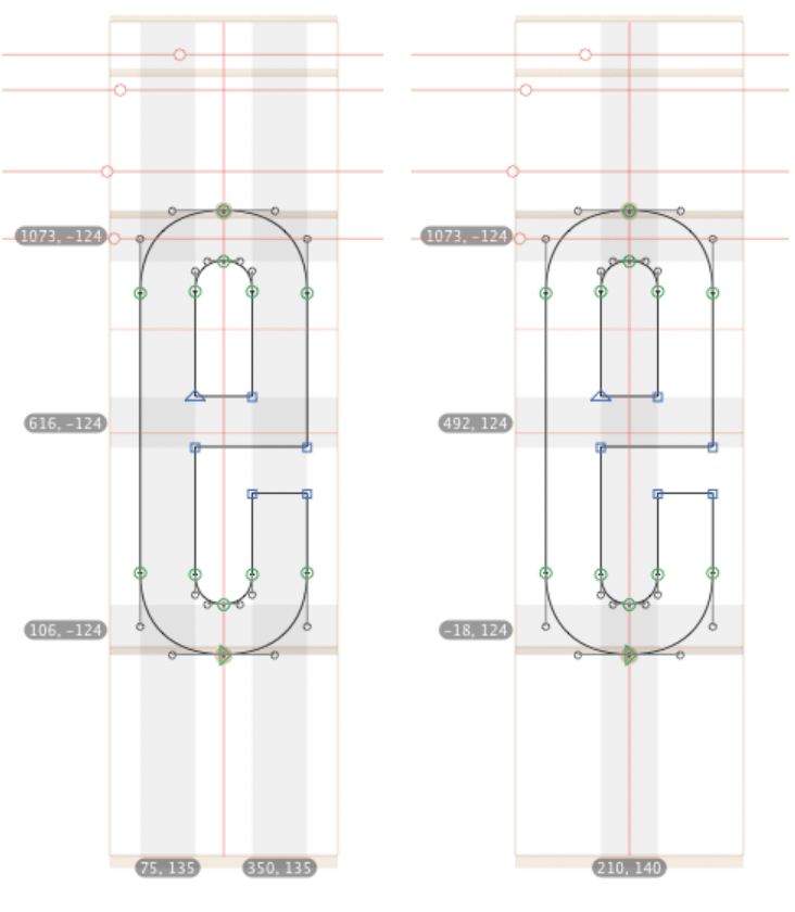
For the record, the screenshot shows PS hinting. What are your standard stems? Perhaps you achieve a better result by experiment with your stem values, e.g. making the stem value a little higher than the actual stem width. And you could treat H and V stems differently.
How are you arranging TT instructions? It doesn’t have to be an either-or question there.
OK. Getting some insight into things I don’t know about is exactly why I asked the question, so thank you.
I can experiment with the stem width values, but I was always under the impression that the stem widths should, whenever possible, match the values set for the font.
As for the screenshots showing PS hinting, I’m unclear on why that is the case. Is it because when I autohinted the font, I did so using Control > Autohint rather than allowing the hinting to be applied during export as TTF? Does Control > Autohint always apply PS hinting? Is there something I’ve missed in the manual and tutorials?
The manual TrueType autohinting is just a starting point for actual TrueType hinting. So unless you had a look at it, you should not bother. And mostly the TrueType hinting is only in y-direction. So yours stems and counters are probably just unhinted.
Well, that opened the door to a level of complexity that I’m hesitant to jump into right now.
The font family I’m working on would mostly be used for display purposes, so manual TT instructions wouldn’t be worth the bafflingly complex effort. The built-in TTFAutohint sounds like a reasonable alternative.
I’m assuming that any TTFAutohint instructions do not override or affect PS hinting in any way — correct?
Despite the complexity of the TTFAutohint documentation at freetype.org/ttfautohint, it appear the Glyphs implementation is fairly simple and largely consists of entering values in the the Glyphs TTFAutohint options custom parameter options for each instance below — correct?
