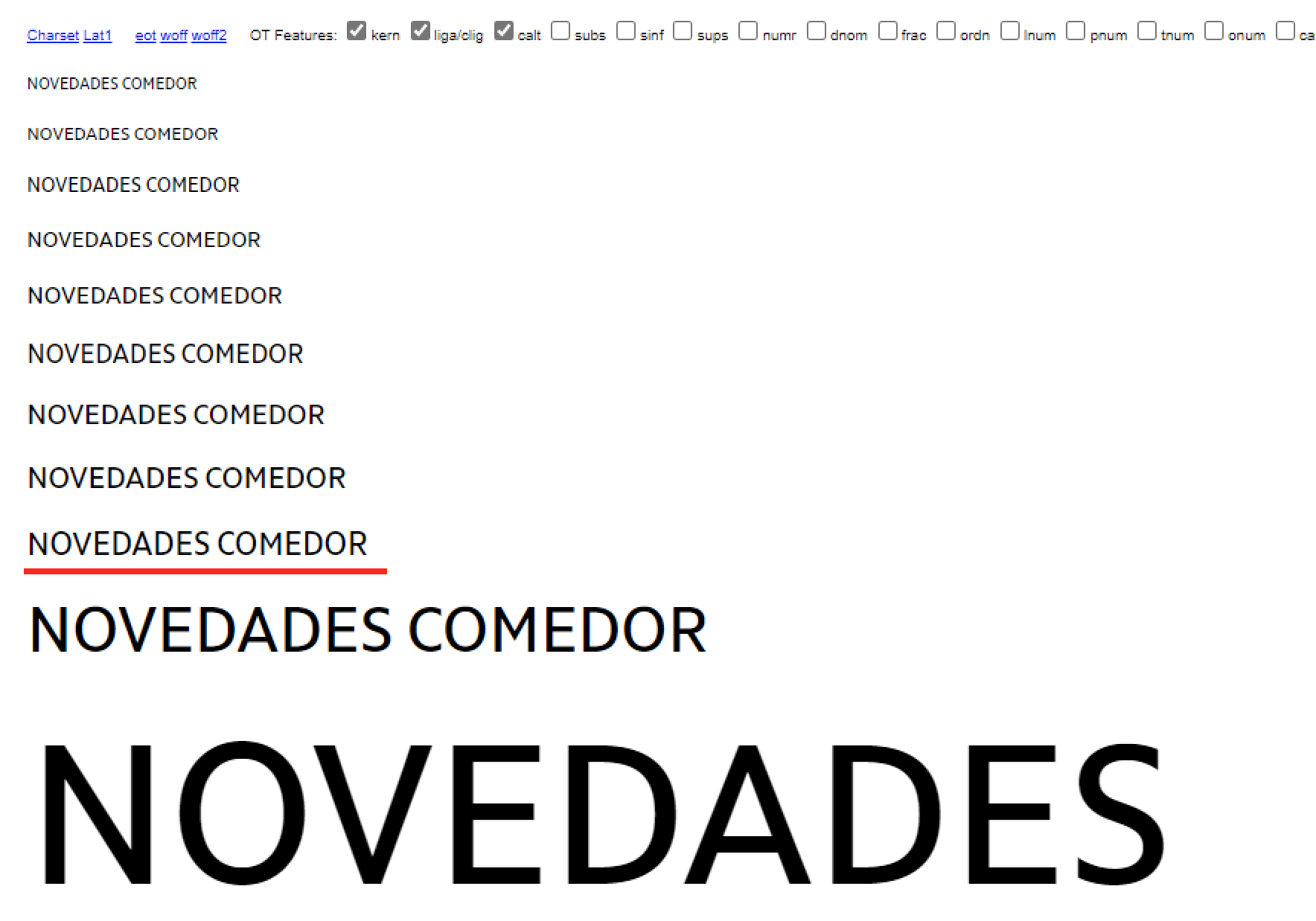
What may be causing this misalignment at this specific point/pixel size? Other weights look fine. Any way to solve this?
On Mac Retina everything is ok! This is Windows, Chrome, Woff2.
What may be causing this misalignment at this specific point/pixel size? Other weights look fine. Any way to solve this?
On Mac Retina everything is ok! This is Windows, Chrome, Woff2.
Postscript or TrueType? Which kind of hinting?
sorry, Postscript Autohint.
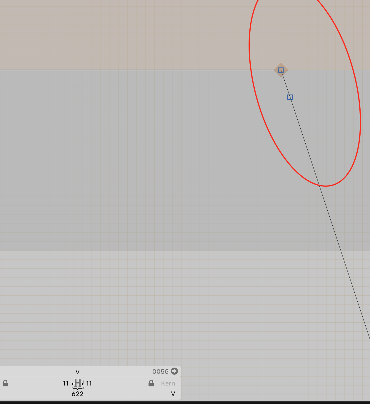
Alignment Zones are correct. The vertical & horizontal hints look fine too on the otf.
However some glyphs have some ‘unwanted’ points because it should interpolate with a Serif version. Do you think these points may be causing this?
Just to be sure, have you check the path direction?
It’s correct on the Master’s file and exported instances
Can you send me that file?
Yes. Woff2 is enough or do you want the master file? I will send it to you later today.
The .glyphs file please.
Sorry for the delay Georg. I cleaned a bit some shapes and I think it got better, at least when I tested it. However the client is still complaining. I will send it by mail to support with some more information plus the glyphs file and the glyphs project where I’m exporting webfonts.
First, you are not exporting PostScript but Truetype fonts. That is quite an important difference.
The exported fonts you send me look quite good (as fare as my quick testing shows). And I can’t see that size difference. It might be related to the specific HTML/CSS that the client is using. I would need to see that specific page. And in what environment/browser are is this?
True, my bad.
This is Windows, Chrome, Woff2 (but I other browsers show it the same way).
However I can also detect that height difference with the Glyphs Webfont Test HTML (not only on that specific page). Tomorrow I will send it to you by mail.