Hinting question: are multiple hint interpolations a reasonable strategy?

For example in this screenshot, hitting both the top and bottom of the crossbar:

This creates less-sharp but more accurately-weighted rendering (IMO) in the preview panel versus when there is only one interpolation. What I don’t understand is why this even has an effect, I would have thought the hint on the crossbar would already be doing all the work in this case? Is the only downside to doing this adding a few bytes? I still haven’t tested one vs. the other in an actual Windows environment

You can’t interpolate two points and have a stem hint on them.
This is how you should do it:

And why do you set it to “No Stem”?

Ok, good to know, I won’t try it.

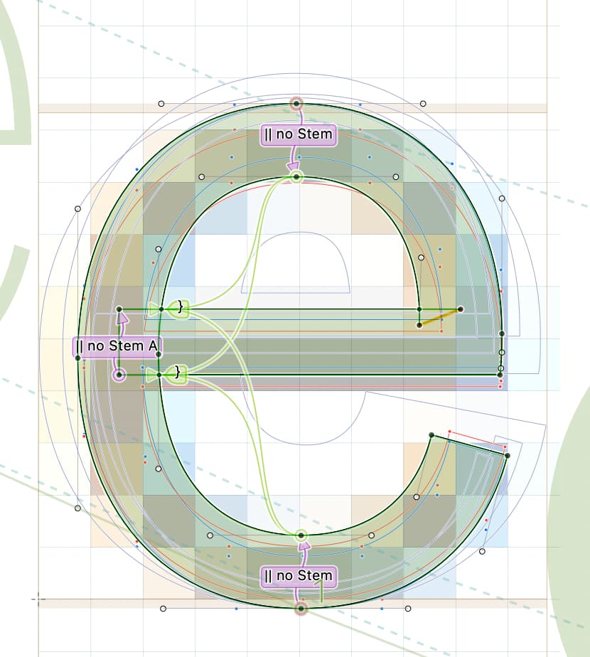
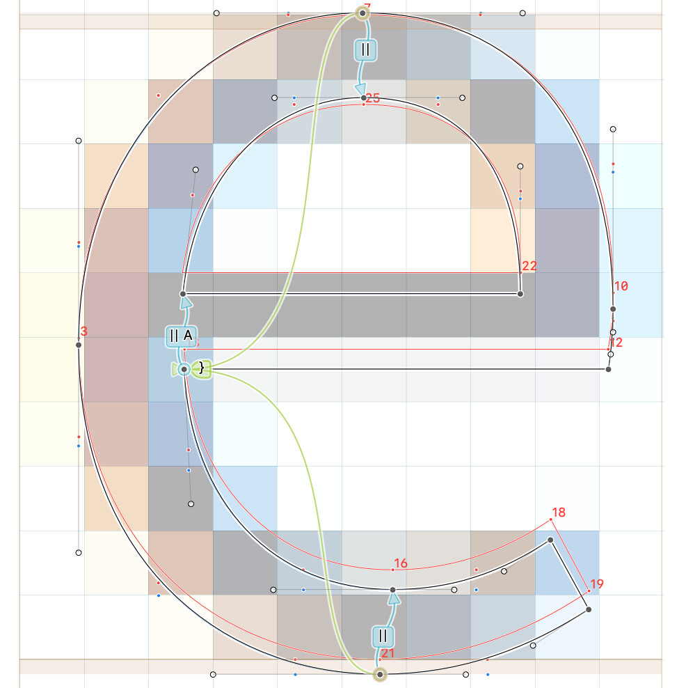
I have it set to “no stem” because it’s a variable font, is that not correct? I could switch all hints to “no stem” as part of a build step instead, if it’s better for the static files to have them set to auto

No, Variable fonts can have stems. There is no difference to static fonts in this regard.

I don’t mean that they can’t have stems, in this video posted elsewhere on the forum, @mekkablue mentions that with a variable font, rounding is preferable only between the snap points so he sets it to “no stem” - (around 8 minutes in) https://drive.google.com/file/d/1zipZXeO0zJxfLSvo2StUNdlTYbljYhqu/view?usp=sharing

but now that I watch it again, it sounds like this is a general strategy for high PPI screens, and not necessarily variable font specific?

Yes, for most use cases, you get better results with that setting. Especially with the Adobe renderer, which is not primarily meant for TTFs.

1 Like