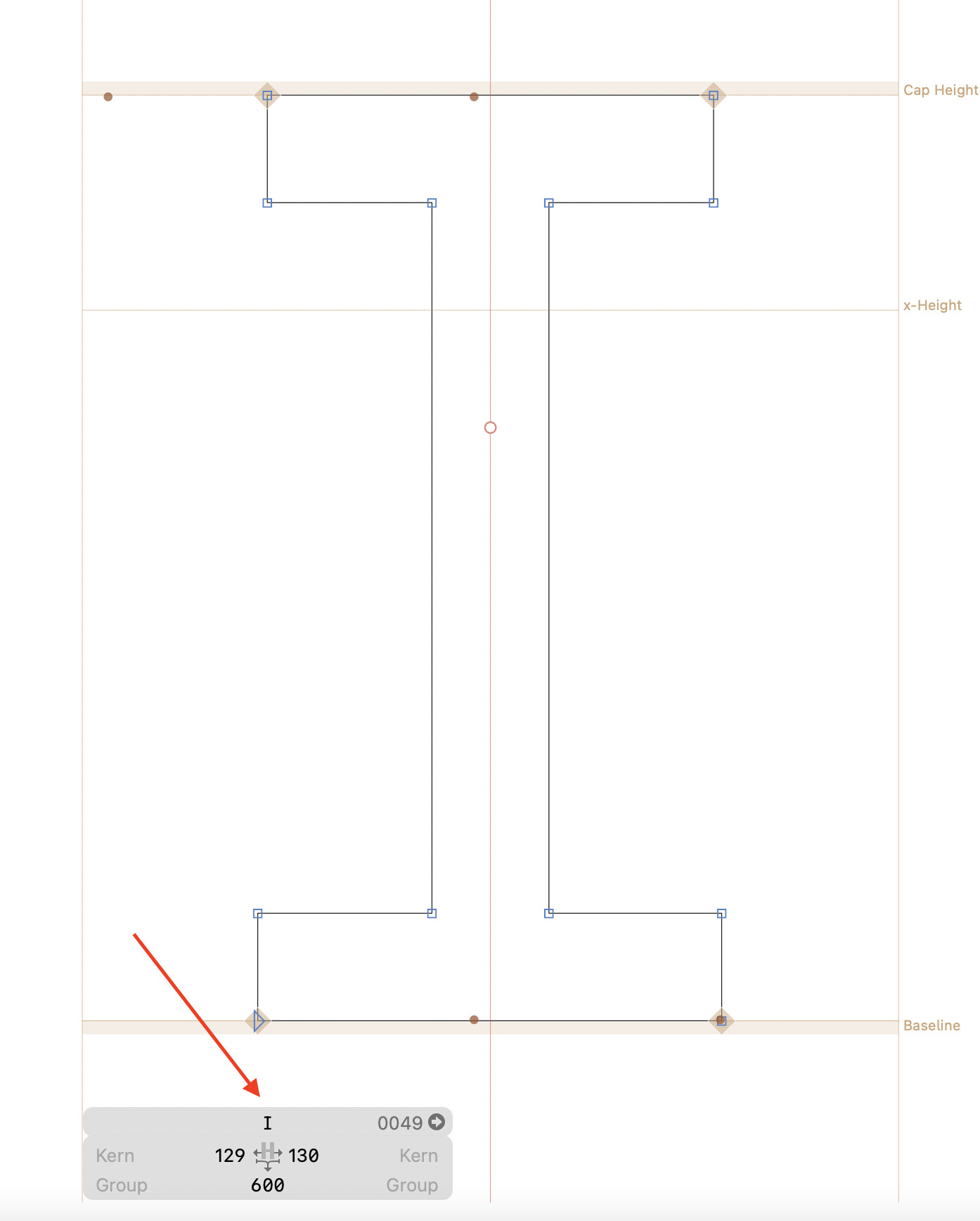
I remember this little gray panel at the bottom used to be centered along the current glyph that’s being edited. For some reason, it is left aligned now. Is there a setting to change this?
No. Why?
Centred feels better for me too. The same reason we have the content of a website centred in the viewport.
I’ll see what I can do.
1 Like
How would the Info box be centered when additional boxes are added? Would you expect the first box to remain centered or for the whole group to be centered (and the first box thus shifted)?
1 Like
I’d have to see the different options. Perhaps those panels stack vertically depending on available space?
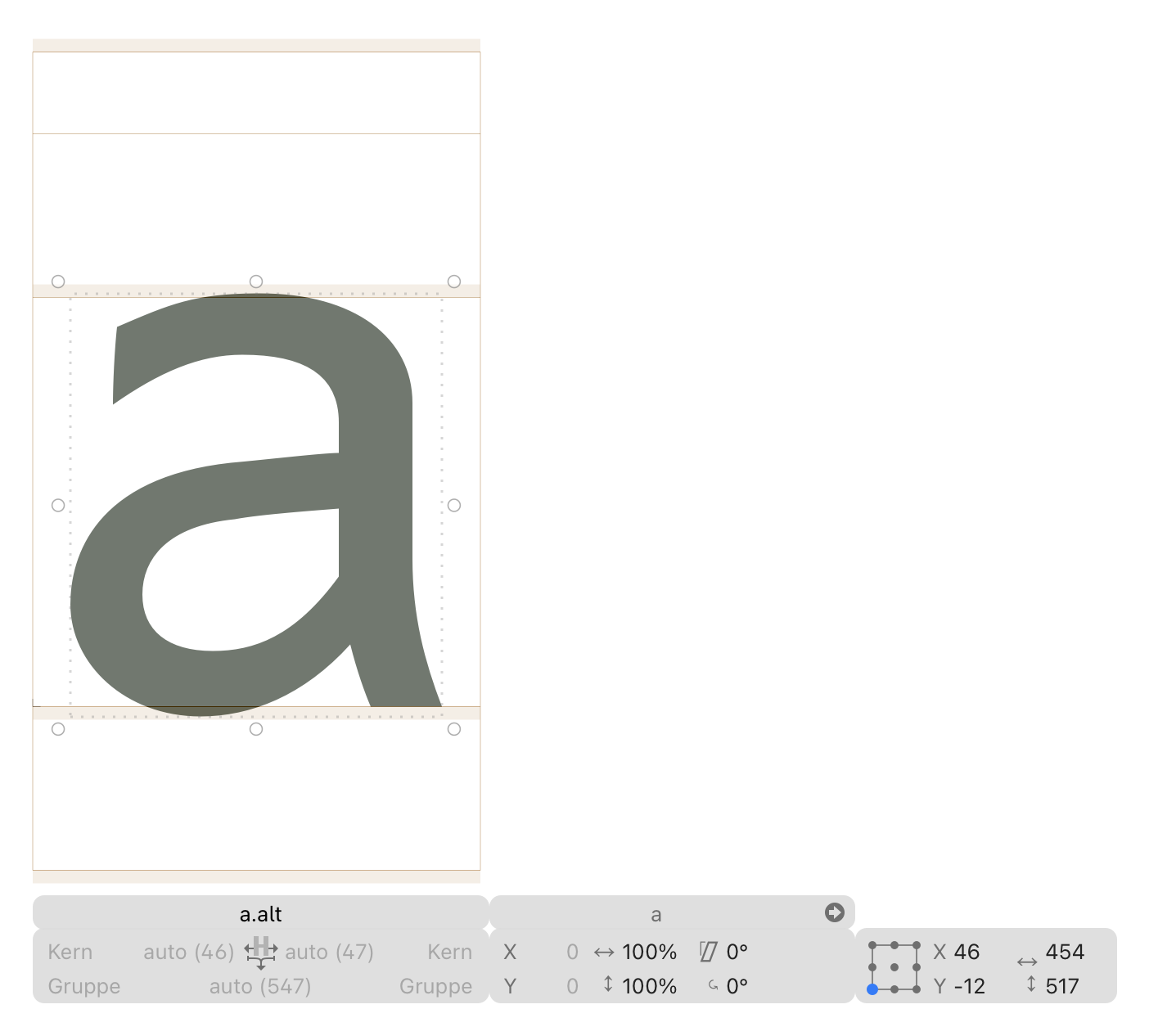
Maybe only center when zoomed in so the layer width is wider than the info box size. Like in the first image.
Have you considered just centering it in the window instead aligning to the glyph? Never quite understood why it moves; it would be much easier to follow when switching between glyphs.
What actually really is the issue with left aligning it? It’s clear to which glyph it belongs and it can extend to the right.
Any good argument why left aligning is bad? Which negative consequences do you have to endure?

But centering would not make any difference in those instances.
My little addition to this nitpicking is that most of the time this panel just flies around for no good reason. It’s most annoying when stepping through a kerning word list and actively using the panel to set groups/values, comparing them, etc. I just deal with it, but since someone started this thread… Just adding a vote for keeping it still altogether.
1 Like
I find if quite useful that it is aligned to the active glyph when kerning. I tried to put the info controls below the toolbar as iWorks was doing it at the time. But had to revert that immediately as it was too confusing. I never touched it since then.
1 Like
+1, I don’t want it moving around either
2 Likes
But centering would not help much either. Because the width changes with the selection. I’ll see if I can find a less distracting mode.
I think the users pledging for centering might mean center in the viewport, not center with the layer. Correct me if I am wrong. But I assume that would help against that “flying around” and chasing it each time one changes the active glyph.
1 Like
Not necessarily, since the boxes grow and shrink to show different-length glyph names, kerning group names, metrics keys, etc.
Maybe keyboard shortcuts for jumping into the Info box and navigate inside of it might already fulfill the desired need and the centering approach is not the primary request.
I think this is not that important to fix, there are better things to do ![]()
Sorry for the nitpicking. It works and it is just visually slightly jarring. I can live with that.
2 Likes