I dont know if this is the right approach or not, but here goes:
(I’m using Glyphs 3.0.2.)
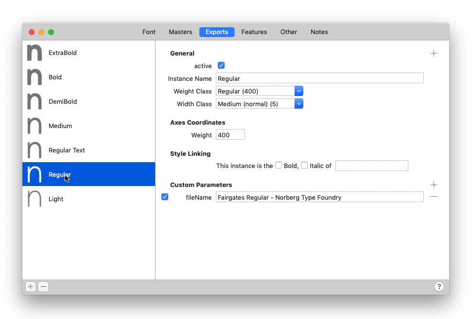
I would like to add a custom weight class for one instance (Regular Text, 450) that sits right between the Regular (400) and the Medium (500) weight. Adding 450 as a value in the Axes Coordinates → Weight field creates a font file that looks as intended, no problems there.
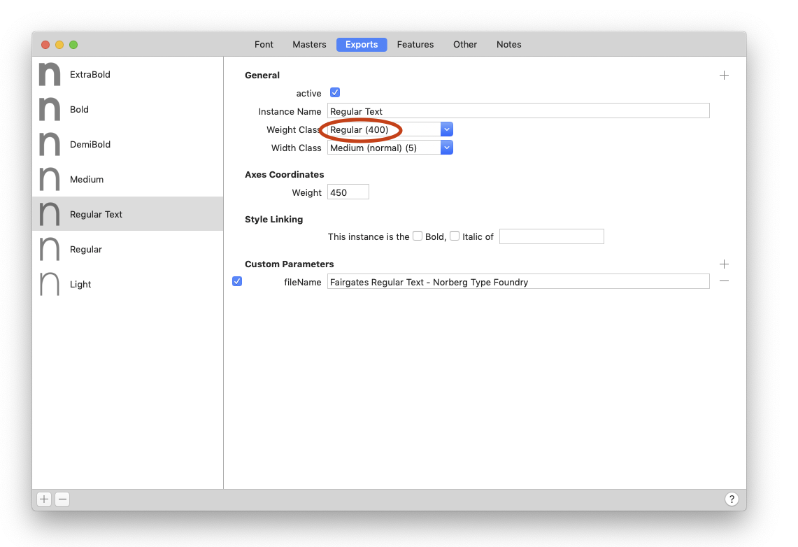
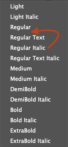
However, even though the font looks good I still have two problems: Adobe applications order fonts (as I understand it) based on weightclass values. Problem is that I can’t seem to rename the weightclass from “Regular (400)” to “Regular Text (450)” in order to create a custom weight class for this specific instance. So I get this sorting, since although the the “Regular” and “Regular Text” fonts differ in weight, they share the same weight class.
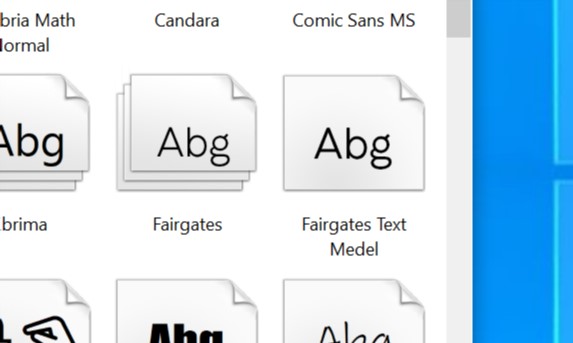
Second problem with this approach is that Win10 doesn’t seem to understand 450 as a weight between 400 and 500, instead it displays the Regular Text weight as a seperate “family”:
Should I give up on this approach and instead use the default weight classes and values, and play around with the Axes Coordinates / Weight values and naming until I find the right balance…?