Before I continue with trying out multiple values for Ascender/Descender I ask the pros in here for a easier solution on this. My goal is to have the perfect line height for the “(Auto)”-Setting in Photoshop or InDesign.
Line height is set by the user and cannot be controlled by the font. By default, in a fresh installation of InD, 120% of the font size is used. That means 1.2 times your UPM value. Easiest is probably to adapt your UPM. But YMMV. Experiment for yourself and use the Adobe Fonts folder: http://www.glyphsapp.com/tutorials/testing-your-fonts-in-adobe-apps.
Thanks for your reply. I have configured the Adobe Fonts folder succesfully, but where can I change line-height settings in glyph. Of course user sets the line-height in the App, yes. But what about the mentioned “Auto” Setting? Is this the 1.2 you mentioned?
Works, but not for all cases. Is there another way to have 0 units gap between the lines by tweaking the ascender values and not blowing up my glyphs to 1200u? I have checked Vertical metrics | Glyphs, but I have no clue what you are talking about sorry
As mekkablue mentioned, Adobe apps will use 120% of the UPM as the default line spacing (set the font size to 10pt and the line hight will show 12pt). The user can change that and there is nothing you or the font can do about this.
The drawings need to be 120% of the UPM. So you can either bring your drawings to that size as Georg suggested, or reduce the UPM value down to a point where UPM × 1.2=drawing height. IOW to drawing height ÷ 1.2 or drawing height × 0.8333.
Edit: just saw the formatting messed with the math operators. Fixed it.
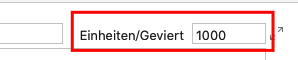
I’m trying to do something similar and found this conversation. I’m in the process of recreating a several old wood type letterpress fonts and a few have odd x-heights compared to modern fonts. I was thinking of creating the original in their historic form and also creating a modern version with more contemporary line-heights and/or x-heights. I’m looking for a faster way to make the modern version other than individually editing the size and kerning of each character. Would I be able to do this by using using the mekkablue line-height script, changing the “Einheiten/Geviert” field, or some way of scaling all glyphs by 110%-120% including the LSB/RSB/and kerning metrics (but leaving the ascender, descender, and x-height as-is)? BTW-let me know if you want to move this to a new conversation.
You would change the UPM (units per em) setting. But again, the font cannot control the line height with which it will be set. The 120% are just a default in some apps. If the user changes the default or sets a different line height, it will not work.