Hi, I’m trying to hint some glyphs, especially ones with horizontal lines, and I’m having some issues.
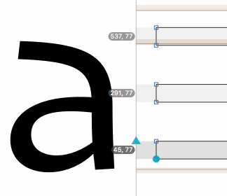
I added the following horizontal hints to my glyph:
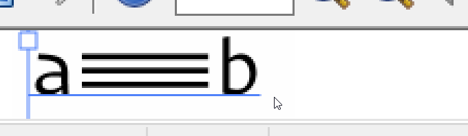
When I view it in Illustrator, the anti-aliasing is blurring the top bar (sometimes is is one of the others, depends on the font size). Sometimes the middle bar jumps around and is not in the middle (closer to top or bottom).
Zoomed in
Am I doing something wrong? Or is my expectation incorrect?
Just trying to figure out how to make the bars look the same at all font sizes.
The same distance all the time and pixel snapping: impossible in some sizes. Think of distributing three stripes and two gaps across 6 pixels. There’s no solution, Hinting cannot do magic and change the number of pixels on your display.
If you want to preserve shapes as much as possible, do not hint. Hinting is a technology for distorting your shapes to fit on the pixel grid, not for preserving the shapes.
I thought that’s what I was trying to do. I basically want to tell the rasterizer: make these bars the same size even if you have to move them to fit the pixel grid.
Anyway, are there any tricks to help the rasterizer? Like making sure coordinates are multiples of N?
Right now, the bars are 77 units high and 169 units apart. Obviously those are not nice round numbers, so that would most likely make it hard to align to the pixel grid.