Identical vertical stems print at different width — sometimes!

Hello there!
I have been silently reading all the articles on this site, working on my typeface this past year (also finally licensed Glyphs after working with Birdfont for a long time), learned A LOT, but now I am stuck and no matter how much I try, can’t figure out this problem:

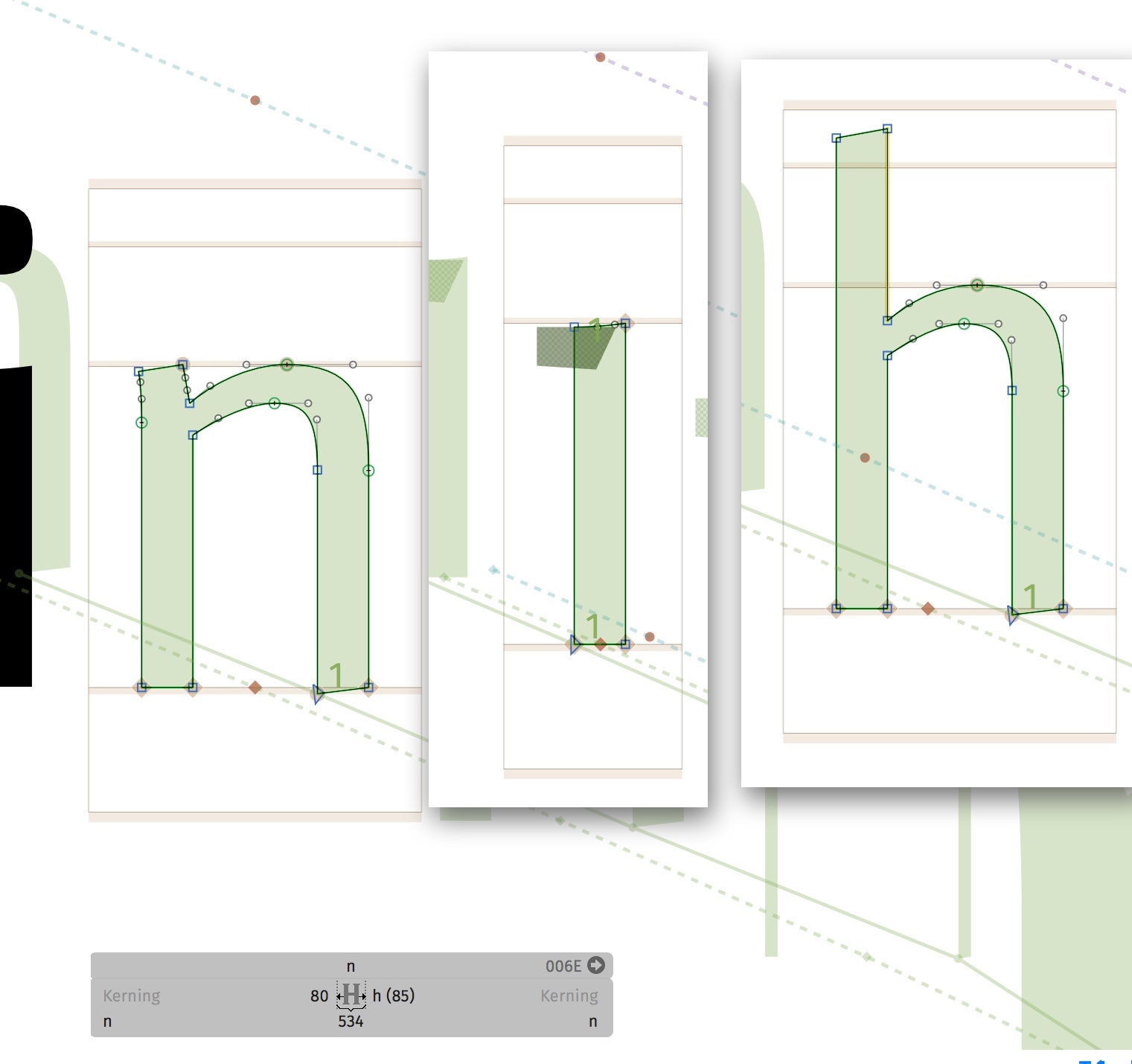
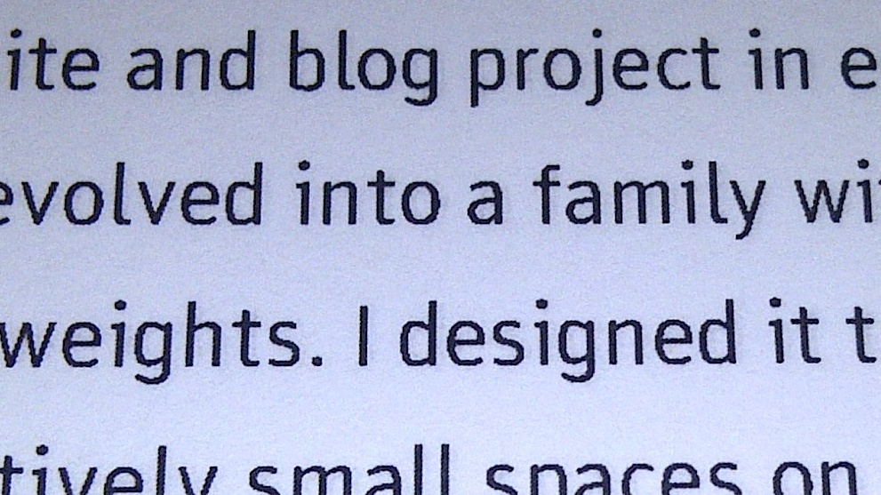
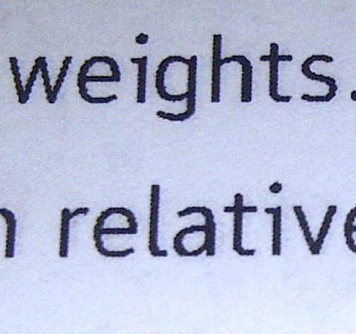
When printing out my typeface (here in 12pt), certain letters’ vertical stems vary greatly in width. A picture is worth more than a thousand words, so here we go:

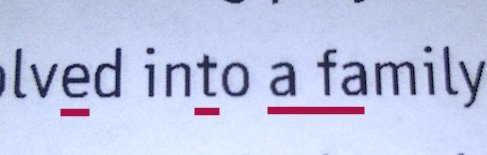
The i looks horrible, the latter part of the n as well. In other widths, letters like a and r and f have the same issue. They all haver identical, perfectly vertical stems at the exact same thickness. I wonder if it’s perhaps a hinting issue, so I exported it without hints, same issue. I printed it at different print shops (office supply stores), same issue. It does it from a PDF as well as straight from a word file or even txt on windows. This picture is from an OTF font, but a TTF did the same thing (I gather they have different outline methods and hint differently as well)

What frustrates me the most is, that it doesn’t ALWAYS do it, and doesn’t always do it consistently


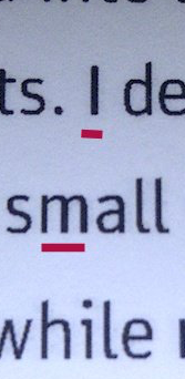
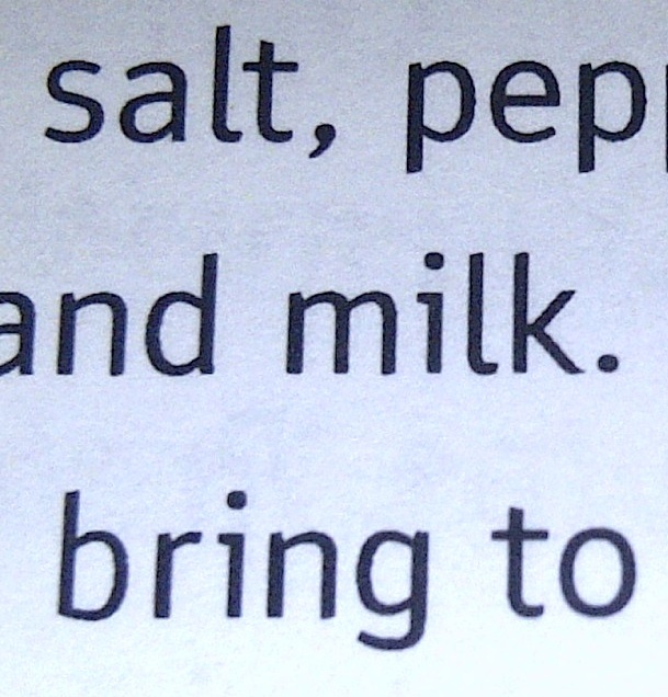
The r doesn’t look perfect, but the i and n are fixed.
This is still the same size (12pt), from the same FILE infact, a PDF made with InDesign. I made a keynote PDF, with the same problem, too.

Sorry for this to be my first post to be so wordy, I am really lost. It would be great if you guys could help me.

Grüße aus Amerika,
Moritz

Get a better printer. Buy a black and white laser printer that can print at true 1200 DPI. At a minimum it needs Postscript emulation, and true Postscript is better if you can afford it. You don’t need to spend a lot—I paid $200 for my Lexmark printer about five years ago, it runs fine, and I only need to replace the cartridge once a year.

Thanks for the input. I had that thought as well, and so I figured printing it with OfficeDepot and FedEx Office here in the US would maybe fix the issue. But somehow I don’t know if that’s it … I mean, their machines seem way, way more sophisticated than anything $200 can buy. The photos are from a print from FedEx. I can go back and see / ask about their machines.

Either way, the issue remains unacceptable if I want to do a quick print of something with that font, or even if someone else uses it without publishing quality equipment. Certainly there must be something in the font generation I am missing … other (non-system) fonts never behave that way on the same equipment.

Thanks again for the help.
Moritz

EDIT: I have a dell b2360 at work. According to a quick internet search it supports postscript 3. It has similar issues.

The only thing I can think of are double paths, wrong path direction and bad hinting.

Hi,
There are no double paths, path direction is correct. Bad hinting … I have no idea. Doesn’t Glyphs auto hint? And yes, I followed the tutorial on the main page – again. It doesn’t matter if I work off of a multiple masters file (my main file) or just one weight. The problem seems to persist.
I guess I still don’t understand why it would do that.
I guess I will play around with the hinting some more. Any help would still be appreciated.

Moritz

It is because of the way the rasterizer of your printer works. Depending on the machine, better hinting may work (from what you write, it doesn’t on your printer), or a different printing mode of your printer. But 12pt at 300ppi is too small to expect sensible output, really, no matter which printer.

Your stem sizes are such that they can be presented at that point size with either x pixels or x+1 pixels, depending on the way the outlines fall on the grid the first time, move it a little bit to the left, and you can fit e.g. 7 px, a little bit to the right, and it’s just six. What I do find funny is that your printer seems to cache the rasterized image of the letter and reuse it. What happens if you print at 11.9pt?

Something else comes to my mind. How did you install your fonts with which you created that document? Saying that you changed the hinting, and the output remained the same, that points at an installation problem. Read this please:
http://www.glyphsapp.com/tutorials/eliminating-font-cache-problems

At that size, hinting should still make a difference. If there is PS or PS emulation available, at least.

Thank You also for your input! I have wondered about and will also try 11,9 size and some other sizes close to 12 and see what happens.

I did read that article (every single one on this site, in fact :wink: ) about caching problems. Fonts are installed into the adobe fonts folder in the global library as the article suggests. I even exported differently named fonts (123, etc.). When I say “the same” I mean that the general problem is the same. The letters that cause problems sometimes vary (though the lowercase i is pretty consistent).

Am I correct to think that other than manually setting vertical and horizontal hints, there is no way to hint in Glyphs? Pardon my ignorance if this is incorrect.

One last thought: Is it possible that there is some pre-existing hinting information in my font file, and Glyphs somehow applies additional hinting? Before I migrated this project from Birdfont (via ttfs), I used ttfautohint. Even though almost every shape has since been re-drawn, the files are all still technically based on that old ttf. I thought I didn’t ttfautohint those files, but I can’t remember for sure. Is there a way to clear all pre-existing hints?

The most important thing about hinting is to set good standard stems. In your case you should be fine with one horizontal and one vertical. Use an average of lowercase and uppercase stem width.
There is no hinting information imported from .ttf files.

Feel free to send me your .glyphs file in a DM, and I will have a look.

I must ask this: are you possibly converting the type to outlines before you make a PDF to send to the printer? If you are, don’t do it because that will cause it to lose all its hinting.

Thanks again for all the responses.
I don’t think the PDF converts to outlines, no.
Thanks for the info regarding the ttf files, Georg. I set the standard stems in the masters section in the cmd-I windows, correct? I noticed my values were actually off a little. (one Unit too large).
Just to be sure, I also adjusted the sidebearings of some glyphs by just a few units to see if it falls on a different spot in the raster.
I will try another print tonight (CST) and see what happens.
Thanks for the offer also Mekkablue, if he problem persists, I will send it.

One unit is stem size is not at all a problem. Only make sure that you one have one (or two at maximum if they have more then 20% difference) stem per direction. And do you add the hints manually. I almost never do that, the autohinter should be just fine for your font. As long as the outlines are fine. Can you post some screenshot from Glyphs (in outline mode) of some of the effected glyphs?

Georg, I have not added any hints manually. Should I actually right click and select autohint on each glyph? Or does it do that upon export? Mind you, I am exporting with a glyphsproject file, not from the glyphs file.

Here are a few effected glyphs in outline mod.

After I modified the font as described above and printed it at the same printer, I got some more interesting but still unsatisfying results:
12pt looks okay-ish now!

11,9 has some problems…

12,1 has different problems

An expanded weight: h and a stems

Same document, different page. Better resolution (no clue why, same printer, same file), now the n is broken.

This is is maybe unlikely, but perhaps it’s really a printer issue after all, just one that happens at 3 different printers I tried?

If it’s okay, I’m going to send the file(s) still to mekkablue … maybe it’s some other beginner’s mistake I can’t see.

Danke once again!
Moritz

What printers have you been using? Are these good laser printers or mass-market inkjets? Also, have you tried printing from other computers?

Can you make a PDF and print it from preview.app? And/or make sure that printing is set up properly in Indesign. There are some stupid default setting like convert everything to a 300 DPI image.

I don’t own a printer. The ones I tried:

One is a Dell B2360 laser printer at my day-job (I’m not a professional designer/dev. yet—student and retail salve). The others are a giant self-serve print machines at FedExOffice and commercial printer somewhere at OfficeDepot in the U.S. I could not tell you what they are, they appear to be ink jet, but fairly high quality. The employees at the stores had no knowledge of the DPI and whether they support Postscript, neither would they let me look at the settings.
I suppose I will eventually have to invest in my own printer. I know you said lexmark, laser printer, 12o0 dpi min and postscript (or emulation)… I will start shopping around. Maybe some after-christmas specials.

I have been printing from a PDF, but I cannot print from my macbook at this point. I played with the PDF settings in Indesign a little but, yielding similar results.

Sorry to be such a bloody amateur at all things print/publishing.