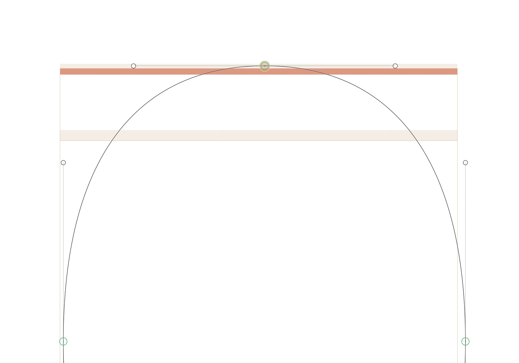
Hi! Just wanted to suggest to please push the red incompatibility highlight to some units above the bounding box, instead of overlaying it with the zone, which is then hard to see. It also scales differently, which makes it even more fun:
You can disable it. From a previous answer by Georg:
“Glyphs 3 changes the default that it always checks for compatibility between masters, if you actually interpolate or not. You can add a custom parameter “Enforce Compatibility Check” and disable it (in Font Info > Font > Custom Parameters).”
Sure, but now it forces to double-triple check overshoots, unless you fix compatibility, which may have a lower priority on the list. In other words, “annoying” should notify, but not get in the way, don’t you think so?
And if it was a few units higher, that would still be pretty annoying
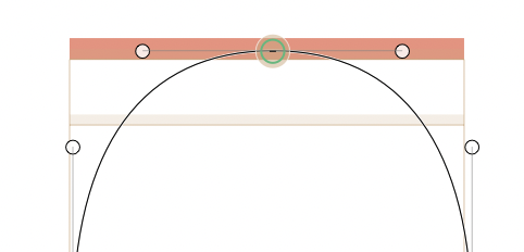
Yep, but it doesn’t indicate where it sits on that zone. For example, on the second screenshot it seems like the node is somewhere in the middle of the zone, and that changes with every zoom level, triggering to check it every time.
So perhaps even drawing it at the top of the zone, instead of the box, would make it easier to see, with pretty much the same functionality.