I am designing a family with Text and Display styles. I have Thin and Bold extremes of each. All masters have correct outlines, but I have a problem when interpolating instances. I tried to follow the guidelines in the Glyphs Handbook, but the Masters and Instances windows in the updated program no longer match those illustrated in the handbook. I created a Regular instance between the Thin and Bold Display styles which were the only ones in the Instances panel. Both are active. The Regular Instance which has been created is between the Thin Text and Bold Display. The illustration shows: Thin Display, Regular instance, Bold Display, Thin Text and Bold Text. What am I doing wrong?
I don’t understand you setup. Can you post a screenshot of the layer panel?
Are you using the same starting nodes between masters? I’ve seen wonkiness like this in my stuff when I’m off by one node.
Here are the Masters, Instances and Layer panels. I haven’t actually been using the Layer panel.
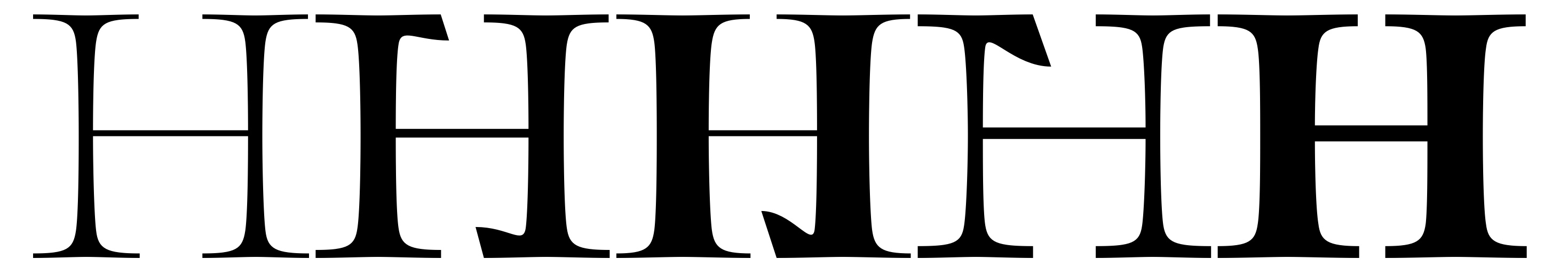
The wonkiness is deliberate to show which glyphs corresponds to the instance.
The instance is supposed to be the middle glyph between 1 and 2, but is actually interpolated between 3 and 4.

OK. Let me put it another way. If I have four Masters; Display Thin and Display Bold plus Text Thin and Text Bold, how do I specify that I want an instance created between Display Thin and Display Bold or Text Thin and Text Bold like I used to be able to specify in FontLab?
I think you need to set up a second axis. Because you also want an optical size, right?
OK, thanks. Yes, I want interpolated weights for Display and Text. I’d like to know where is the information regarding Axes coordinates, Weight and Optical size for each Master in the manual, or tutorials? I still don’t know how to do what I want as indicated in the question above. I think you assume I know what I’m doing, but I’m fairly new to Glyphs, having worked in FontLab 5 (and VI until I could stand it no longer).
First I would add an optical size axis as @mekkablue suggested. To do so:
- Go to Font info (command + I)
- In the font tab add a custom parameter and look for the parameter ‘Axes’
- If you double-click the value for the ‘Axes’ parameter and then click the little cog, you can add an axis and select Optical Size as the name of it
Now if you go to the masters tab you will see that each master now has two fields for coordinates: weight and optical size. I would double check that each master has sensible values and then add your desired instances accordingly.
For an instance between Display Bold (let’s say wght=700 opsz=72 ) and Display Light (let’s say wght=100 opsz=72 ) the instance may have a value of wght=500 opsz=72
For an instance between Display Bold (let’s say wght=700 opsz=72 ) and Text Bold (let’s say wght=700 opsz=12 ) the instance may have a value of wght=700 opsz=36
I thought Glyphs was supposed to be easy! It was much easier in FL5 just to select 2 named fonts and do a percentage blend between them.
I have done what you suggested but it doesn’t work. Where are these opsz values from?
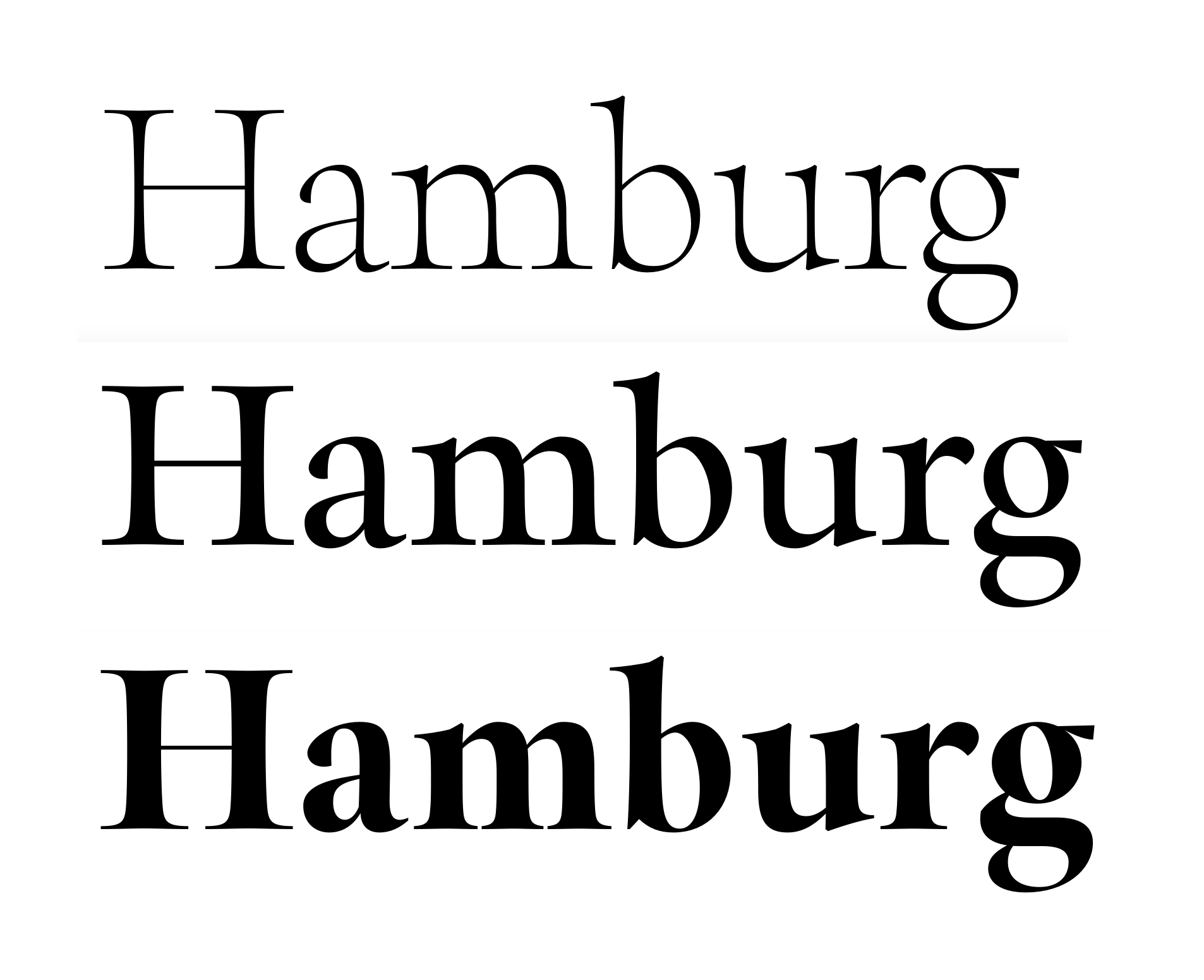
The image shows the instance in the middle, but it is obviously not a straight blend between top and bottom. Look at the thickness of the serifs and thins. How does one know which 2 fonts are being blended? Why are all these values added manually? How does one know which values to insert?
I just don’t get it.
If you only had two masters, it would be much easier  But you have six and that was not even possible in FL5.
Have you read the Multiple master tutorials? https://glyphsapp.com/tutorials/multiple-masters-part-1-setting-up-masters
- Give your masters better names for keeping oversight. Now you have two different Thins, but they could be Small Thin and Big Thin and Small Bold and Big Bold. Or maybe Low and High Contrast instead of Big and Small.
- Consider reducing masters. Is the Regular master really necessary? Can you move the italics into a separate file? Keep in the same file only what you want to interpolate.
- For masters, find values that make sense for you, then be consistent.
opszvalues could be related to the intended point size, for example, whereaswghtvalues are often related to the stem thickness. - Pick your master values in such a way that they form a rectangle in design space. A and B should share the
wghtcoordinate, but notopsz. Same is true for C and D. It is the other way around (shared opsz, but diverging wght) for A-C, and B-D:
A---------------B
|               |
|               |
C---------------D
- By picking good spots for your instances, you can control which masters are taken for interpolation. Here, instance X will be interpolated only between masters A-C, and Y only between C-D. That is why a rectangular arrangement of the masters makes life easier:
A---------------B
|               |
X               |
|               |
C-------Y-------D
- Please be more specific in your descriptions, otherwise it is hard to help you. E.g., instead of writing ‘it doesn’t work’, explain what is happening or describe the steps you are taking.
1 Like
I get it now. Finally!
Thanks very much.
1 Like