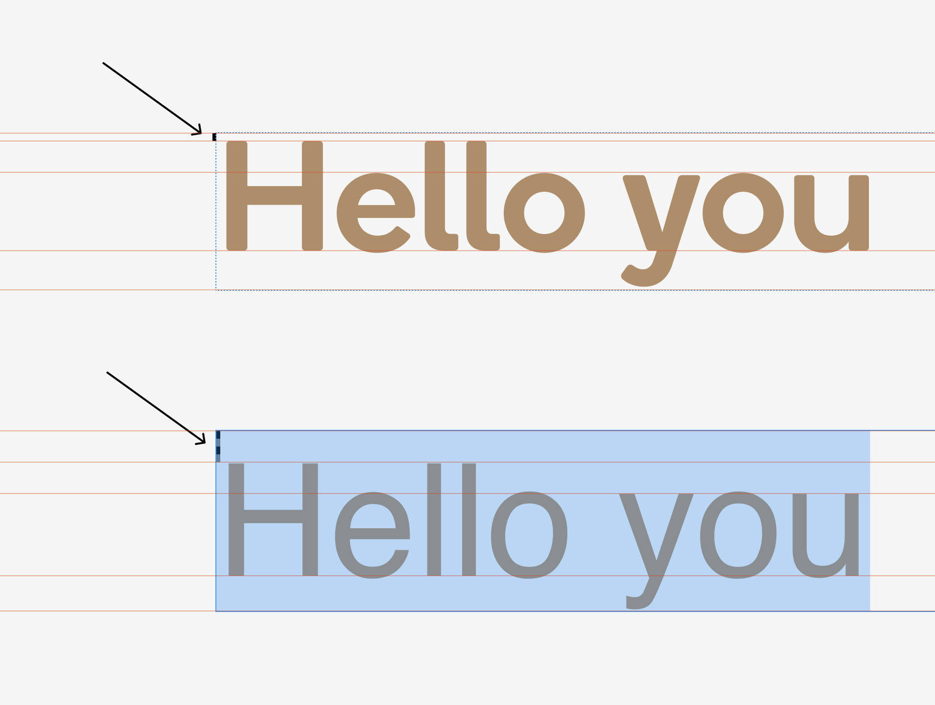
We are working on a new website were we use the Boing Regular en Medium. The problem we have is that for some reason the font designer decided to limit the space above the font (4 times less compared to regular fonts like Helvetica that is shown in the picture below). Because of this its like the font is floating too high compared to the baseline and doesnt work together with other fonts.
You can change this by changing the metrics entries in the font file. A software like DTL OTMaster is capable of that (I’m aware it’s very expensive, there is surely other software that can do it as well). Change the values in hhea, typo and win (ascent/descent) to match those of whatever font you want it to work with and save the .ttf/.otf, re-install, should work.
Not sure what the legalities of doing this are, though, to be honest.
You can also do this in Glyphs, again, if you’re legally allowed to: open the font file in Glyphs, go to Font Info > Masters, then add custom parameters for typoAscender/descender, win and hhea (you can use the mekkablue script Vertical Metrics Manager). Also add the custom parameter Use Vertical Metrics to Font Info > Font.
I would prefer to buy Glyphs Mini 2 to support this site, but is that version good enough? And are you 100% sure it will work just like other tools you mentioned?
I don’t know about Glyphs Mini 2. From my experience, just for home usage, editing a .ttf in Glyphs and then exporting it again work well enough, although it is generally not recommended. As far as I can read, Glyphs Mini 2 doesn’t support exporting .ttf files, only .otf, but importing either works. It’s not explicitly states, but I wouldn’t bet on there being support for the custom parameters you would require.
All you need is doable with ttx/fontTools, if you are somewhat comfortable with Command Line: https://fonttools.readthedocs.io/en/latest/ttx.html
Specifically, you are looking to edit the values in hhea and OS/2.
Honestly, what Helvetica does there is way too wide, and it sits clearly too low in its box (it should appear centered). My recommendation: The designer made the right choice, don’t change it. Better adapt the CSS to accommodate the font than the other way around.
Im not that familiar with code sadly. I can ask my developer, but i first going to ask him if we can fix it with css settings like Mekkablue suggested. That would be great. Thanks anyway for the help. Ill post again when i have an update!
Im the designer I love the Boing but the devs prefer something like the Helvetica with low alignment. What CSS settings would you change for this to work?