hello,
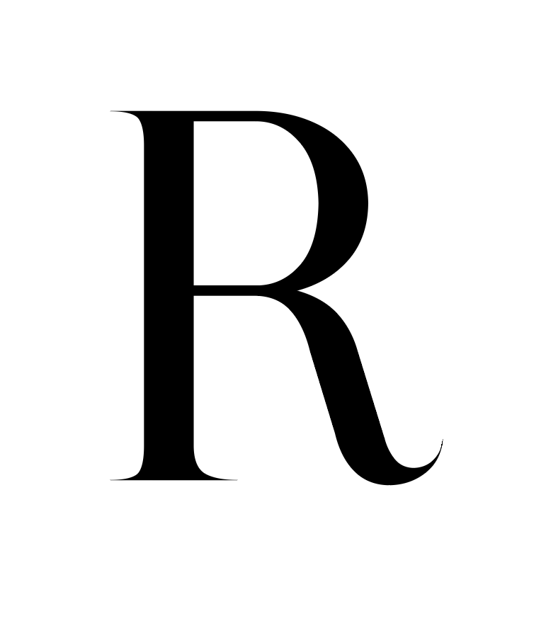
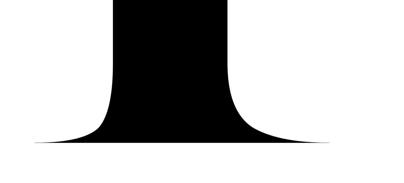
i’m working on a face that has sharp points for the serifs (and some stroke terminals) but when I test this face out in illy i get a weird ‘image’ for the letter. this only happens on some of the terminals, and doesn’t show up when i convert the letterform to an outline. aside from not ending terminals in a point, is there anything else i i should be doing differently to avoid this? (i’m still on the very 1st version of glyphs and everything else works great for me)
and these are my settings from Glyphs (Version 1.4.4 (609)):
I did try unchecking ‘Autohint unhinted glyphs’, but the result was the same, and I also tried checking ‘TTF- experimental, no hinting’ but again, the result was the same.
these screenshots were made in Adobe Illustrator 2017.1.0 (21.1.0)
oh, and this letterform is from one of the middle interpolations. the same result happens on the thin letter, but not on the bold letter.
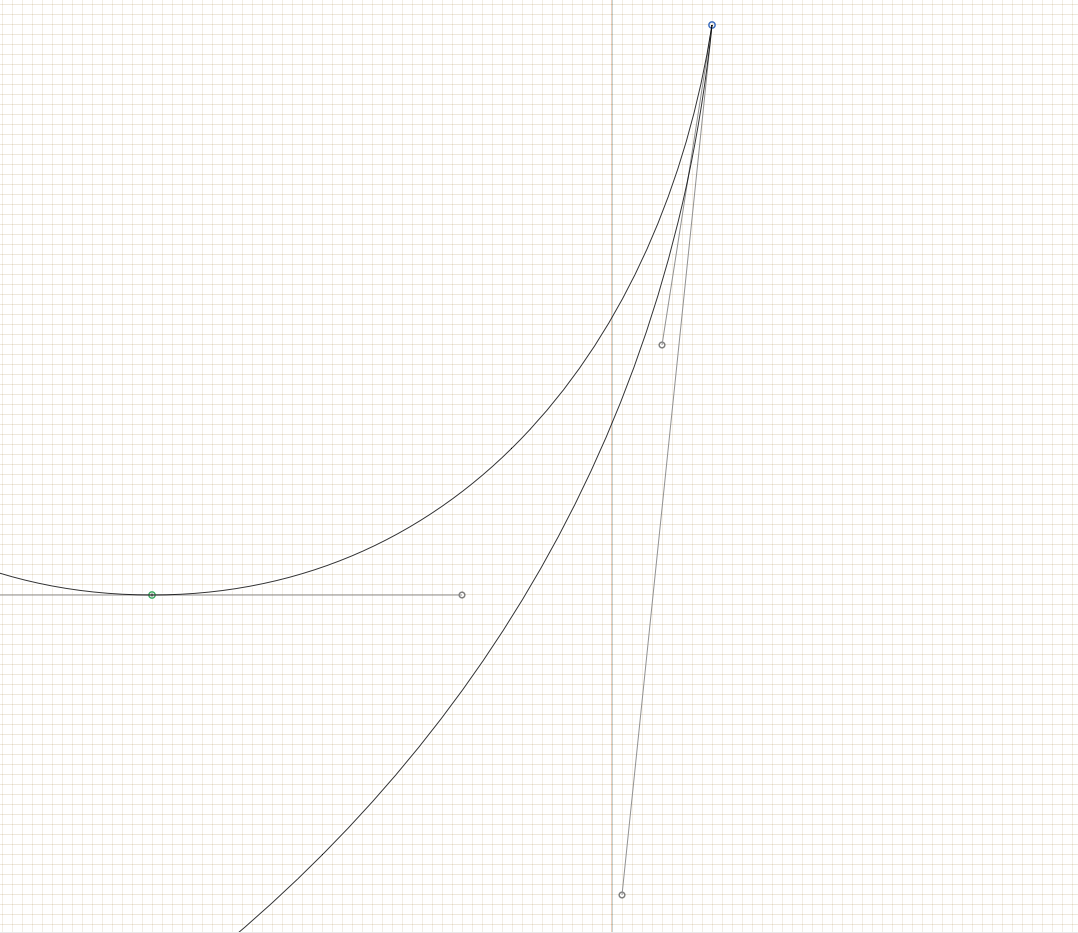
It is possible that the middle interpolation results in a position like this. I assume the bottom handle in the bold master (not visible in the first screenshot) is very short? And I assume, in the light master, the short handle is of the bottom curve, right? The problem already exists in the light master. If you make extreme pointy corners like this, you have to be extra careful with your curve segments.
Disable hinting, it probably makes no sense in this typeface, since it is only for very large sizes.
ok, yes, i’ll disable the hinting on this, and yes, i hear you on the pointy terminal issues.
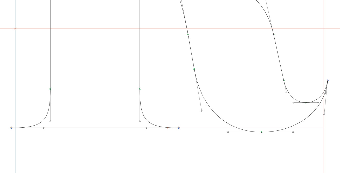
just thought i’d also send along screenshots of the complete curve structures of both the masters too, just in case you were curious. here they are: bold / thin. and thanks again for your time and excellent work with glyphs!
I know what the problem is. The inner curve is slightly overlapping the outer curve and the remove overlap is inserting points that are then rounded to the grid. Make it a tiny bit less sharp to fix it.
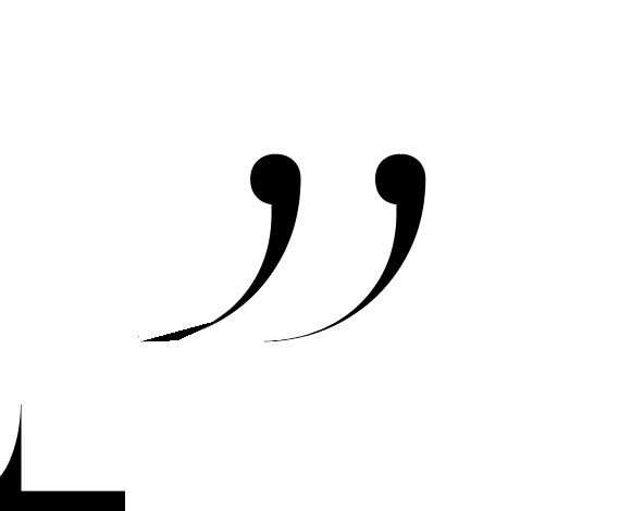
i was looking over everything again, and noticed this too - it looks like it’s the same sort of problem, but the only thing strange is that it’s happening to one of the quotes, but not the other… this is ‘quotedblright’ which is two components put into the ‘quotedblright’ and spaced apart a bit…
If it is a problem with the path, I bet the angle at the tip is too acute, again creating a number of technical overlaps. Try pulling the handles apart a tiny little bit to make sure the path cannot overlap itself there.