Separators ( are excluded from the width syncing. But all (other) glyphs need to be the same width. So it needs some GPOS trickery to make them work as expected.
I wonder how one should approach coding ligatures that are not one unit wide, but 2 or 3 units. When I have the isFixedPitch CP active, I cannot make any glyph wider than one unit.
When I disable it, I can, but then I loose the fixed pitched info, I assume?
Will the .monospace number value help in any way? What is that for exactly and is it needed? If I add/use that, I also cannot give the ligatures any other width than the one unit.
Ah, so the glyph keeps the normal one unit width and then exceeds to the right outside the RSB. And then GPOS would look like pos hyphen_hyphen_greater.dlig <0 0 1200 0>; or even pos hyphen_hyphen_greater.dlig <0 0 ${.monospace*2} 0>;
That seems to work
Love it. Thanks a lot! Happy to finally have a way to implement these in the hopefully most-Glyphs-compatible appraoach.
Sure, i meant the proper handling of glyphs that are wider than one unit inside of Glyphs
In the past I tried a lot of off approaches, which all felt hacky and wrong.
It’s more about things like arrows, that form from combinations like --> and need to keep the width of the single units combined. I’d rather draw the long arrow into one glyph instead of piecing it together from alternates. Or maybe for some glyphs single pieces could work indeed
For things like :: where the middle gap might need horizontal reduction, it certainly could be an option. But for this I consider using GPOS, too.
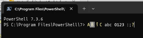
FWIW, PowerShell seems to ignore the “GPOS trickery” (setting advance widths of combining marks to 0) completely, and centers the resulting glyph inside the double width: