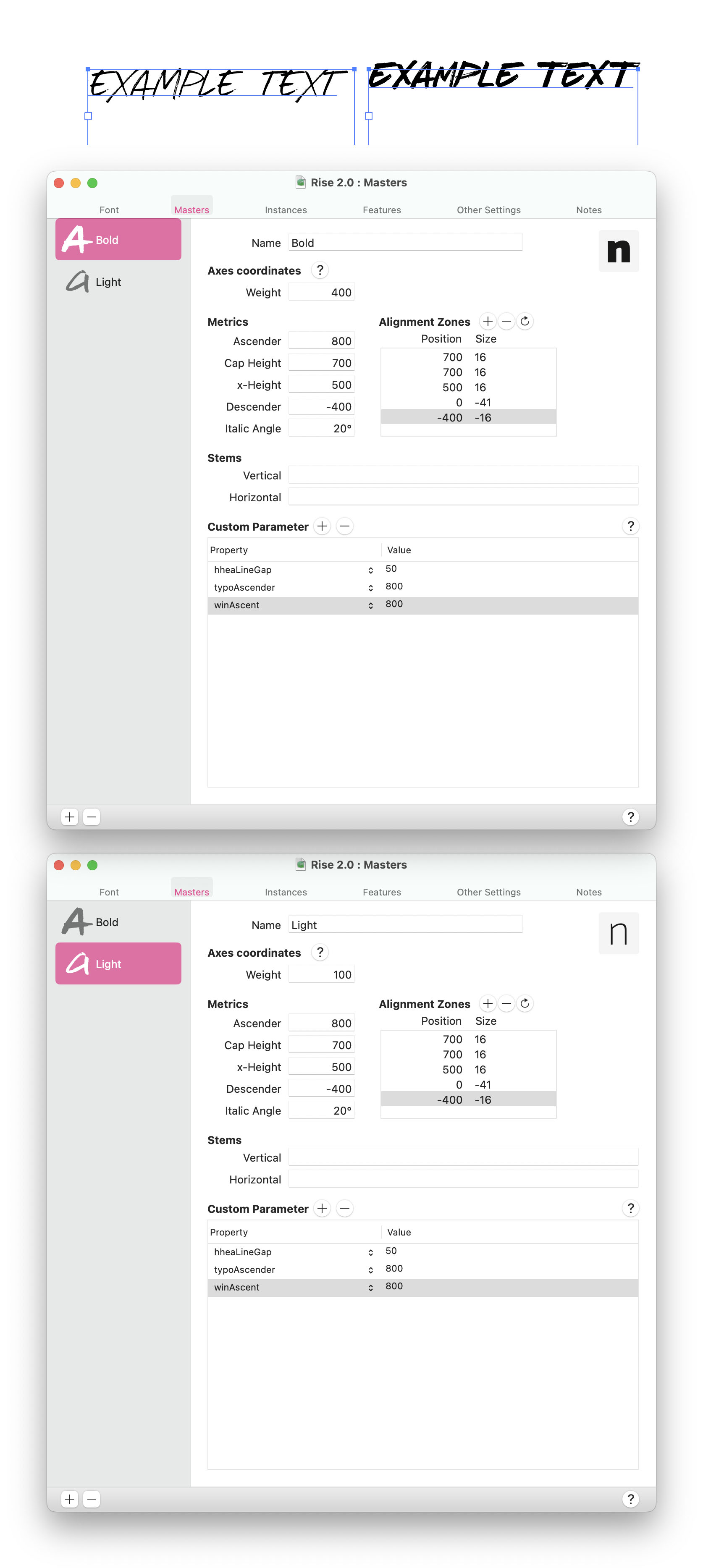
So I’ve made a custom font and it includes both a Regular and Bold face. It all seems to work correctly in glyphs but when i export the font and use it in illustrator the Bold face shifts the baseline up so the letters are outside of the text box perimeters. See screenshot for example.
I found another thread on here with a similar issue and have tried to add some custom parameters to the bold face to force the ascenders but it has had no effect.
Here are the font master tabs in Glyphs. Any help noticing what ive got set up incorrectly is greatly appreciated.
How it is displayed in Illustrator depends on your ‘Area Text Settings’ in Illustrator. In the default setting it will measure the height of your lowercase d. See the Vertical Metrics tutorial for further details.