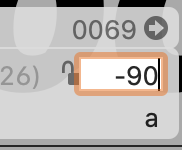
In the info box, the kerning value text box on the right side overlaps the lock icon, which reduces the icon’s clickable area by about half. This makes it very easy to misclick, and especially after kerning for a while it’s becoming increasingly frustrating. It’s made worse by the fact that the cursor doesn’t always change shape when hovering over those elements, so you can’t be sure where you’re about to click. (Though this last part may be a bug related to Kernkraft; everything seems to get laggy when I use it.)
I’d also argue the lock icons are much too small to begin with. It would be great if they could be made bigger and/or there were keyboard shortcuts for them.
I’m using Glyphs 3.1 (3133) on Mac OS 10.15.7.