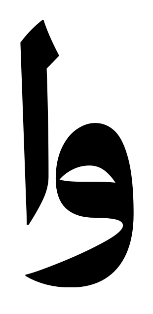
I have a problem in kerning letter waw with alef, not sure if there are other letters have the same problem. The problem is setting a value between these letters and looking fine in glyphs, but in FontGoggles and Adobe it looks different
This glyphs 3:

This FontGoggles:
I need to increase the kerning value too much in glyphs to match the previous kerning view, it something like 100 in glyphs = 50 in FontGoggles