hello everybody,
i’ve just exported a font for testing and in the swash version I found a really deep descender (i’m testing on adobe apps).
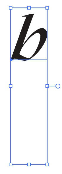
I’m not sure but this may be caused by some letters like /p that have a long swash that go deep down below the descender line.
Which is the best practice in these situations? Do i have to force the vertical metrics (if yes, which is the way to do that)? Do i have to leave in this way?
Thank you in advance for any advice you can give to me.