Sent.
In the t_s_u.liga, you need to add more anchors because it is a ligature. Hit Cmd+Opt+U to add all default anchors. You can use the “Show Mark Preview” plugin from the Plugin Manager to get a better preview.
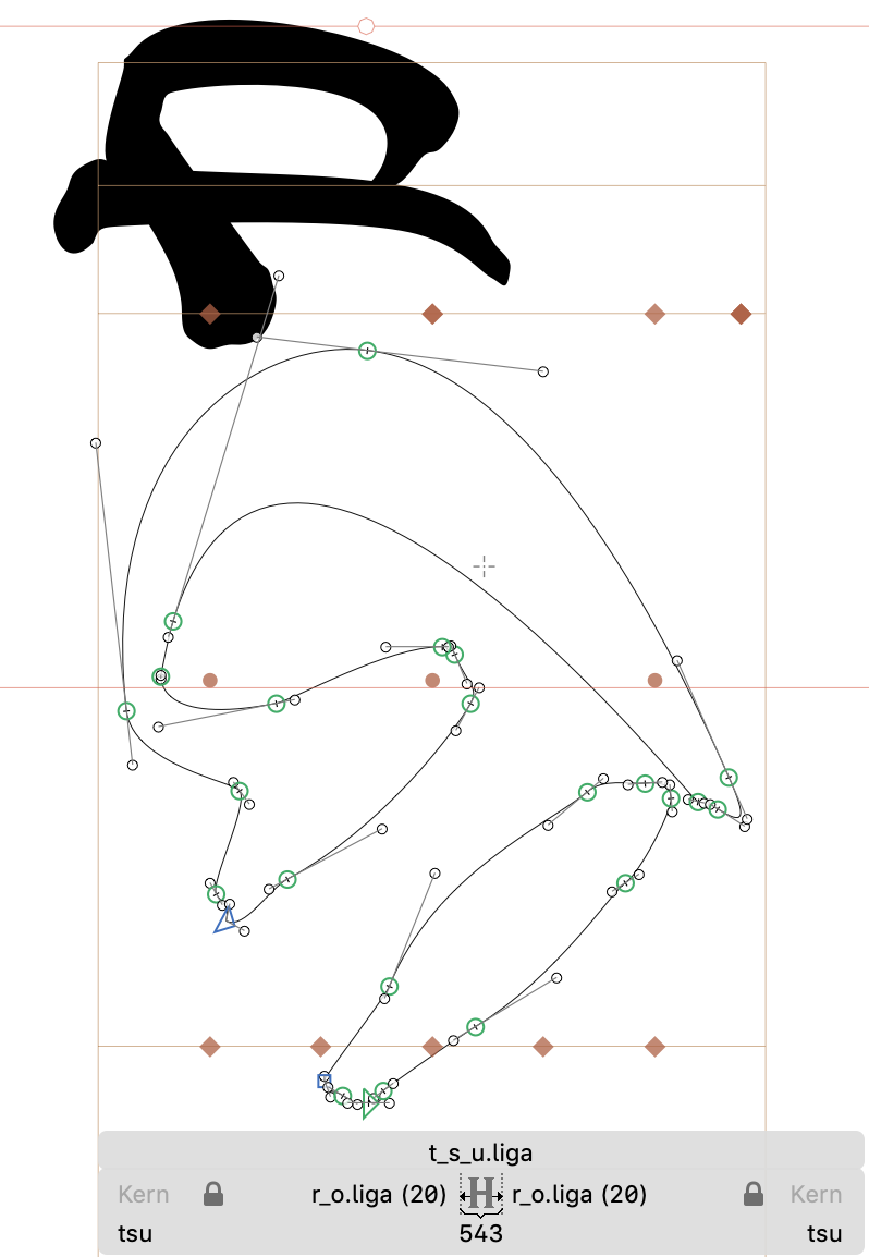
Thanks. I tried that, and it had no effect. Do I need to do it also to the mark (k_a.liga)? Here is t_s_u.liga:
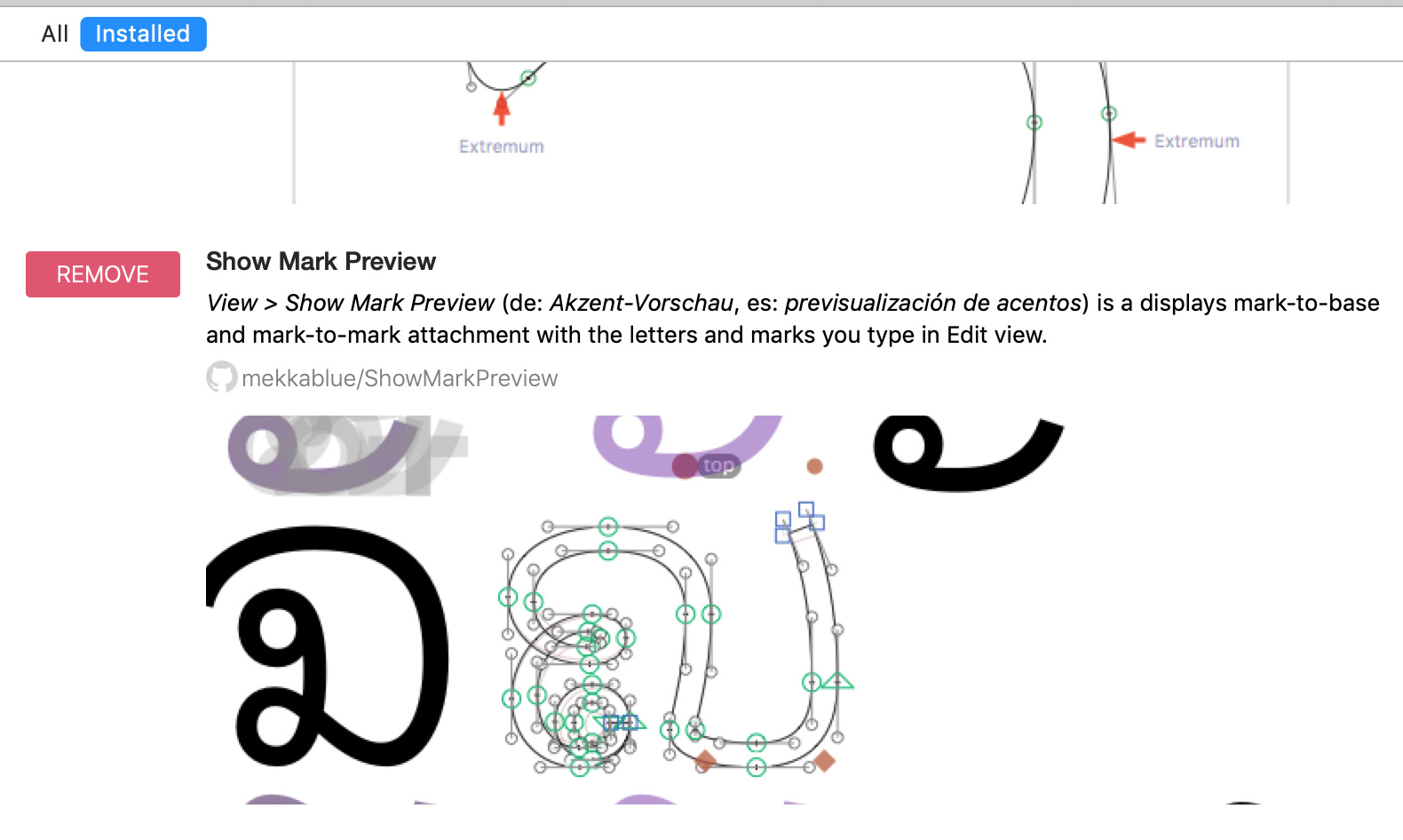
I installed that plugin, and yet I see no way to use it. It says:
View > Show Mark Preview (de: Akzent-Vorschau , es: previsualización de acentos ) is a displays mark-to-base and mark-to-mark attachment with the letters and marks you type in Edit view.
See:
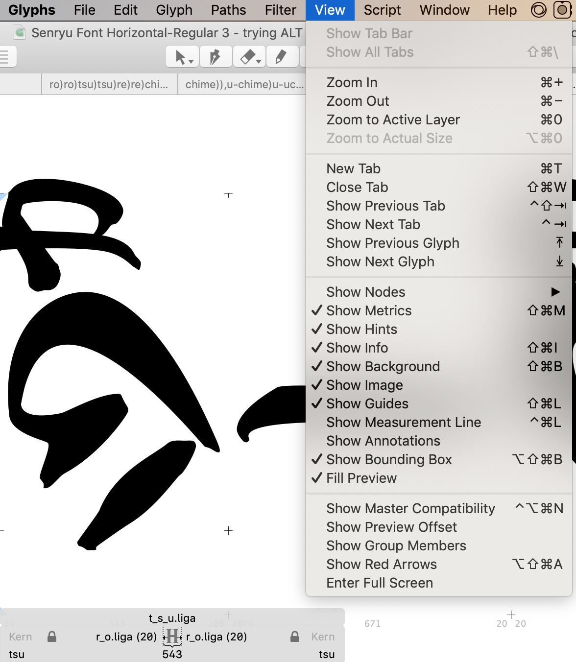
And yet I see no such ting on the view menu:
I noticed that following your method of adding automatically, there is no anchor called top. Only top_1, top_2, top_3, and top_4.
Should I change one to top? Or does renaming them make it not work? We need the whole set of markers to make it function at all with one marker?
I tried renaming the _top marker in k_a.liga to _top_1 to correspond to one of the ones in t_s_u.liga as I have read they must be the same except to the first _. That still did not work.
Ligatures don’t need a top anchor.
But the “mark” just needs a “_top” anchor. That worked for me in Indesign.
Have you restart Glyphs to load the new plugin?
Thanks for the tip - restarted and it works now.
Oh, so how would it decide where to put the mark, without an anchor? Now that ‘show mark preview’ is working, I can see the preview if both ligatures have anchors, but if I delete the top anchor from the base ligature and only keep the _top anchor in the mark ligature, the preview of it disappears.
I only heard of Indesign since trying out this Glyphs app. I’m a bit confused - is this the case: that Glyphs doesn’t let you see how the font will actually be, i.e. is not enabled to preview the font? So you have to do that in other apps?
I was not given a straight answer on this on another issue so I am finding it very confusing.
And, related to that, is this ‘show mark preview’ trying to address that issue? I see purple versions of the ‘mark’ glyphs, in addition to the already black versions. Is it that the black versions are the errors from Glyphs attempt at previewing the font, and the purple ones are the real preview, how the font would actually appear when using it in an app, such as Pages, TextEdit, LibreOffice and so on? I had been assuming that the preview Glyphs was showing me was how they would appear, hence with anchors doing nothing whatsoever, I had assumed they were indeed doing nothing whatsoever.
I don’t mean to be rude by asking this. And I’m not trying to point out ‘issues’. I’m merely genuinely trying to understand this app. I think it’s a wonderful app! But understanding how it is functioning and what I am seeing, is vital for me to be able to use it to create desired outcomes. Without such knowledge, it’s very hard to go forward.
I also think this forum is amazing. I did not think I would be able to learn font making so quickly. It’s taken me about 2 weeks and I’m nearly finished with my first font! Just these final complex issues to iron out…
Ok so latest update: since adding marks to t_s_u.liga, and to another ligature, as per these instructions:
I tested the font using both Pages and TextEdit.
- t_s_u.liga no longer works. It appears now as ‘t’ + ‘s_u.liga’. Note that before, I could write ‘tsu’ and it would show the t_s_u.liga glyph. I could even write ‘tsusu’ and it would appear as ‘t_s_u.liga’ + ‘s_u.liga’.
- There has been no change in the others.
- Even when I now delete all markers from t_s_u.liga, and export the font with a new name, t_s_u.liga still no longer works, appearing as ‘t’ + ‘s_u.liga’. That seems very odd.
- That instruction seems to me to potentially contradict your other statement:
Do you mean t_s_u.liga doesn’t need any anchors at all? Or, is it that you mean it needs actually the full set, as per your first statement, but that it doesn’t matter that the markers are called 'top1; ‘top2’ etc. and so do not need one specifically called ‘top’?
Also, I tried (Pages and TextEdit as above) base ligatures with a single marker, ‘top’, using that in combination with non-spacing marker ligatures with a single ‘_top’ marker - no change.
And, I tried base ligatures with no markers, using them in combination with non-spacing marker ligatures with a single ‘_top’ marker - no change.
That’s the point. Mark positioning needs both.
How does that reconcile with your statement:
Also, as I explained above, it is not working whether or not there are pairs of marks. As I explained, i tried with adding _top anchor to the mark ligature, and full set of anchors to the base ligature - no change. And:
I seem to have tried all the ways you said and yet none of them appear to be working.
I sent you the Glyphs file - thank you for testing it in Indesign. How about in the Glyphs app itself? Did it work? I don’t know about Indesign but so far it seems not to be working in:
- Glyphs
- TextEdit
- Pages
So I am at a loss as to what to do.
That was probably meant differently. Usually ligatures are ligatures of letters, rarely marks. Ligatures of letters would have top_1, top_2, etc. while ligatures of marks would have the regular _top and top.
In any event, if you want to have mark positioning, you need corresponding anchors in letters and marks. Please read the Diacritics tutorial to fully understand the principle.
To be fair, you are attempting something pretty rare and advanced as your first font. I am sorry I can’t spare you from a lot of extra reading. And I also cannot guarantee it will work in all apps as desired.
I really appreciate your help. I did provide screenshots above of how I did follow the instructions on the tutorials provided. Including what you just said. See here for example:
Since I seem to have followed the instructions, precisely so far as I can see (and with screenshots provided - do they not look right?) it remains a mystery as to why it is not working.
Did they work for you in the file I sent you? You only mentioned Indesign, which I do not have.
Is it possible that the system is having a hard time realising that the mark itself is a ligature?
Would you mind if I send the file to you again and you could check it in something not Indesign, such as:
Glyphs
Pages
TextEdit
Then we would be on the same page, since able to use at least one of the same apps to see if changes are happening? I also aim to make this font compatible with Pages, and if possible also TextEdit. I’m sorry to ask for this help but it could make the difference between making a font (and future fonts) that work, or not.
the t_s_u.liga glyphs needs the top_1/2/3 anchors.
What Georg said.
And since you defined the other ligature (k_a) a nonspacing mark, you do not need negative sidebearings in that one. Simply set LSB and RSB to a generic value that makes it easy to edit in Glyphs, e.g. 40.
Also, I believe the corresponding anchors are not on the same height. So mark positioning will not look like they appear when just typed next to each other (as they are in the screenshot).
And while you’re at it, I think you can improve the paths themselves as well. Consider the advice written in the Drawing Good Paths tutorial.
Thanks @mekkablue. Can i ask a question about that? So the tutorial says:
This is important: every curve segment should fit nicely in a triangle.
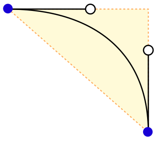
That seems to be the most notable rule I’m breaking. So far I have found (unknowingly) breaking that rule very helpful. It allowed me to make very pleasing shapes. So can I ask, what is the negative effect of doing that? For example, here is how my font looks so far:
Senryū font version 24.pdf (33.0 KB)
It’s looking great I think! That was a pdf exported by Pages. I do not see any negative result associated with my breaking that rule. Understanding what is negative about it may help me understand why I should follow that rule.
I think I understand what you’re saying. The position they appear in here:
… is how I want them to appear. I made it like that before trying non-spacing marks. By making the k_a.liga’s position high, and making that severe -579 on the LSB.
Then, when I tried the non-spacing method, I made k_a.liga into a non-spacing mark, and added the anchors (in various different ways for a number of tests of the different methods I was told to do here on this thread). I deliberately added the marker on k_a.liga very low down, so that I could easily see if it changed accordingly - the k_a.liga should have appeared far higher up, so far as I was understanding. It would have been ‘wrong’ but would have shown whether the anchors were having any effect. And, they did not have any effect on Glyphs, despite wherever I moved the anchors on either glyph. Finally I left the base anchor on the x-height as this was instructed in the tutorial, and made the k_a.liga mark where you see it. No change on Pages nor on TextEdit. The only place I can see it change is on Glyphs with the “Show Mark Preview” plugin switched on, which makes the purple position appear as if the anchors are working, with the black also still there as if they are not working. But only the black positions come out in the actual font when exported and used in Pages and TextEdit. Also I still do not understand if we are meant to expect it to be exporting the black positions or the purple positions. Or how I can get it to export the purple ones instead of the black ones.
So, now to:
and
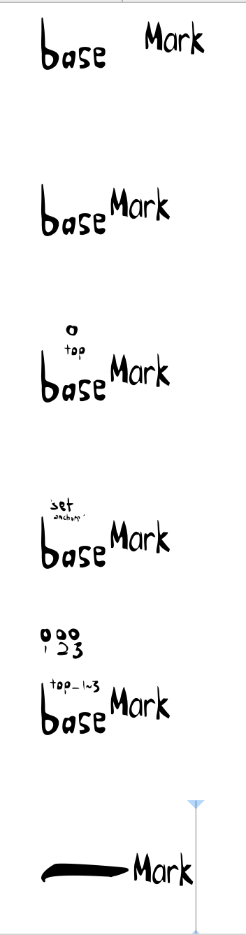
I have now done a systematic test which should hopefully diagnose what is going on here. I have tried all the different methods recommended to me. To make it easier to see, I have created brand new ligatures, as nonspacing marks with value 20 sidebearings. Here is their name and description:
b_a_s_e.liga - no anchors
b_a_s_e_two.liga - one anchor, _top - the glyph image shows its position
b_a_s_e_three.liga - I chose ‘set anchors’ which made many. The top ones were, from left to right: top_1; top_2; top_5; top_4 (there was no top_3)
b_a_s_e_four.lliga - I set 3 anchors, top_1; top_2; top_3 - the glyph image shows their position
m_a_r_k.liga - one anchor, _top - I forgot to indicate the position but it’s below the letter ‘a’ at a distance of about 3 quarters the height of ‘a’.
I also included a ‘hyphen’ which does have one marker - top - above the glyph in the centre. So we can see how the behaviour changes depending on if the base glyph is a ligature or not.
Here’s a demonstration. Here is the text:
base mark
basemark
base2mark
base3mark
base4mark
-mark
Here’s how it appears in Glyphs - you will have to click on these next images to see them not cropped:
Here with the “Show Mark Preview” plugin switched on:
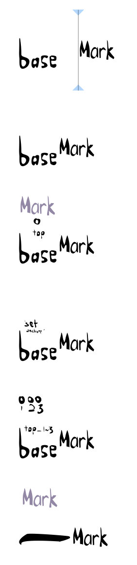
Notice the anchors are only working with b_a_s_e_two.liga and hyphen.
Then exported to Pages:
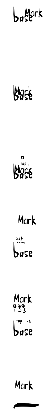
Notice the anchors are only working with b_a_s_e_three.liga, b_a_s_e_four.liga, and hyphen.
So there is a discrepancy between the “Show Mark Preview” plugin and how the font works in Pages. Also TextEdit behaved in exactly the same way as Pages.
How should I proceed?
Also, when there are multiple top markers, such as top_1; top_2; top_3 - does the mark glyph just match its _top to the one with the highest number? It looked to me like on those it worked, it was doing that.
Regarding this issue:
I checked the liga list in features, and sub t s u by t_s_u.liga; is above sub s u by s_u.liga; in the list. So I expect this issue may be being caused by the fact that s_u.liga is a nonspacing marker? Perhaps that makes an hierarchical difference?
If so, then is there a way we can have s_u.liga as a nonspacing marker, but still preserve the t_s_u.liga? Perhaps an ignore rule or something? If so, how to write it?
Again just to say, the font is going really very well. Hopefully you can see in the PDF I uploaded. I know it may seem ambitious as my first font, but to be frank, my whole reason for learning font making is because I need to do these specific things for this way of writing, that, to my knowledge, have not been accomplished before in a pleasing manner. Hence finally deciding to make it myself, and therefore learn how to, with your kind assistance and the wonderful tutorials on this website.