Hello,
I’m new to type design (and Glyphs), and even more new to any kind of computer programming, so I may have bit off more than I can chew for this variable font project. However, I’ve managed to get to a point where I’m seeing certain aspects behaving as I hoped, but others clearly not.
I’m working on a modular variable font that doesn’t necessarily interpolate between masters, but transitions incrementally between letterforms with more or less “modules.” I spent a while looking for a way to limit the number of interpolations between axis coordinates, so jumping to the whole numbers defined in each master, but I couldn’t find a solution. I don’t know if this is practical for the font, but I’m interested in knowing whether or not it’s possible.
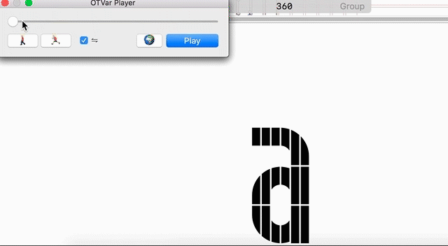
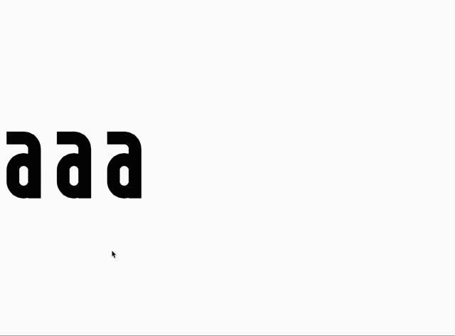
I ended up finding another way by using alternate glyphs, which is showing the desired results in the OTVar Player, but doesn’t work after exporting and using testing it in the Dinamo Font Gauntlet or Adobe Illustrator. I also tested it in a html/css project to even less desired effects where the spaces between “modules” aren’t visible.
gif of html/css test results (you can see some of the modules moving incrementally while other modules are bugging slowly outwards and even growing which is true for Dinamo and Illustrator tests as well):
(the streaking at the top doesn’t actually happen)
I’ve also tested a version with both a height and width axis and a lot of alternates, which behaves the same way as the version above with the single axis.
The font with two axes actually works with the exception of the same migrating/enlarging modules and something weird happening with the widest variation of the font only displaying the shortest variation of the font when the height axis is all the way up.
Please let me know whether or not my problem is clear.
I’d like advice on why the exports aren’t behaving like the OTVar Player and why it appears differently in the html/css test. I tried adding the autohint, disabled subroutines, and UPM scale parameters with no success.
I’d also like advice on any better ways of doing this, or any resources to learn how to code/draw the shapes or letterforms themselves more efficiently.
I’m not confident it’s the issue, but what I planned to do next was reorder the shapes to see if that’s what’s causing the migration, because the shapes I originally drew (the corners of each letterform) seem to be the only ones moving incrementally. But each master has identical alternates so I don’t think it’ll solve anything.
Again, let me know if any of this makes sense. I really appreciate whatever help anyone can give me.
Thank you!
P.S. I had to remove some images/gifs that might’ve helped, so let me know if I need to share anymore info.