My new font is out today!

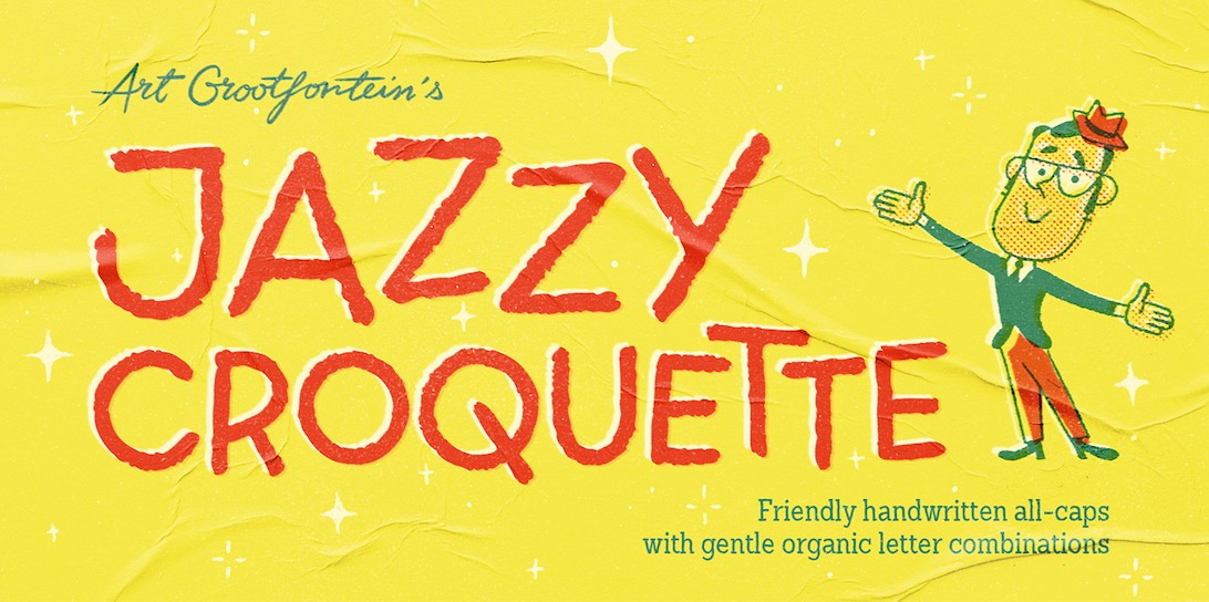
Hello the Glyphs community !
I’m tremendously proud to present you my new font Jazzy Croquette !
image

This typeface couldn’t have been done without the help of 3 very generous people on this forum :
@GeorgSeifert, @mekkablue and @Elena.
So as a gesture of thanks, you’ll find a little wink to each of you guys in 3 of the sample images…
Can you find them ? :smile:

4 Likes

Looks awesome @ArtGrootfontein - both the font and the images!
re: the wink - i did find my name :wink:

Well done @elena ! :grin:
Yours was not easy !

1 Like

It looks great, and congratulations! I just finished mine too. Feels good, doesn’t it?

Thanks, @Jack.Martin !
Where can I see yours ?

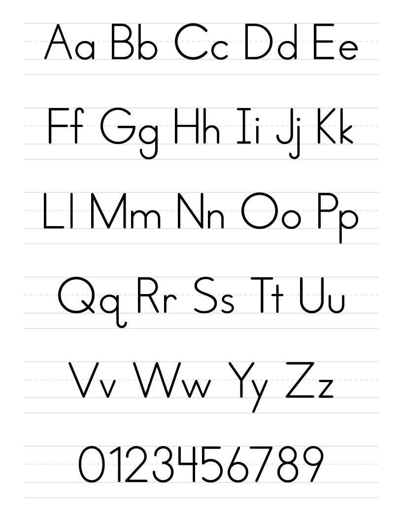
It’s not available to the public (yet). I designed it for my company which is in the education business. It’s designed to work with penmanship lines to help young children recognize letters, numbers, and punctuation. You’d be surprised that there are very few typefaces like this and they’re very poorly drawn.

What is the reason you pick the one story ‘a’ and ‘g’ (also the symmetric ‘b’ and ‘d’)?

Nice job, @Jack.Martin, thanx for sharing this.
It’s very legible.
Rosemary Sassoon also worked on a similar project with a font family developed specially for use in children’s reading books :
https://www.myfonts.com/fonts/sassoon-williams/sassoon-primary/

I work with primary school educators. Most agree that the simplest shapes are the easiest to recognize, read, and trace. This also takes into consideration children with learning disabilities. As children mature, other typefaces are introduced.

YES! YES! We’ve just discovered her work and are considering using them. Even as an adult, they’re beautiful to look at. I might buy them for myself :grinning:

Funny thing is that research in the subject suggest to use more details. Have a look at the research of Sofie Beier and Ann Bessemans.