I am currently trying to design a typeface family with 7 straight weights and 7 italic weights (those I named “cursive” to be more fancy). Unfortunately when I test the fonts in Adobe apps, the submenu seems to be in wrong order. What is curious is that it seems to be different in every app. I have checked the instances time and time again, and I can’t find what am I doing wrong.
Here are some pics:
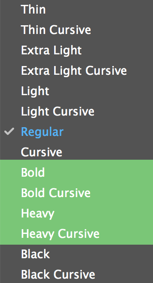
In indesign everything seems to look fine.
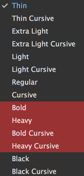
In illustrator some straight weights get ahead of the cursive weights.
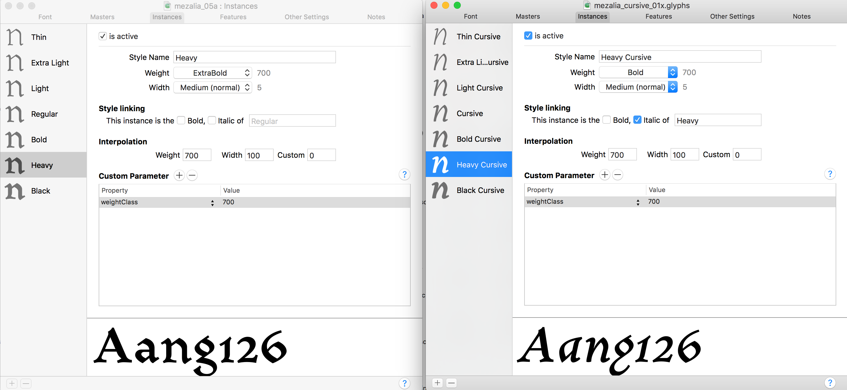
Delete the weightClass parameters, and set the Weight pop-ups properly. Bold should be Bold, Black should be Black. Consider renaming ‘Heavy’ to ‘Extrabold’, but in any event set the Weight pop-up menu to ExtraBold.
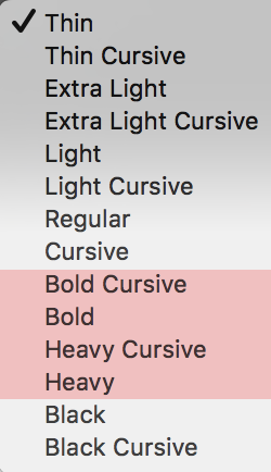
Sorry. The screen was made after an hour of increasingly more frantic attempts to correct the problem. For most of the time the Weight menu was the same for both variants, and the problem persisted.
I read the Naming tutorial.
I wasn’t using Adobe Fonts folder, because I don’t install my fonts there, so I didn’t think testing there would be appropriate. I did this now, and the order was fine. But when I tried to install the fonts back in the system some mix-ups appeared again. Is this a cache problem?