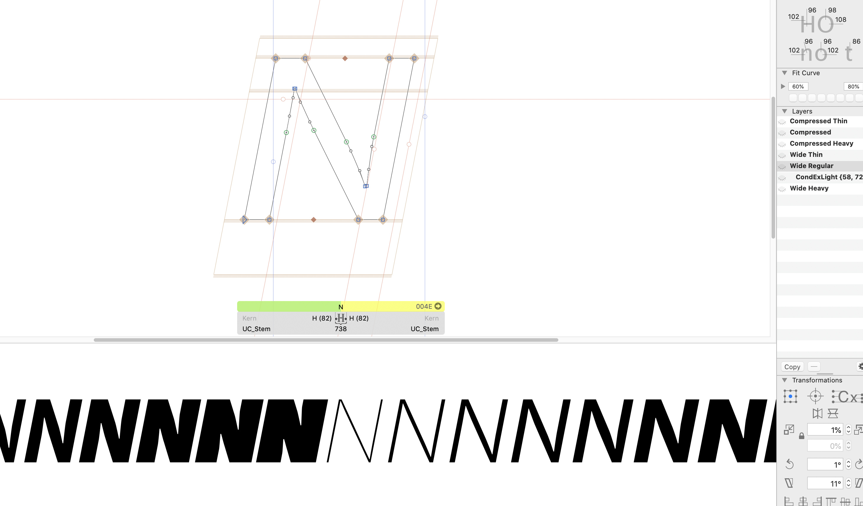
OK, I’ve got a new interpolation problem. As soon as I add an additional master for N to correct the width of the cross stroke, the interpolations go crazy. I am using the cutting edge version, the same happens in 1271. In an older version I’ve tried the problem is not there. All the outlines are compatible.
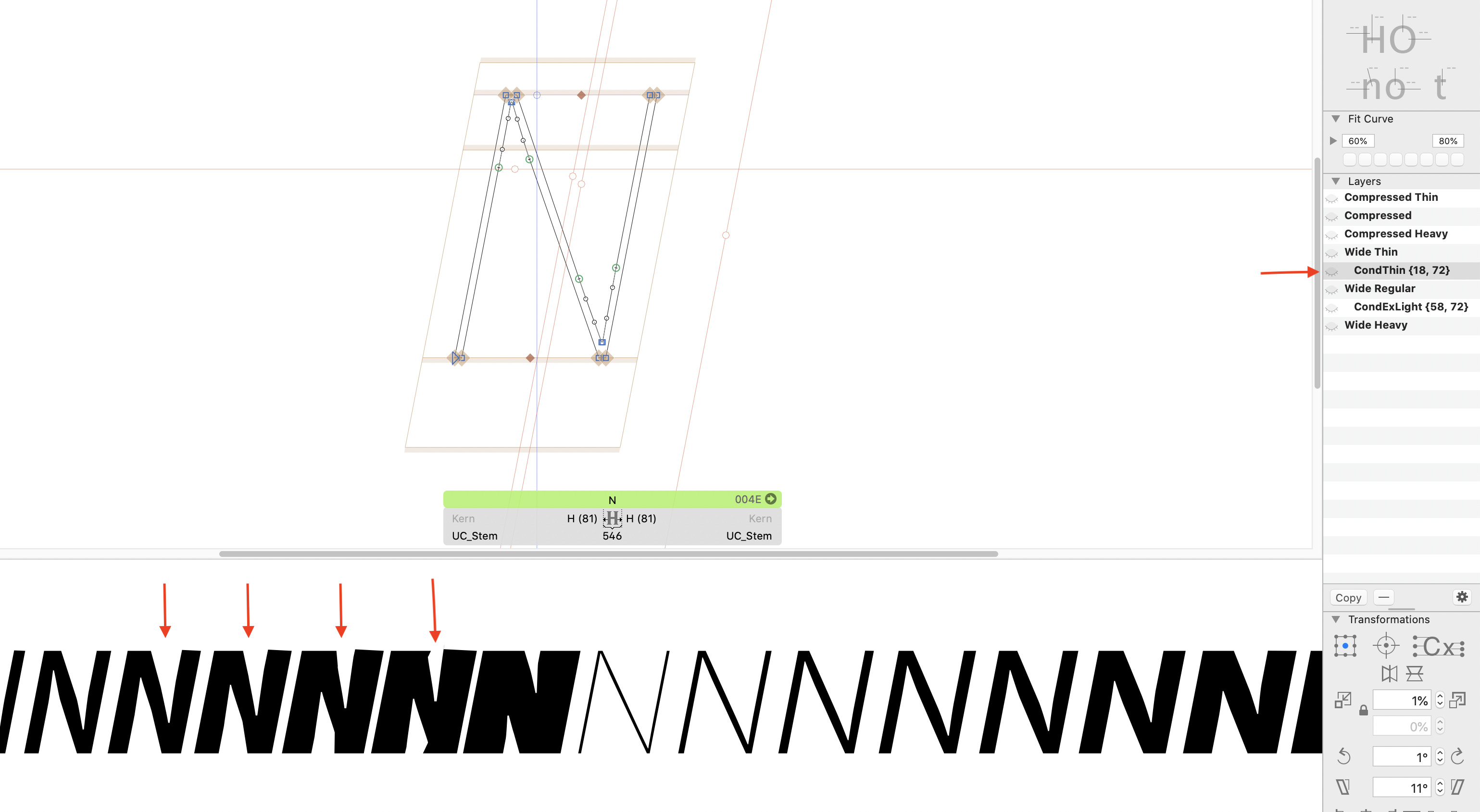
I’ve tried moving the brace layer under other masters but the problem re-appears. Interesting, the problem only appears on the middle-width (Condensed) instances between Regular and Heavy. I have 5 widths: Compressed, ExtraCondensed, Condensed, Normal and Wide. The masters are Compressed and Wide (Thin - Regular - Heavy).
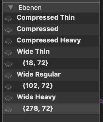
OK it looks good now, I used {18, 72} {58, 72} {278, 72}. But this seems like a temporary solution, additional masters should work without this hack, right? And I’m a little worried now the same glitch will appear in other places I haven’t noticed.
I would use 102 instead of 58. Otherwise you get in trouble if you like to export as a variable font. And it is easier to draw as you know your stem thickness form the other masters.
I don’t understand why creating additional masters with the brace trick is causing so much problems. I’m heaving a hard time getting the shape of the S to look good in many instances. The problem is, the more masters I add, the stranger results I get. Is there a rule for proper positioning of the brace layer? Why would adding more masters create silly shapes? If I remember correctly in older versions of Glyphs this was not a problem.
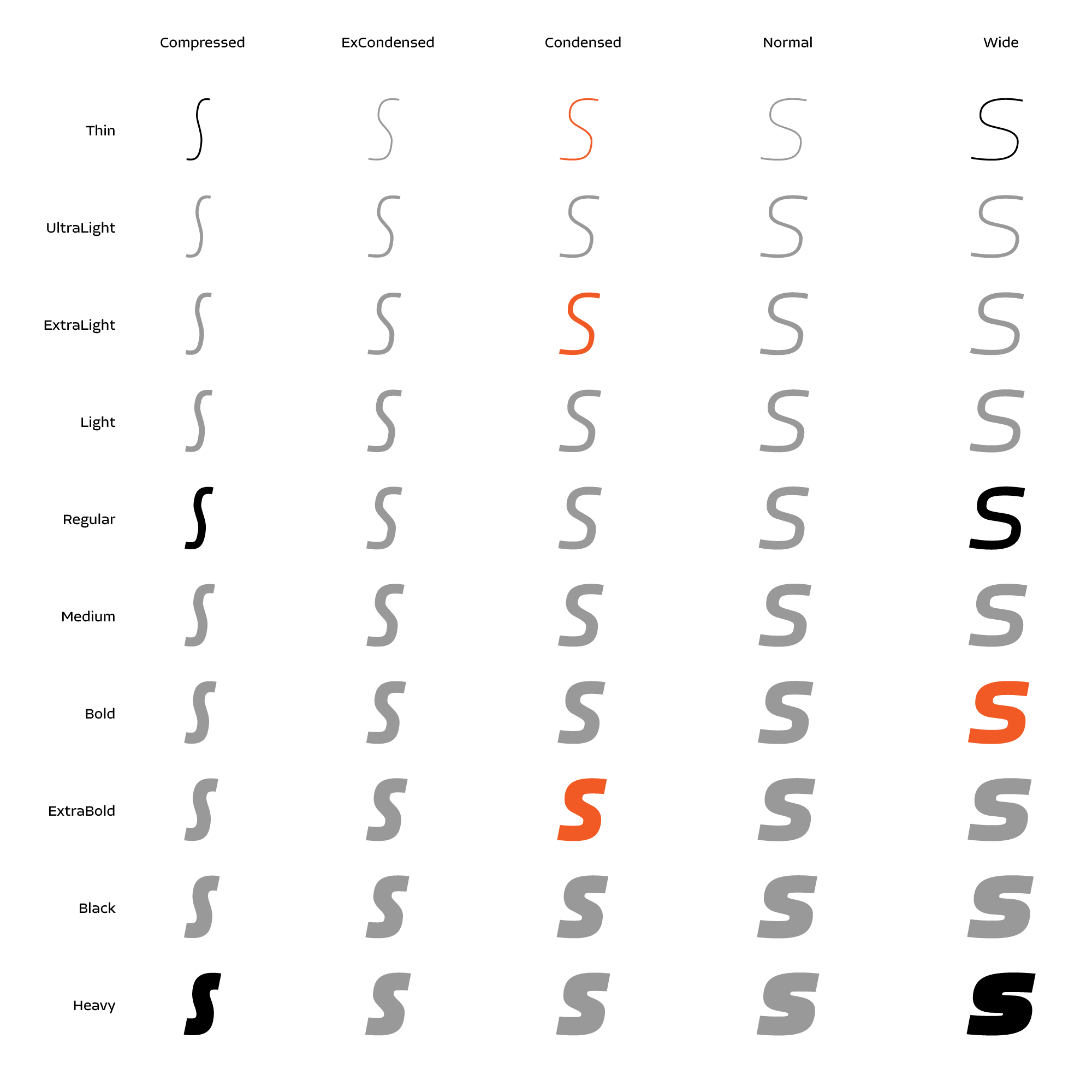
This is my current setup (masters are in black, additional masters in orange):
Btw, It would be nice heaving a GUI in Glyphs that looks like a picture above, to select the exact instance you want to turn into an additional master.
Try to line up the brace layers with the masters. So instead of having a ExtraLight Condensed and Extrabold Condensed, have one Regular Condensed and Heavy Condensed.
And sometimes it is more about keeping the handles in the same proportions.
Can you point out what you consider a problem? It looks as I would expect it to be?
About the UI proposal:
I try to make it not so easy to add them. Otherwise people add to many and make a mess
ExCondensed Heavy looks a bit too squarish and I wanted to slightly change that. And those thin and light weights are a bit fragile so even a couple of points off look really bad, hence the additional masters.
I would love to know how many additional masters are too many?
And does it matter where I put them in the layers palette? In your example it looks like you were careful to position Heavy under heavy and so on…
The GUI could have a warning to educate users when they overdo it. And it would be a convenient way to better picture the master setup. As soon as I made the picture above, I assumed what your advice might be and I was right.
Brace layers should be fine everywhere.
Too many brace layer are just tedious to make and maintain. And putting them in a variable font becomes very difficult.